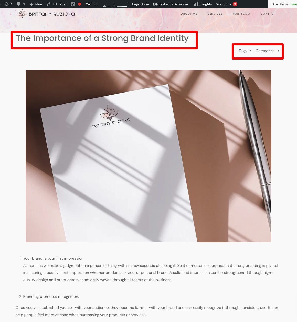
Adjusting Title, Blog Category and Tag link positions on Blog
Hello,
I can't figure out why the title, blog category and tag links are showing above the featured image on a blog post.
Here is the link to the page: https://brittanyruzicka.com/strong-brand-identity/
Attached is a screenshot highlighting the areas I'm referring to.
Additionally, is there a way to disable to hover effect on the featured image in just the blog area?

Comments
Hi,
I can see that you changed the template for your post.
Do you still need help with that?
Best regards
Thanks for the reply, I ended up switching to a different layout.
However, I do have a couple of questions about this layout "Intro Header". How do I go about adjusting the template?
https://brittanyruzicka.com/strong-brand-identity/
I'm interested in adjusting the blog title so that it isn't full width but rather within the bounds of the left and right margin of the content on the site, as well as the overall height of the header (seems rather large).
Also - where does the subheader image show up? I was under the impression that it would show up just below the title.
Essentially I'm looking to achieve something similar to what I attached (excluding a sidebar). Does I have to purchase Elementor Pro in order to have access to a template that will mimic this or can I achieve this through creating a template that can be applied to blog posts?
(example of what I'm looking to do)
Thanks again!
1) Please go to Betheme -> Theme options -> Blog & Portfolio -> Blog, and set padding for the Intro header for the left and right sides.
2) For the Intro header, you can set up an image in the Media section of the Post options.
You can use the Image element with dynamic data if you want to display a post image right below the Intro header.
3) You do not have to use Elementor PRO. If you set up an image with dynamic data, as I described in the second point, you can use a negative margin to move this image up.
Best regards
Thanks for the quick reply and detailed response as always!
I was able to achieve close to what I was looking for. However, how do I change the height of the header background throughout the blog area?
Also - I'm noticing that with the addition of the image in the content area with dynamic data to make it overlap the header, the navigation arrow is now over the top of the image. Is there any way to change the positioning of this and/or turn it off? (link to page below)
Thank you again!
1) You can decrease/increase the Intro header padding.
2) Please use the following CSS code:
#Intro .intro-next{
   display: none;
}
Put it in Betheme -> Theme options -> Custom CSS & JS -> CSS.
Best regards