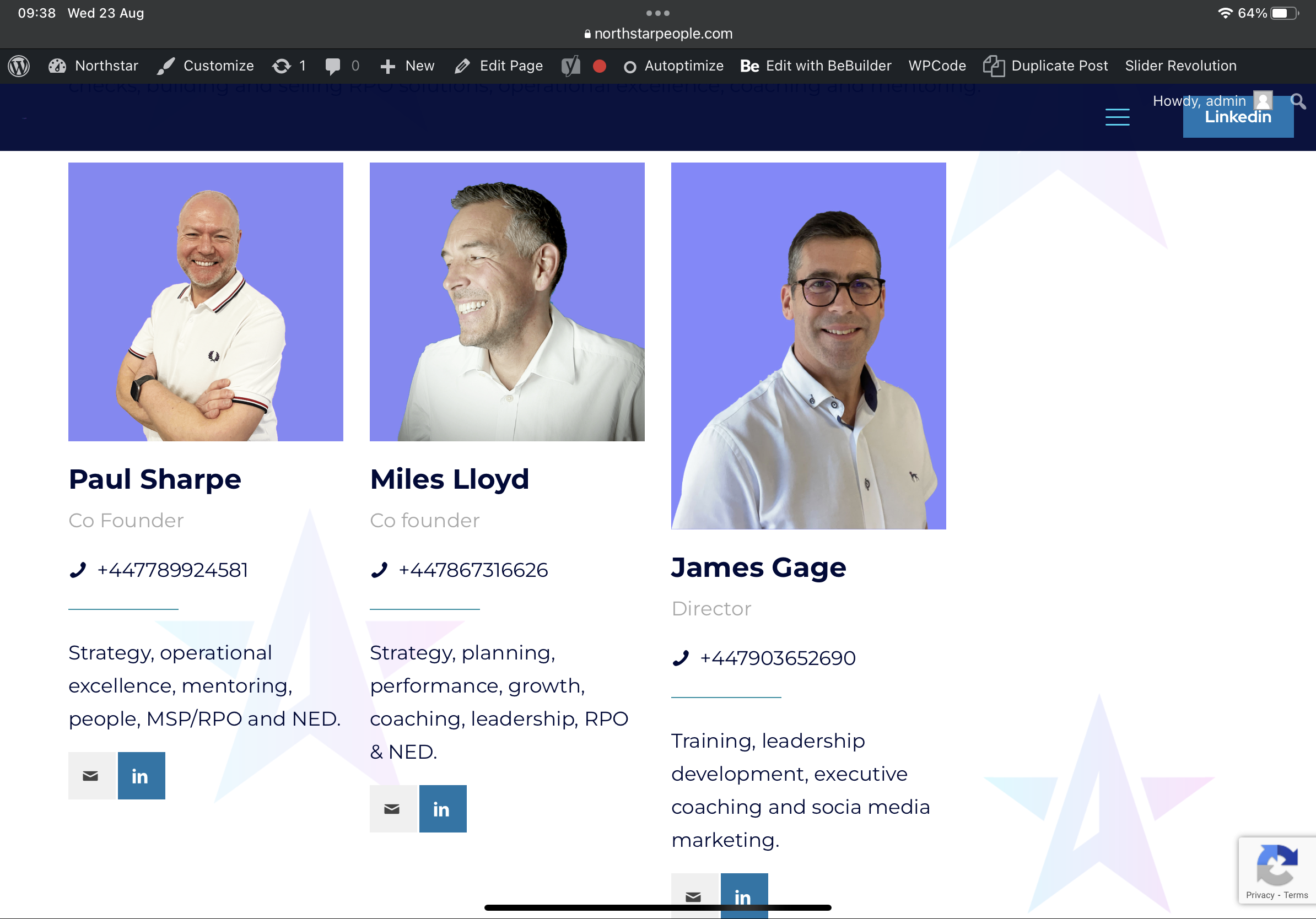
One ‘our team’ element image is showing longer than the rest despite dimensions being the same
Not sure why James’ image is showing longer? All set to 1/4 and image dimensions are the same.
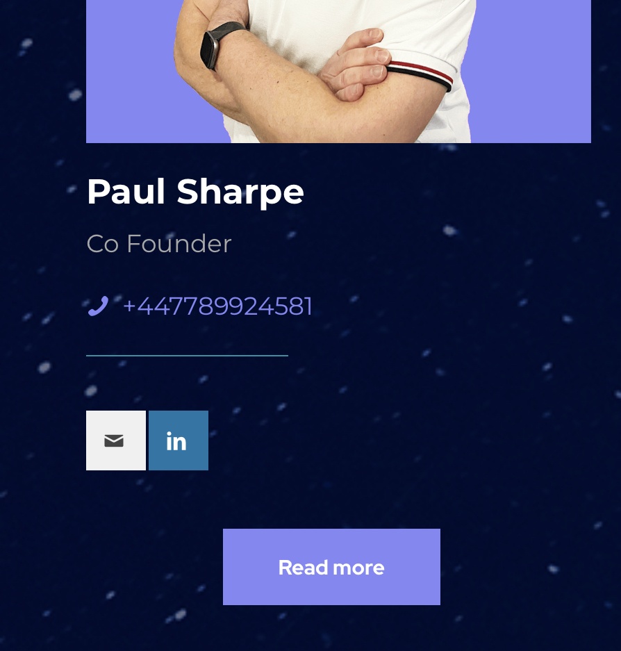
I also want to create a button next to the LinkedIn and email buttons that is a light box to more text, is that possible?
I have currently in another section like image below but would much prefer it to align with the LinkedIn and email ones.


Comments
Hi,
1) The link to this page is not working. Did you change that?
2) Adding a button next to icons would require modifying the Our Team element structure, but we do not provide help with file customization.
Best regards