
Shopping page: Align thumbnails, spaces, titles, texts and container

We have a lot of jumping, especially on smaller screens, mainly due to a longer product title or different thumbnail sizes.
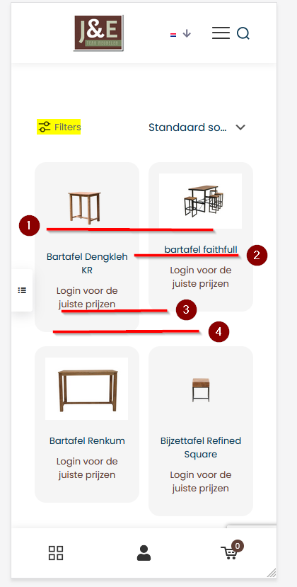
What I would like:
1. I want the size of the field where the thumbnail is to be at least as large as the largest thumbnail that exists.
2. The product title must always be aligned with the product next to it.
3. The text below, where the price normally appears, must always be aligned with the product next to it.
4. And the gray container must always be the same size as the one next to it.
Could you please help with the correct CSS?
This way I could reuse that for any type of device with a different display size.
Thank you very much in advance!
Comments
Hi,
1 & 2) I recommend to use photos that are exactly same size. If you somehow can't do this, you can use the following custom css:
.woocommerce ul.products li.product .product-loop-thumb {
  aspect-ratio: 4/3;
}
Remember to adjust the proportions to your requirements.
3 & 4) You have to use titles that are same length, on smaller screens, titles would break to next line. You can also cheat this with custom css but final effect might not be satisfactory.
.mcb-section .mcb-wrap ul.products li.product .title { min-height: 40px; }This has helped me tremendously again. Thank you!
You're welcome.