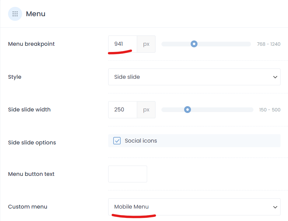
Mobile menu breakpoint issue
Hello,
When a custom menu breakpoint is set for smaller screens, some strange output is seen around this value for the Side_slide functionality.
This is using the original/default header system (with Elementor in use) - not BeTheme.
The menu breakpoint is set at 941px and a "mobile menu" is in place.
At 940px viewport width, the menu shown is not the selected "Custom menu" and the menu itself doesn't have the top margin/padding to stay clear of the search icon:
Only at 766px viewport width does the correct menu show and spacing for the search icon work.
I note in the menu.js file that the default mobileInit value is set to 768. Within the source the `var mfn` data does show 941. Not sure if there's an issue in its implementation, or something else?
You can see this in practice at https://tinyurl.com/bd5n788y
Can you please advise how to get the view of the 767px menu shown all the way up to the 940px breakpoint?
Thanks


Comments
Hi,
I have passed it to the dev team. To prevent incorrect display, use the following CSS code:
@media screen and (min-width: 767px) and (max-width: 941px) {
 #Side_slide .menu_wrapper {
   position: unset!important;
 }
}
However, assigning an appropriate menu requires us to fix it in files, which should be available in the upcoming update.
Best regards
Thank you.
Please let me know when resolved so I can proactively update for the client immediately.
If it's a quick fix and the code changes can be shared, I'd be happy to modify the files before the update is available.
If I will get a solution for that before an update, I will let you know.
Best regards