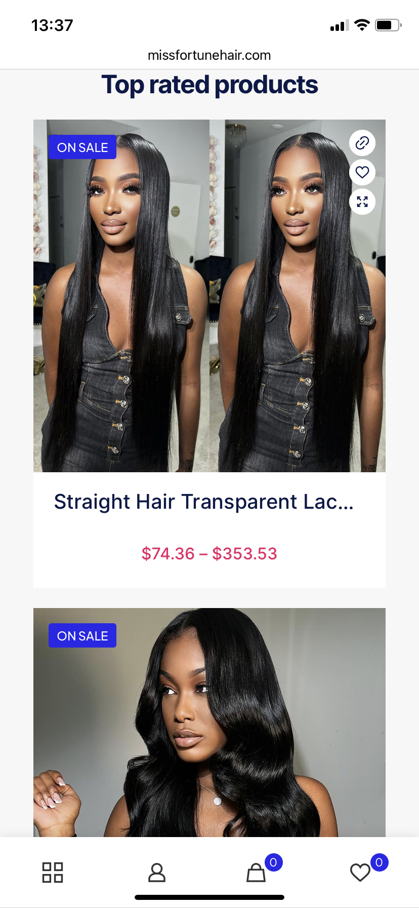
How to reduce product display size for mobile devices?
I uploaded 2 products and they display terrible on mobile devices.
Because of their size, a single product takes up almost the entire screen, as shown in the first image.
I need it to be smaller and be able to display 2 products in one row as shown in the second picture.
Is there a way to achieve this?
my site is : https://www.missfortunehair.com/


Comments
Please go to Betheme -> Theme options -> Shop -> Products list, and set the Mobile layout to two.
You can also use Query Loops to have higher control over columns on each resolution and image size.
https://www.youtube.com/watch?v=maE0FuFIhjQ&list=PLyfUqkbtW2kxq8AY0SivMxX7kf2H9Y-Wf
Best regards