
Product Shop Page Alignment

Hello,
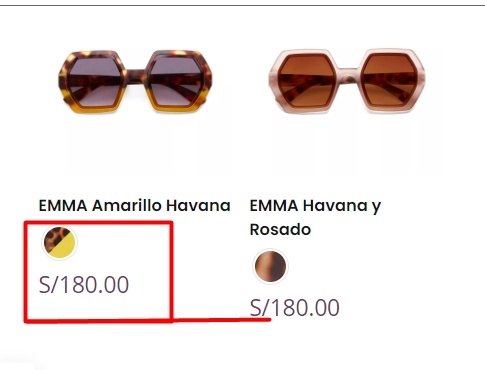
I observed that this is a recurring issue, especially when some product names are longer than others. As depicted in the screenshot, I require alignment for color and price information, matching products on the left with their corresponding pairs on the right.
Any ideas? Please I need your help.
Comments
Hi,
Please always attach a link to your website so we can check it out. If the page is offline(localhost), then our help will be limited. You will have to contact us when the page is online. Also, please make sure that the page is not under maintenance before you provide us with the link.
Thanks
Hello, I think the screenshot could be enough, but you can check the page here: [Links visible only for registered users]
The problem I describe is on mobile view.
Sometimes, a screenshot is enough, but in 99% of cases, we must check what element, construction, etc. you used on your live website. That is why you should always attach a link to your website.
Try the following CSS code:
.woocommerce .products ul, .woocommerce ul.products {
 display: flex;
 flex-wrap: wrap;
}
.woocommerce ul.products li.product, .woocommerce-page ul.products li.product {
 display: flex;
 flex-direction: column;
}
.mfn-variations-wrapper-loop {
 margin-top: auto;
}
.woocommerce ul.products li.product .desc {
 display: flex;
 flex-direction: column;
 flex-grow: 1;
}

@media only screen and (max-width: 767px) {
 body.mobile-row-2-products .products_wrapper ul.products:after,
 body.mobile-row-2-products .products_wrapper ul.products:before { display: none; }

 body.mobile-row-2-products .products_wrapper ul.products { justify-content: space-between}

}
Put it in Betheme -> Theme options -> Custom CSS & JS -> CSS.
Best regards
Great! It works. Thank you!