
Responsive on mobile it is not working correctly

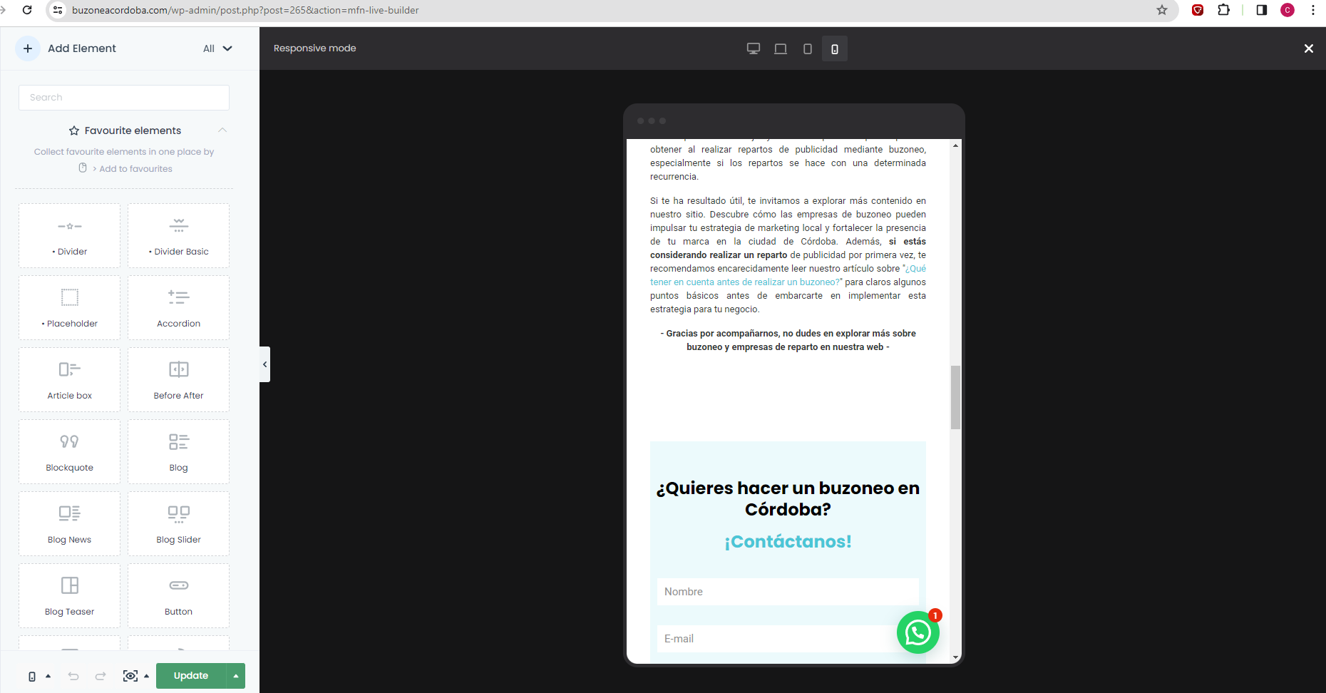
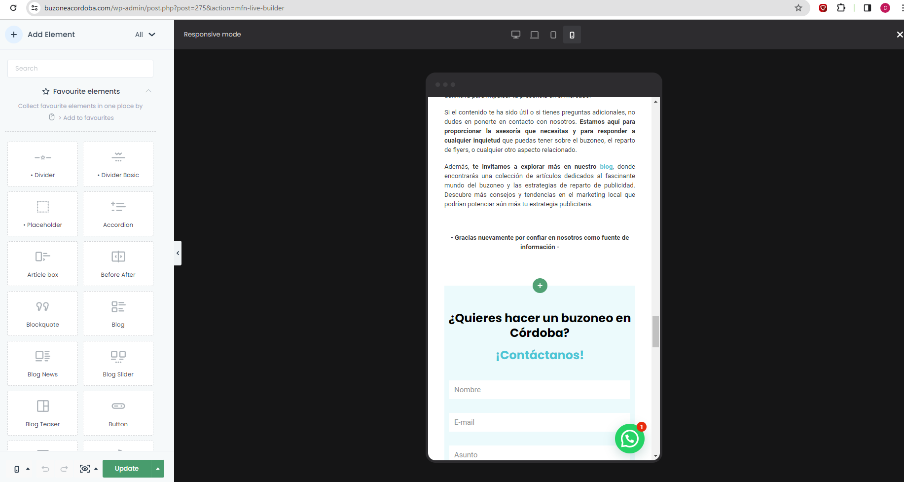
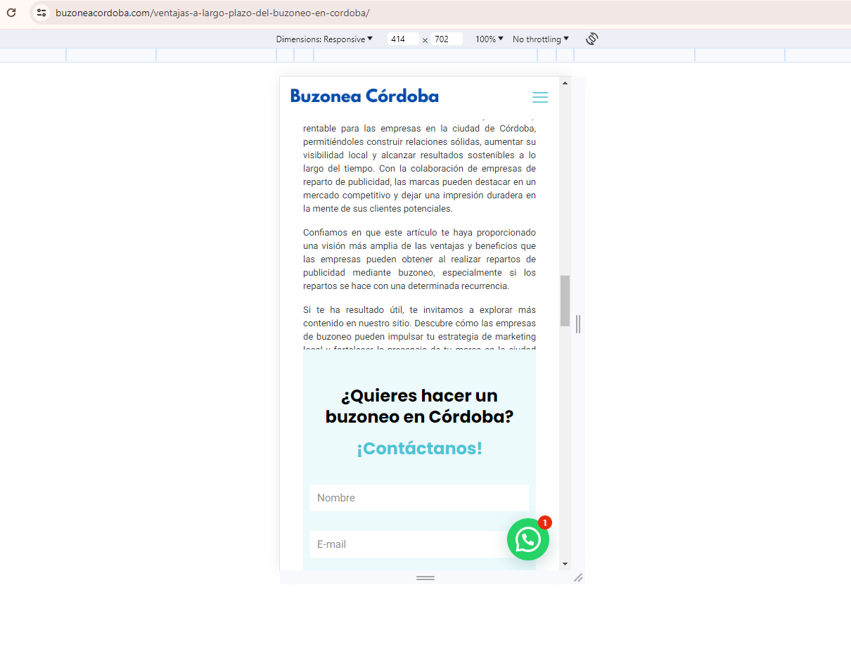

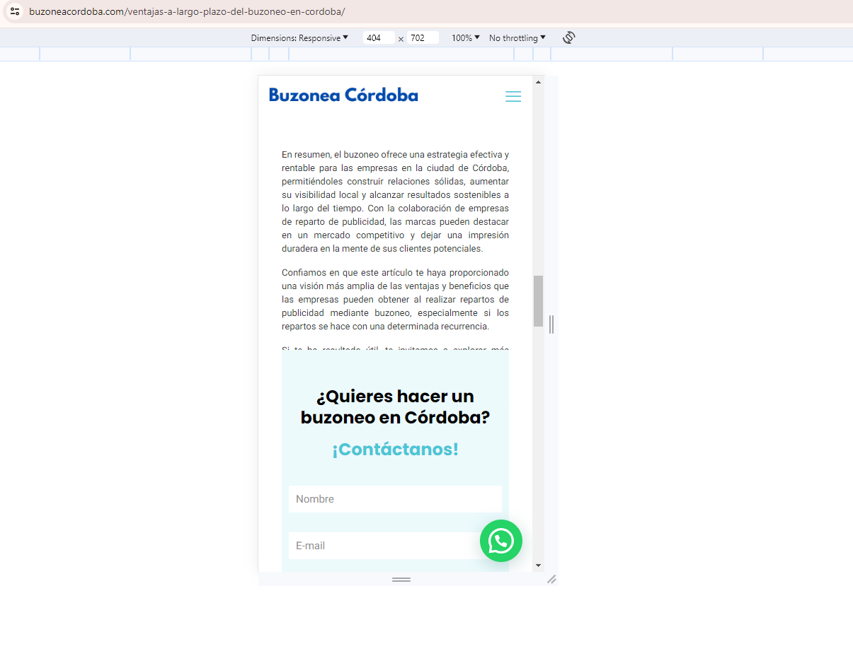

Hello, the responsive mode on my page is not working correctly.
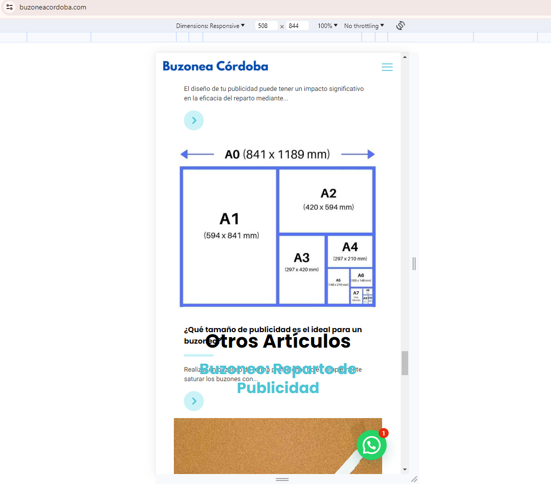
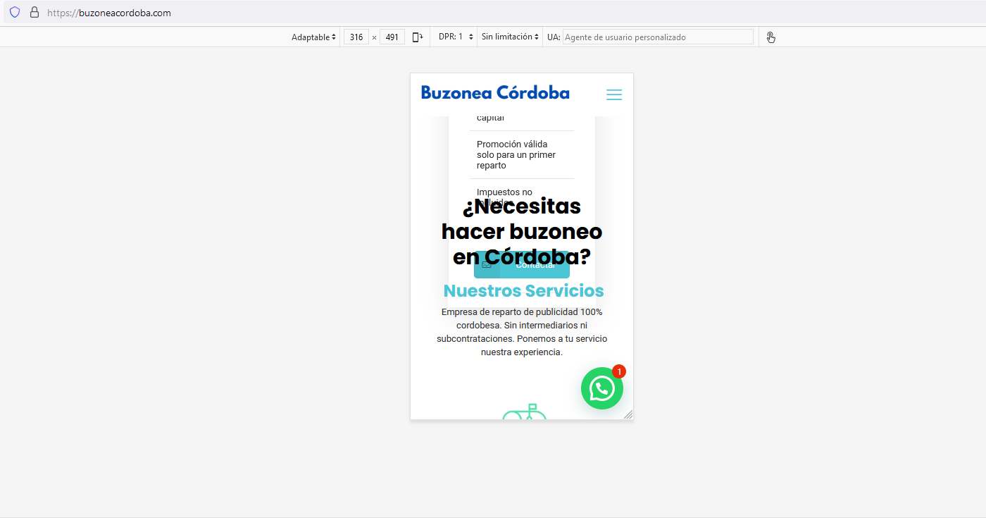
I have even edited each page of www.buzoneacordoba.com in BeBuilder's mobile view but the blocks do not adapt correctly to the different screen sizes.
Many blocks, depending on the dimensions of the screen, overlap each other or appear further away than necessary.
The browsing experience is unfortunate, especially in mobile viewing.
I have attached some screenshots of the problem.
Please help me solve it. I am very disappointed with the current result.
Greetings,
Carlos.
Comments
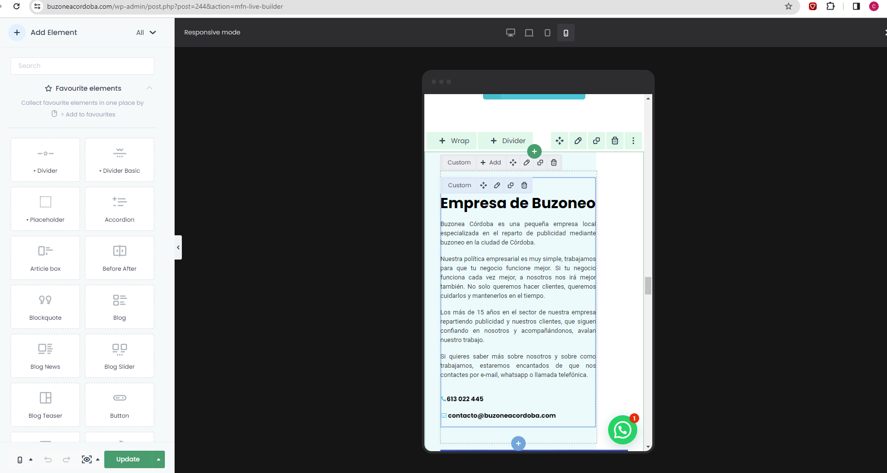
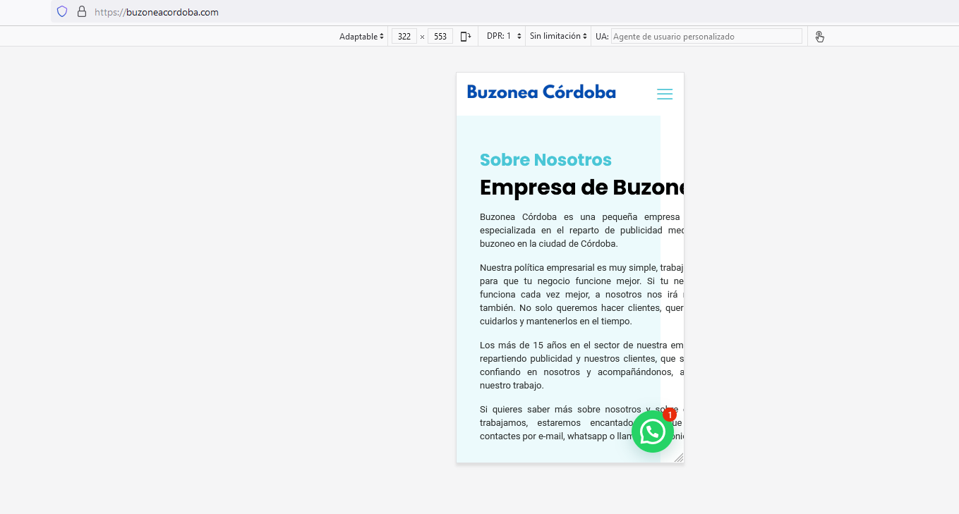
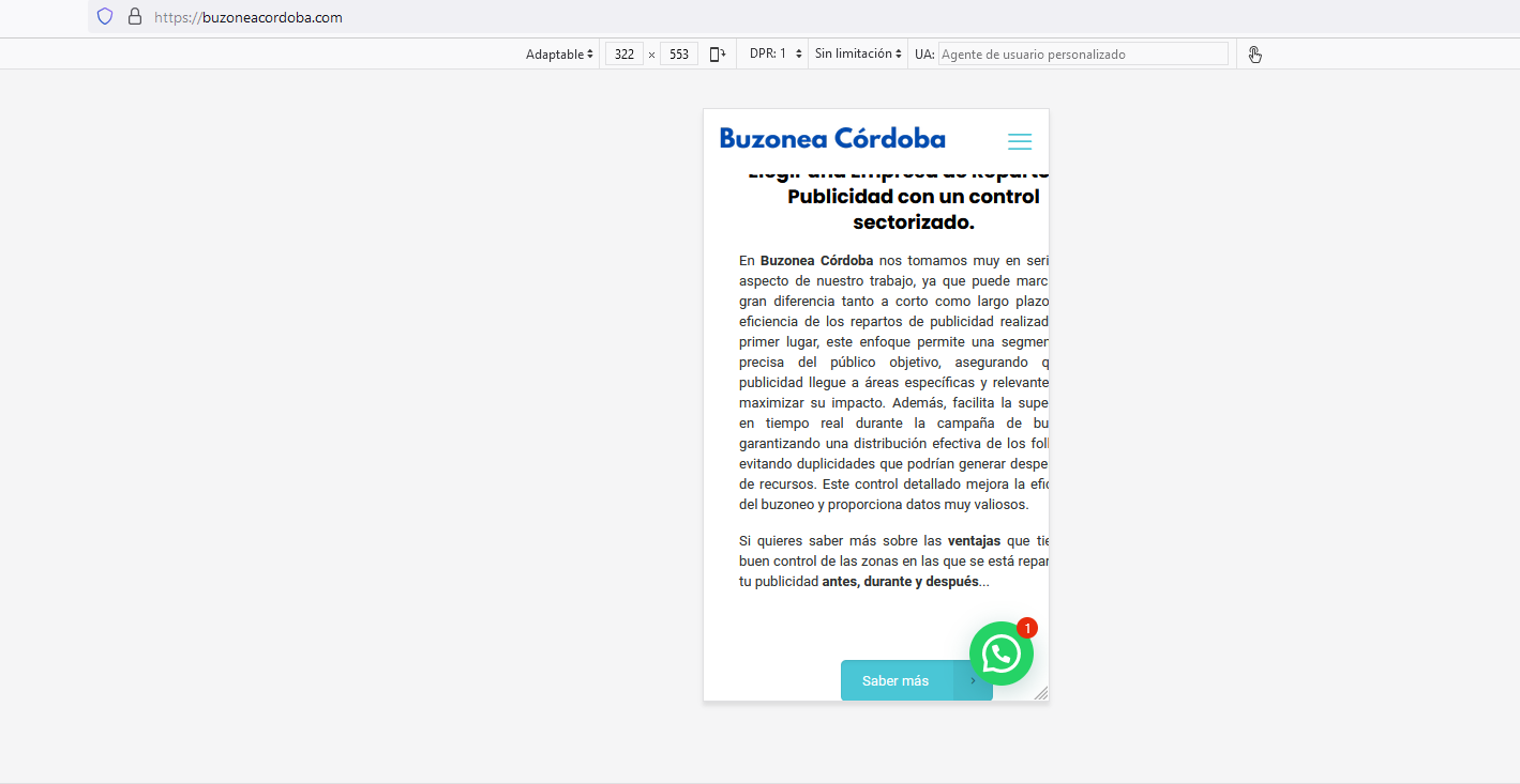
Hi,
You set up custom widths for wraps in many places, causing incorrect layout. Example:
That is why the display is incorrect and going off-screen.
You must edit it and change it to default.
Best regards