Inter font looks different than in Google preview
Hi,
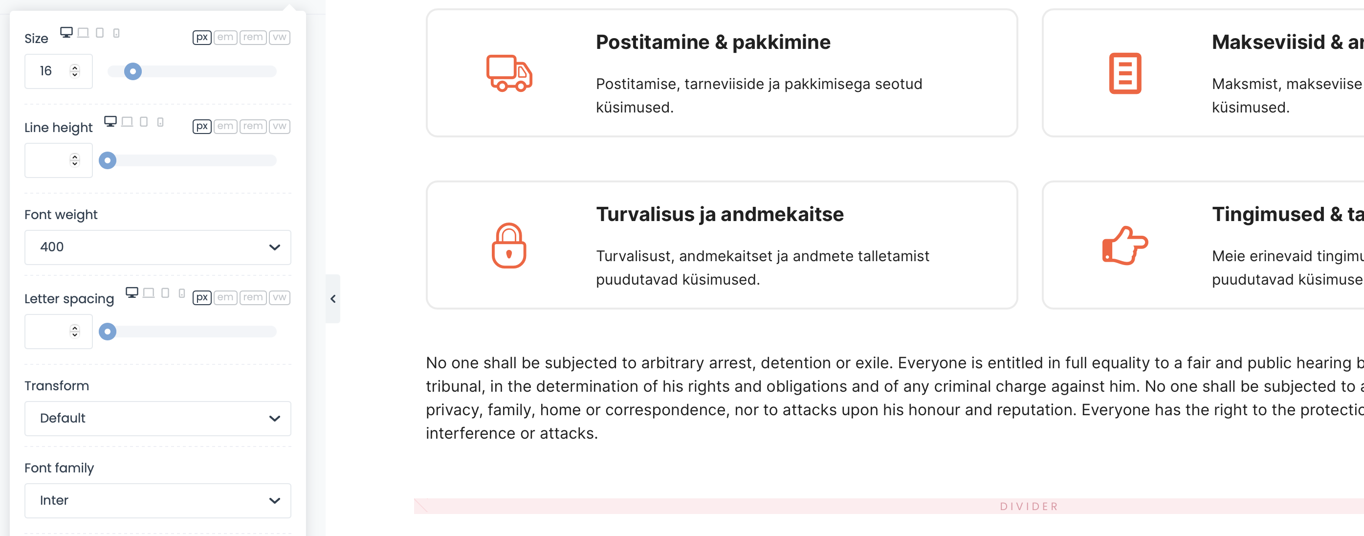
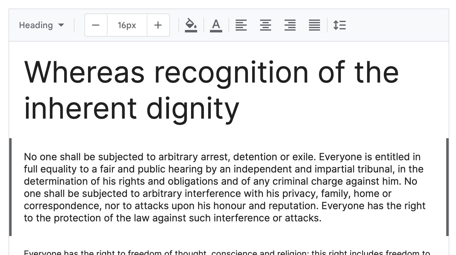
I'm very picky about my fonts and I've began to notice a difference in the Inter font representation on our site vs other sites. I now tested the same text, 16px, weight 400 on our site and in Google font preview. Please see the screenshots - the font is not exactly the same. It looks a bit wider and thinner. What could be the reason?


Comments
Hi,
Do you maybe use the option to cache fonts locally in Betheme -> Theme options -> Performance?
If yes, did you try re-downloading this font?
Also, did you check the appropriate font weights?
Best regards