
Mobile menu styling

Hi,
i have problemes styling my mobile menu.
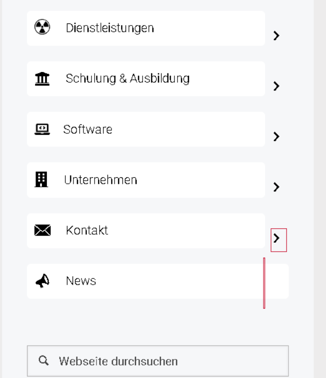
The icons for opening the submenu are not horizontaly centered with the respective menu item.
I cannot center the icon with the existing padding and margin settings
The last menu item has no submenu and the background should only extend as far as the upper menu items.
Thanks for your help
Comments
Hi,
Please always attach a link to your website so we can check it out. If the page is offline(localhost), then our help will be limited. You will have to contact us when the page is online. Also, please make sure that the page is not under maintenance before you provide us with the link.
Thanks
The page is currently in development and protected with http basic authentication.
How can I provide you with the login details?
Please send us the WordPress dashboard access privately through the contact form, which is on the right side at [Links visible only for registered users] and we will check it out.
Notice!
Please attach a link to this forum discussion.
Sending incorrect or incomplete data will result in a longer response time.
Therefore, please ensure that the data you send are complete and correct.
Thanks
We have made some adjustments to your website.
Please check it out now.
Best regards
Thank you, it looks better now. However, the preview in BeBuilder and on the website are different. In BeBuilder, all menu items have the same height, but on the website, items 1 and 3 appear taller
The social icons are also different in BeBuilder and on the website
BeBuilder:
Website:
1) Menu items' height differs because your icons have different dimensions:
When you use icons with the same resolutions the display will be correct.
2) For mobile display you did not have set the wraps set to 1/3 in the sidebar.
I have corrected it.
Best regards
Thanks, I hadn't thought that the settings for mobile are different.
Is it possible to have 3 links/buttons always fixed at the bottom of the sidebar menu?
Please open the sidebar template settings and change the content position to Space Between.
Best regards
okay, I tried it, but now all the content is distributed vertically.
I actually only want the social icons and the 3 buttons pinned at the bottom, the rest should remain aligned to the top.
Also, the buttons in BeBuilder are all shown without spacing, on the website with spacing.
1) The other way to move these buttons down is by adding some top margin to the section.
2) Elements in BeBuilder have default margins assigned to them.
Open these elements settings under Advanced -> Spacing, and set the margins to zero.
Best regards
ok, but is there no CSS that can achieve this?
Only add margin does not always set the buttons to the bottom at every screen height.
Like the mobile menu on this page, no matter which smartphone you have, the 3 buttons in the mobile menu are always fixed at the bottom of the screen.
Then i have a problem, with this menu, i set submenu to hide, but it is still shown.
1) You can also move all wraps and elements except buttons on the bottom to the first section and then use Space between option.
2) This option works correctly. The menu displays first-level menu items, and the submenu is hidden.
Best regards