
Site is different responsive since last theme update, need fix asap

Hi
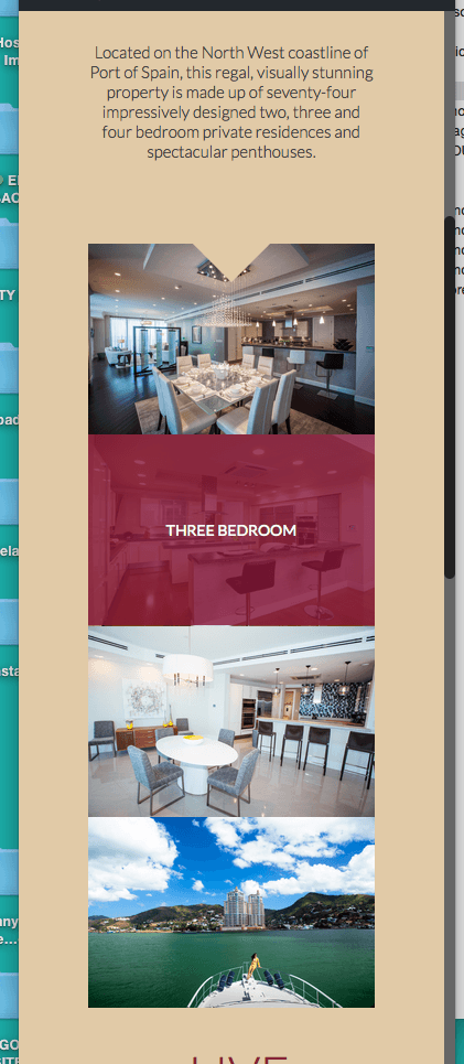
Since i updated the theme the responsivness of the site has been drastically reduced.
Originally the full width sections were full width when i used the custom class "section no-margin-h no-margin-v" for the section the zoom boxes are in.
Now i see there is a section style similar to what i was using but it's not full width on tablet only web. which i think is 960px+
How do i get these sections to go full width on tablet/mobile?
See screenshots of them now and website is here [Links visible only for registered users].
Comments
we know about this issue. This will be fixed with next update (today).
Thanks!