Blog News Element Responsive Design
Hi,
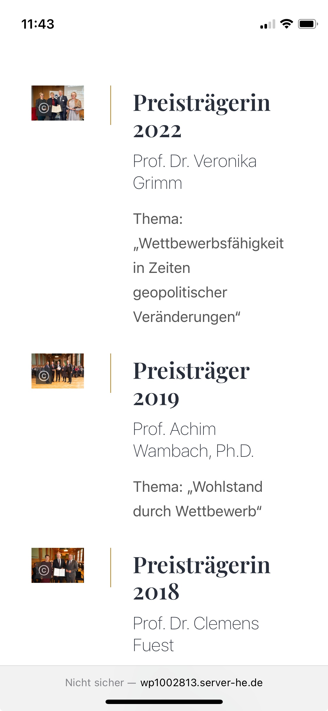
I use the blog news element on a website. In the mobile display, the elements are next to each other, which is why the images are displayed very small. Can the elements also be placed one below the other?
http://wp1002813.server-he.de/_wpcd/preisverleihungen/
Greetings

Comments
Hi,
Try the following CSS code:
@media only screen and (max-width:767px){
 .Latest_news .ul-first .post{
   display: flex;
   flex-direction: column;
 }
 .Latest_news .ul-first .post .photo{
   width: 100%;
   border: none;
 }
 .Latest_news .ul-first .post .desc{
   margin-left: 0;
   margin-top: 15px;
 }
}
Put it in Betheme -> Theme options -> Custom CSS & JS -> CSS.
Best regards
Great! Thank you!
Hi,
is it possible, to reduce the space?
Kind Regards
Use the following CSS code:
.Latest_news ul li .photo{
 padding-right: 0!important;
}
.Latest_news ul li.has-post-thumbnail .desc{
 width: 100%!important;
}
Put it here:
Best regards
Thank you very much. The spacing to the right is correct, the left should also be removed.
Please also add this:
.Latest_news ul li.has-post-thumbnail .desc{
 padding-left: 0!important;
}
Best regards
Thank you!