
Search options

Hello,
I struggle again, this time with the search function. In the elements, there is a search field, which works perfectly. I have problems with positioning.
I try to have it in the header for mobiles, but if I try to change its dimensions / width from Inline to custom, not to be disproportingly wide on mobiles, it will also shift search results, so It can't be seen normally on mobiles.
The same issue is when I try to change the position of the search field, because I want it to be centered in my wrap, but the left side of the search results is cropped..
In the image below, you can see only the position of the element and with "inline" width where the search results are visible whole, without the left side cropped and missing:
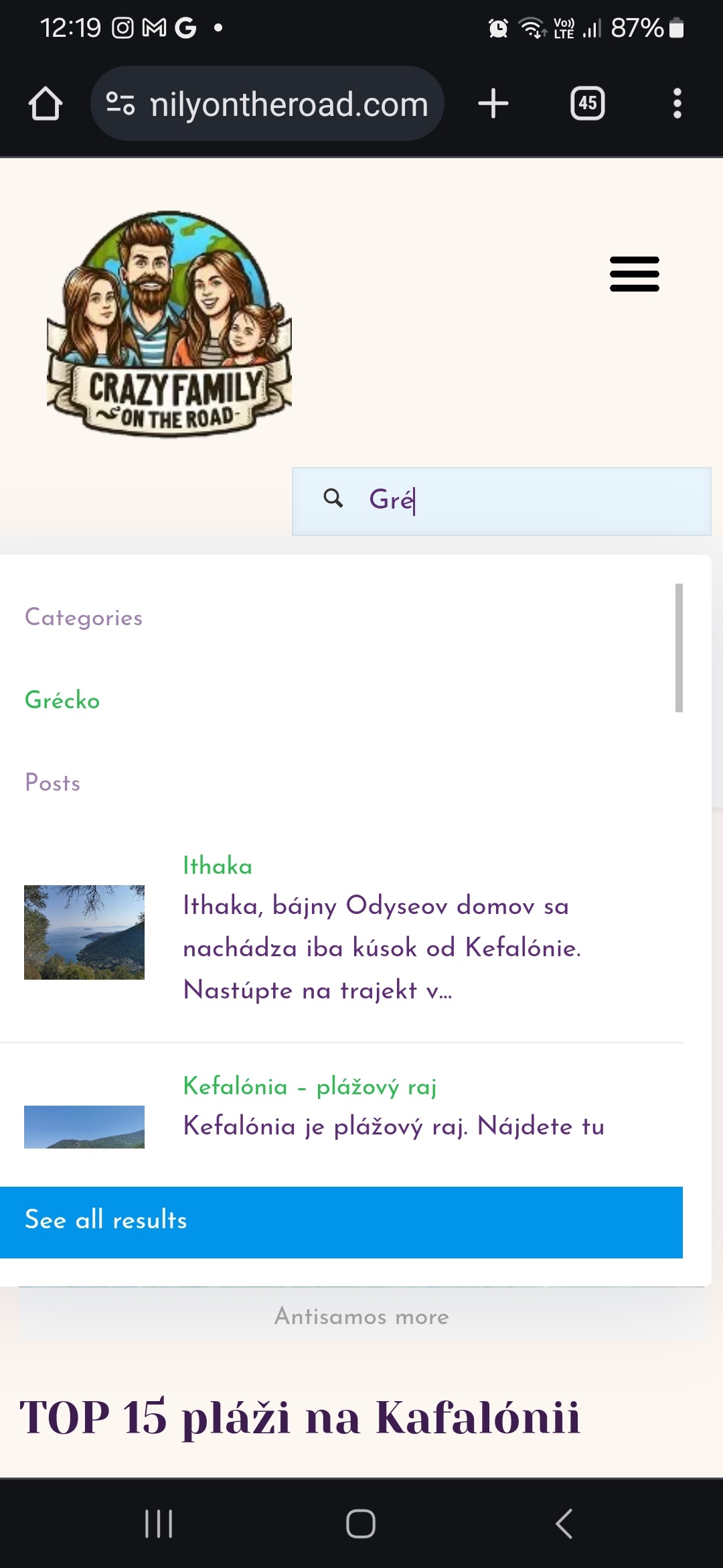
Here you can see the left side missing when I changed the inline to 200px so the field isn't too wide for mobiles
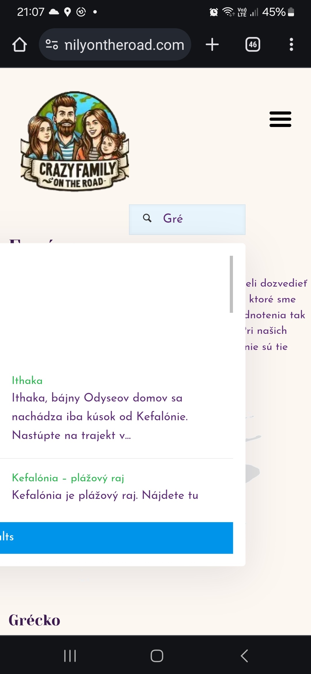
And same will happen when I want to change the positioning of the search field.
you can see here:
Login access to dashboard is the same I sent you few weeks ago with different problem I had.
Thank you very much for help.
Regards
Martin
Comments
Hi,
Please try the following CSS code:
@media only screen and (max-width:767px){
 .mfn-header-tmpl .column_header_search .mfn-live-search-box{
   right: unset!important;
   left: 50%!important;
   min-width: 250px!important;
   transform: translateX(-50%)!important;
 }
}
Put it in Betheme -> Theme options -> Custom CSS & JS -> CSS.
Best regards
Awesome, it works. Thanks alot.
so the point here is the transform option ? This one I see in the advanced settings in the search element in builder. So if it is, I know how to handle if encounter similar problem next time :)