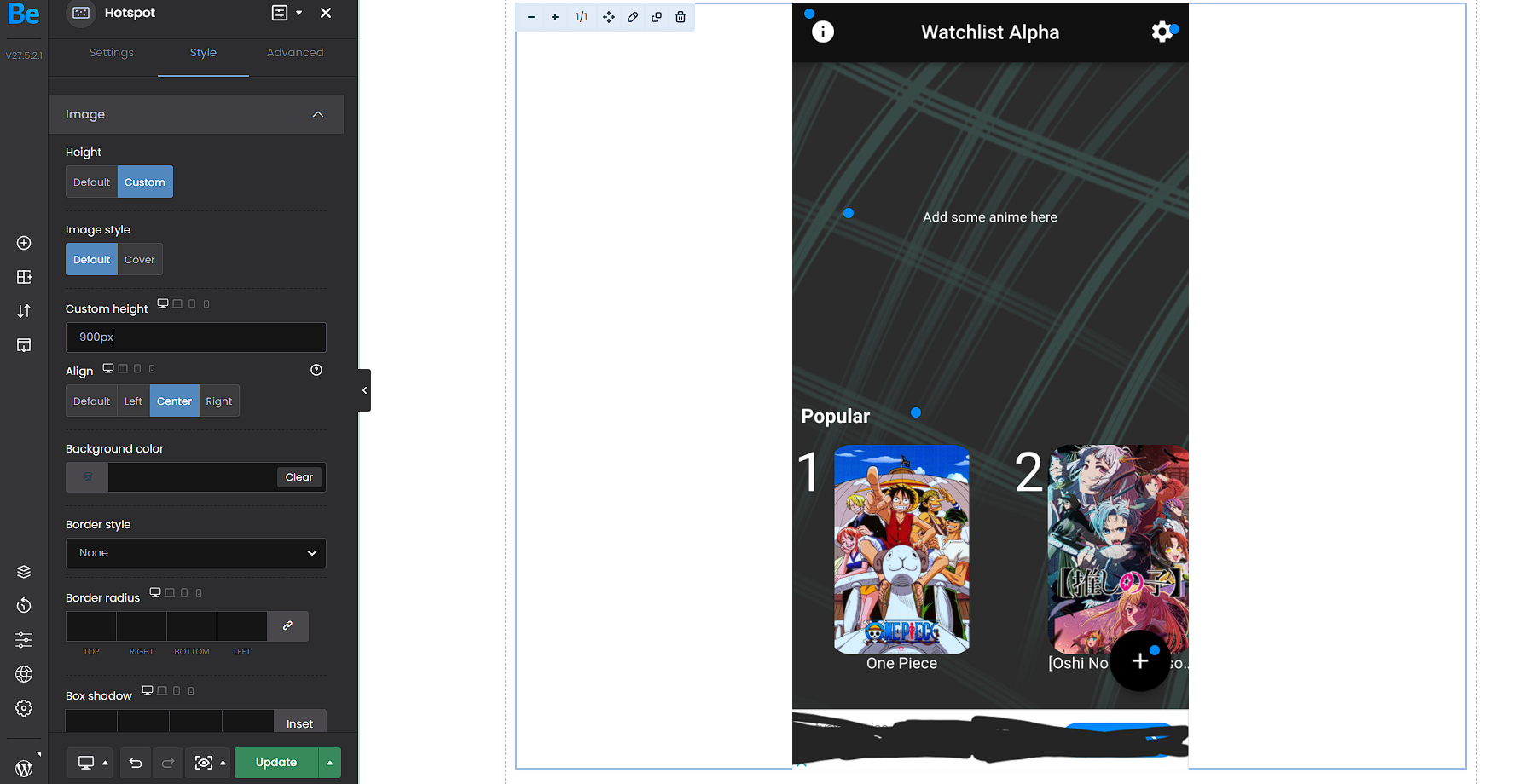
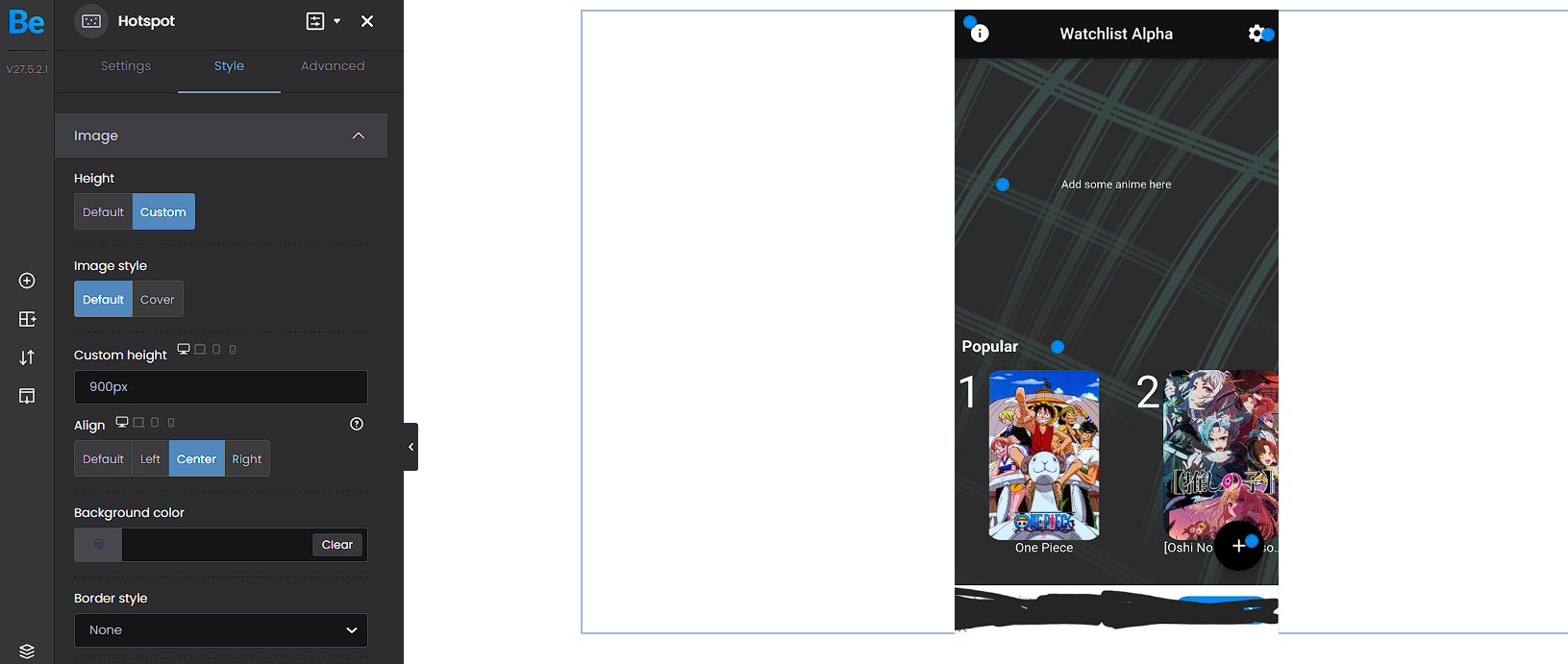
Hotspot image custom height responsivity doesn't work

When I for example set the custom height to 900px for desktop and 500px for mobile, the hotspot size on desktop is 500px and the size on mobile is an other than defined.


Here are screenshots I took after I reload the BeBuilder (while 900px are defined, for mobile 500px) and re-enter the 900px.


As you can see the image size after I reload the Builder goes down to 500px like on mobile defined and not on desktop.


Website: https://merrek.com


Comments

Sign In or Register to comment.
This website uses cookies

We use cookies to personalise content and ads, to provide social media features and to analyse our traffic. We also share information about your use of our site with our social media, advertising and analytics partners who may combine it with other information that you’ve provided to them or that they’ve collected from your use of their services.

Cookies are small text files that can be used by websites to make a user's experience more efficient.

The law states that we can store cookies on your device if they are strictly necessary for the operation of this site. For all other types of cookies we need your permission. This means that cookies which are categorized as necessary, are processed based on GDPR Art. 6 (1) (f). All other cookies, meaning those from the categories preferences and marketing, are processed based on GDPR Art. 6 (1) (a) GDPR.

This site uses different types of cookies. Some cookies are placed by third party services that appear on our pages.

You can at any time change or withdraw your consent from the Cookie Declaration on our website.

Learn more about who we are, how you can contact us and how we process personal data in our Privacy Policy.

Please state your consent ID and date when you contact us regarding your consent.