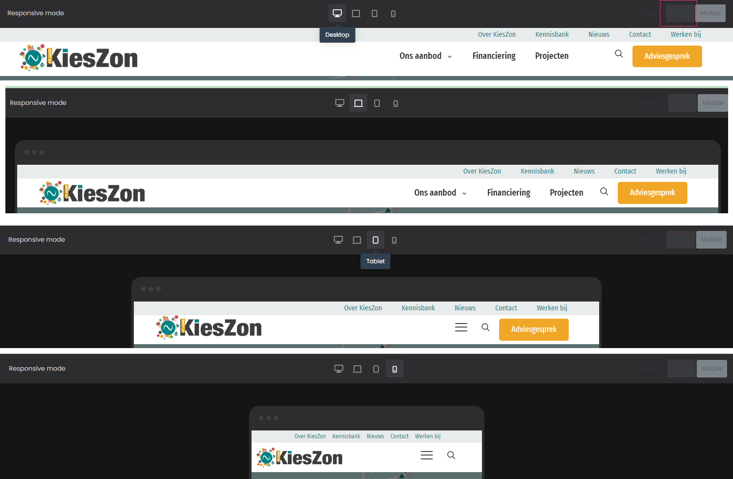
Issue with Sticky Header Display on Desktop, Laptop, and Tablet
Hello,
I'm experiencing an issue with the sticky header I created using the mfn-live-builder. The sticky header displays correctly on mobile devices, but it does not show properly on desktop, laptop, or tablet.
Details:
- Backend: In the mfn-live-builder’s sticky header preview, both the menu and top bar are shown correctly.
- Frontend: On desktop, laptop, and tablet, another menu is displayed instead of the custom sticky header. However, the custom sticky header is displayed correctly on mobile devices.
I have double-checked the settings but haven't been able to identify the cause of the problem. Could you please assist me in resolving this issue?
Thank you for your help.
Best regards,
Mark

Comments
Hi,
which other menu is being displayed exactly? I have checked your site but didn't noticed anything wrong. Menus are shown correctly and there is no extra menu in frontend.
The standard menu is currently being displayed (from Betheme options) instead of the designated header template. The header template includes a top bar above the menu, which should also be sticky. It’s important to ensure that both the top bar and the menu maintain their position when users scroll for a better user experience.
It has to be cache on your end because on my side everything works fine. I can see both top bar and menu when sticky. I attach screenshots as proof.