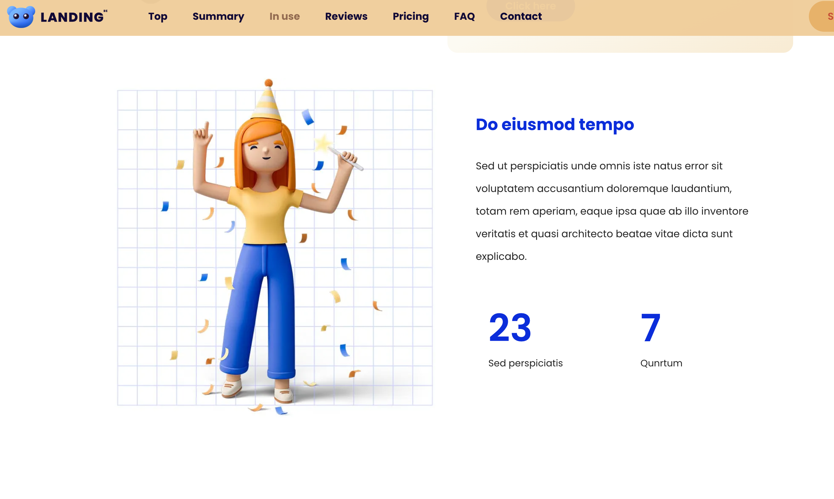
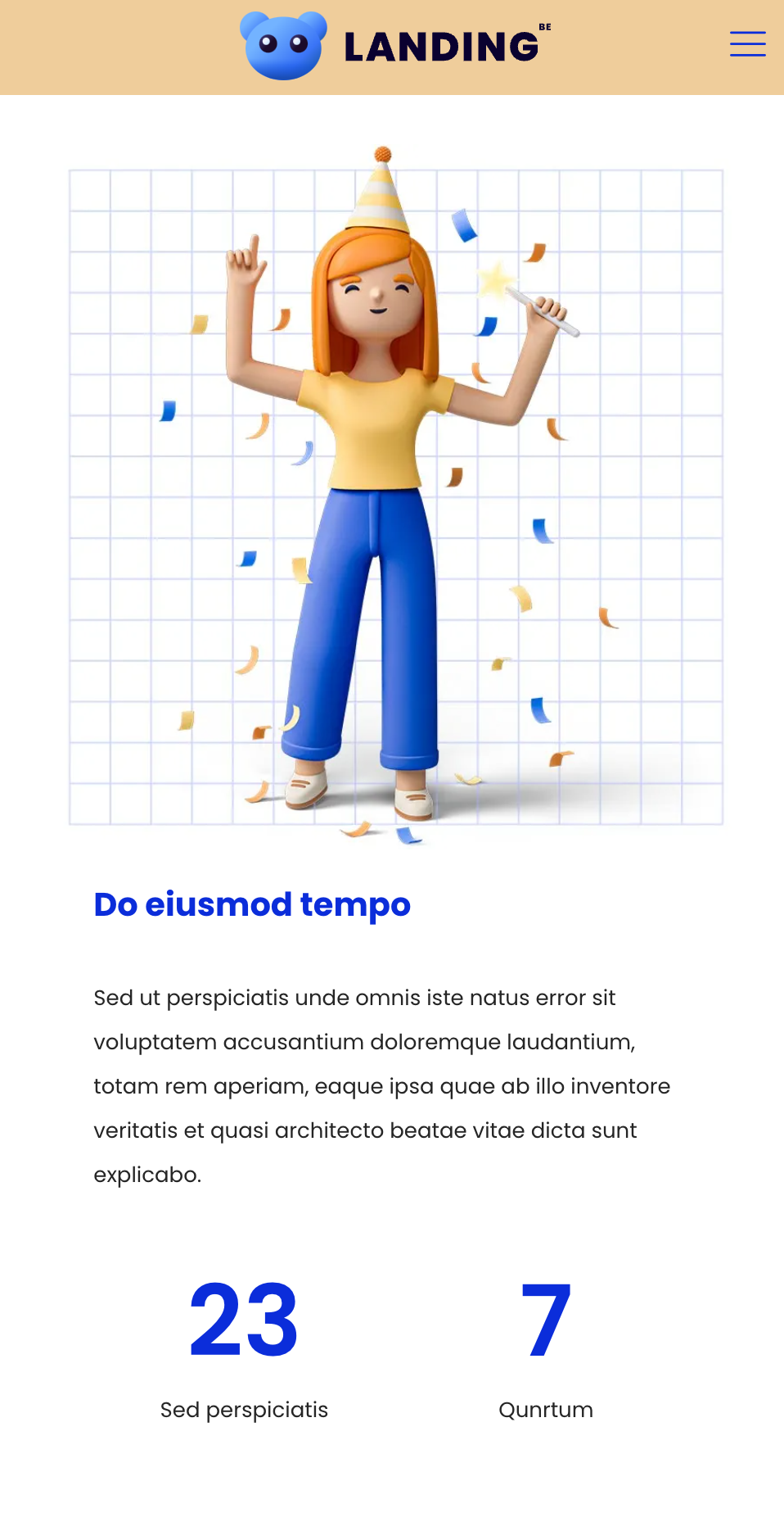
Change the ordering of columns on a small screen
Using this template, I see that sections with multiple columns will always show the left column on at the top when the screen size is too small (e.g. mobile). Is there a way to configure the left column to be at the bottom and right column at the top on mobile?


Comments
Hi,
Please see the following video tutorial:
https://support.muffingroup.com/video-tutorials/order-on-mobile/
Best regards