Issue with Privacy Policy Checkbox Alignment on Contact Form
Hello!
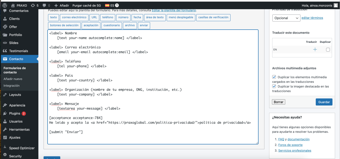
On the Contact page of this website (here’s the specific link: https://praxoglobal.com/contacto/), I’ve used a code to create the form. I’ve attached a screenshot with the code.
To create the checkbox for the privacy policy acceptance, I’ve used the following code:
[acceptance acceptance-784]
He leído y acepto la <a href="https://praxoglobal.com/politica-privacidad/">política de privacidad</a>
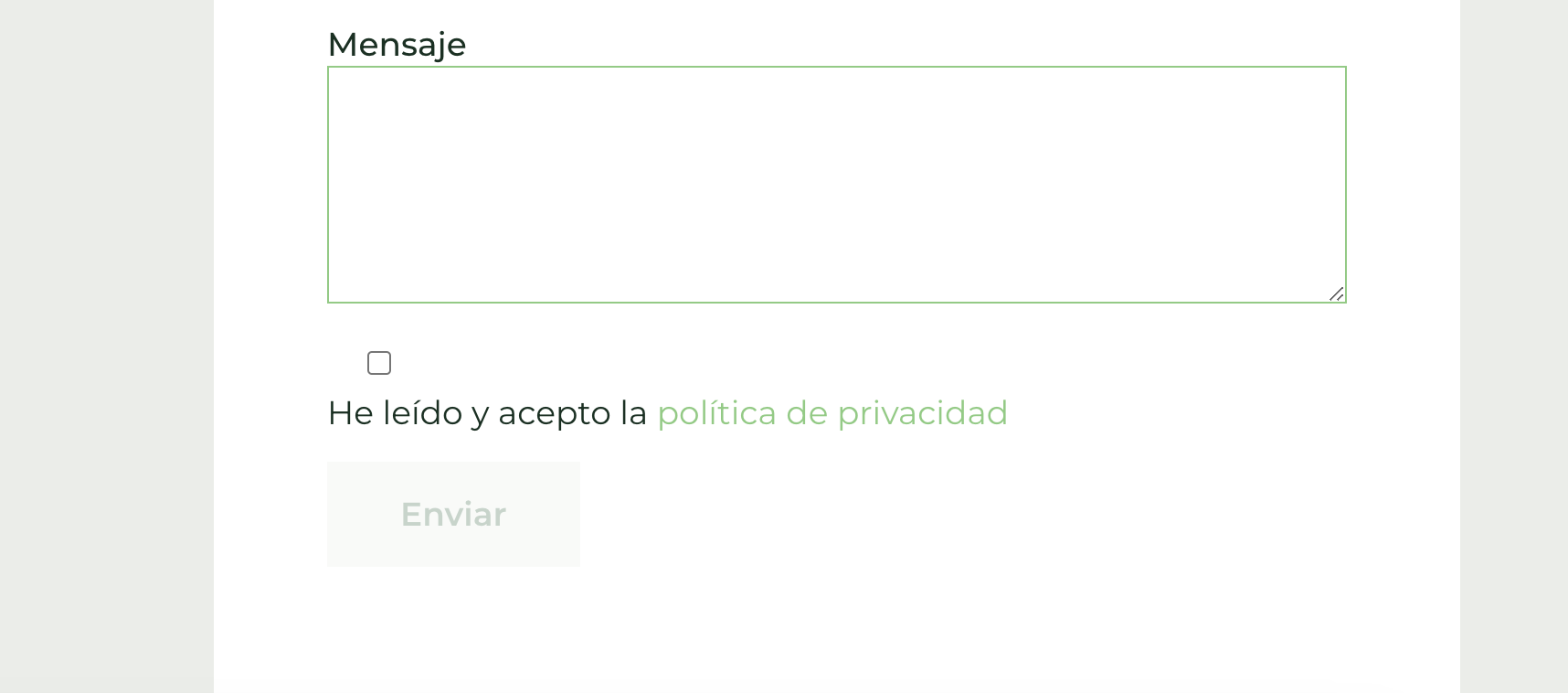
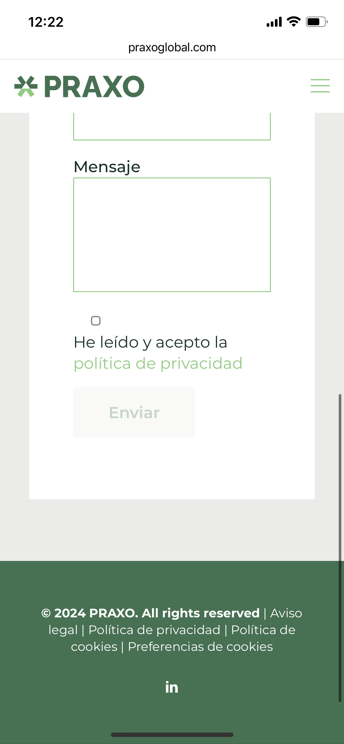
The problem is that the checkbox appears visually misaligned on both the desktop and mobile versions. It’s placed above the text, while it should be next to it. I’ve attached a screenshot.
How can I adjust it so that it looks more or less like this?
Thank you so much!


Comments
Hi,
The closing of the Acceptance shortcode is missing.
It should look like this:
<div class=“column one”>[acceptance Acceptance optional]<span style=“font-weight: 400;“>Agree to <a href=“#”>Terms and Conditions</a>.</span> [/acceptance]</div>Best regards
Thank you so much! It looks good on desktop now, but on mobile, the checkbox for accepting the privacy policy is still appearing above the text. How can I modify it for mobile as well? I’m attaching screenshots of how it looks on both desktop and mobile.
Please purge the cache because I still see the previous view from before your change.
Thanks