
layout issues in responsive mode for icon boxes

Hi,
I am working on a site that has 9 icon boxes arranged in three rows of three columns. I'd like for them to all be the same height on tablets as well as desktop. I have the wrap that contains them set to stretch, but they are not stretching to the same height. Can you point me in the right direction to make them stretch properly?
I am also using images instead of icons at the top of each box. The icon sizes are great when I look at them on my desktop, even when I have it set to tablet or phone mode. However, when I look at the same icon on my tablet or phone, it is tiny. I can't figure out how to get them to display at a decent size on my devices. Can you help with that as well?
Here's my site url: https://www.integrityits.net. It is only a one page site and all of the content is in the Services We Provide section.
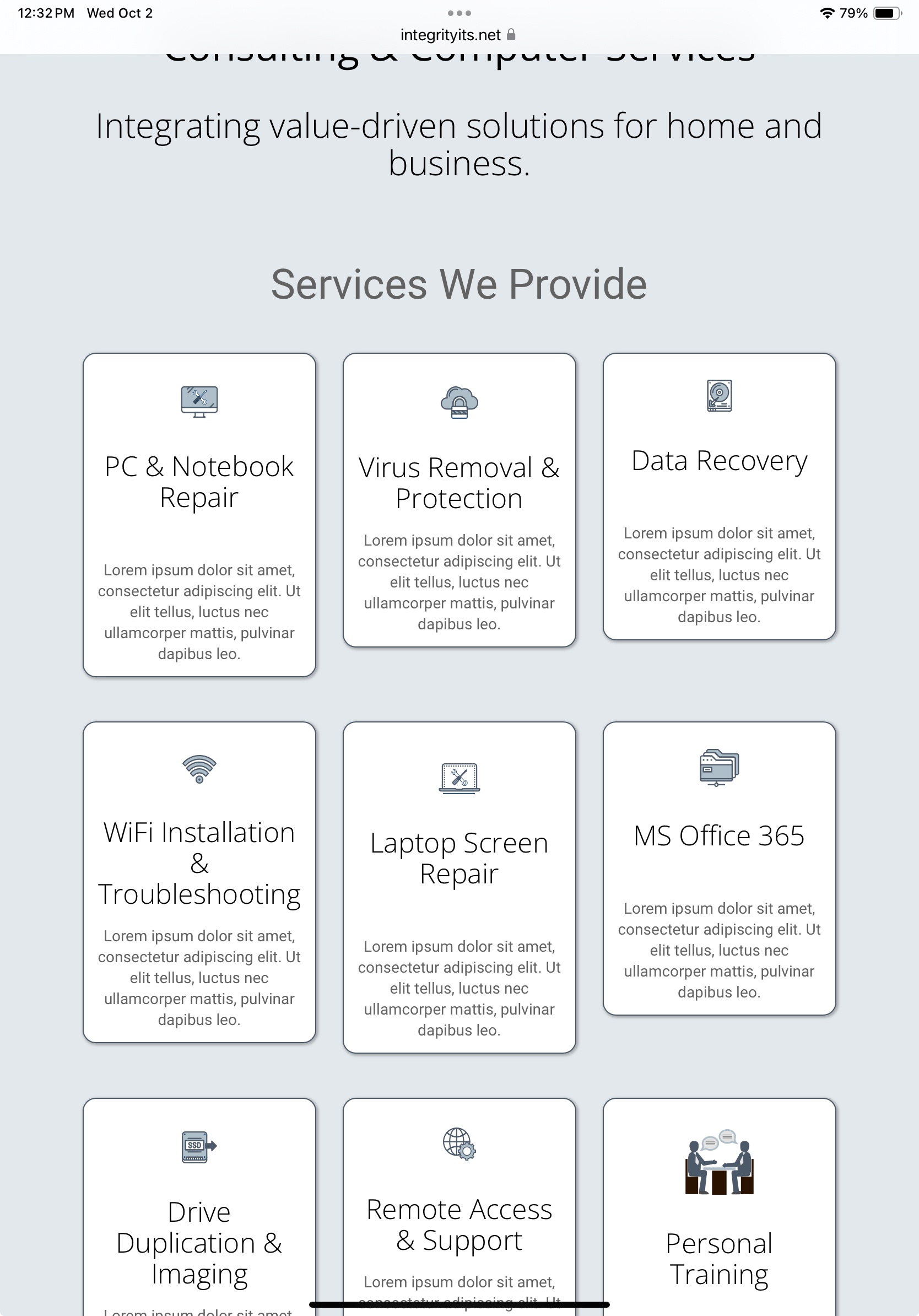
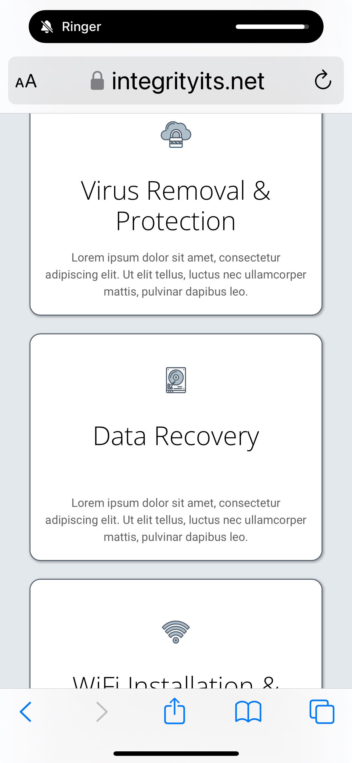
I have included screenshots of my tablet and my phone showing the uneven icon box heights and icon sizes on tablet and the small icon size on my phone.
Thanks so much for your help.
Comments
Hi,
1) There is no easy way to stretch these elements. You would have to rebuild this construction so the individual icon boxes will be placed in separate wraps. So, you will have to assign border, border radius, and background to the wrap settings, and set to stretch wraps in the section options.
2) Image size can be adjusted in the Style tab of icon box element.
Best regards
Thank you for the information about the wraps stretching. I will try that to see if it helps. I currently have all three of the items in one wrap.
I have used the image width option in the Style tab. I set the width of the icon wrapper to 100% and then the image width is set to 50%, but it doesn't enlarge the size of the icons on mobile devices. It leaves them tiny. No where near the 50% that I have set. They are only about 10%. I have also tried setting a specific size...like 80px. Nothing works to change the icon size.
I rechecked your website, and the images on mobile look like this:
Did you handle this in the meantime?
Best regards
No, I have not been able to resolve this issue. When you look at them in the "mobile" layout on a computer, they look great. But when you look at them on the actual mobile device they are tiny. I have attached a screenshot from my phone. I have tested in various browsers and it looks the same in them all. I have spent so many hours trying to fix this issue.
Please send us the WordPress dashboard access privately through the contact form, which is on the right side at [Links visible only for registered users] and we will check what might be the reason.
Notice!
Please attach a link to this forum discussion.
Sending incorrect or incomplete data will result in a longer response time.
Therefore, please ensure that the data you send are complete and correct.
Thanks
I tried the credentials you sent, but they are not working:
Please send another message with the correct login credentials.
Thanks
The root cause is the SVGs, as they do not have height and width set within them.
For a test, I uploaded an SVG file that contains that, and the display is correct on mobile:
Please check it out.
To correct that you must re-upload these SVGs but they must have width and height.
Best regards
OK. Thanks so much. Maybe I'll just use png files instead.
I really appreciate your help with this!!
I am happy I could help.
If you have any other questions or problems, feel free to ask.
Best regards