
Mobile menu not changing

Hello!
I am trying to edit the layout of the mobile menu and I understand that in the menu option I have selected (highlighted in the picture) the menu should be on the right side, not on the left.
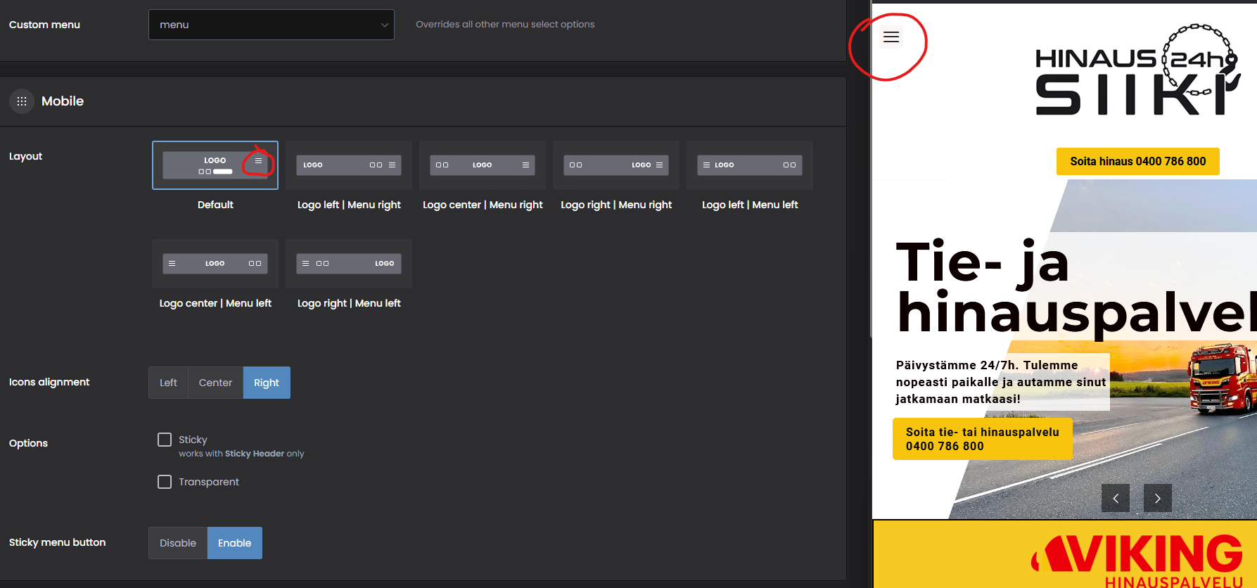
Also, choosing any of the given options has no effect on the layout of the mobile view menu, but the menu remains on the right side of the page.
Can you help with this?
Thank you!
Comments
Hi,
It is because sticky menu button option enabled:
Disable it, and it should be correct.
Best regards
Hi!
Thanks, it worked, but so it is not possible to have sticky menu in mobile without having the menu only on the left side of page? In that case using sticky menu seems a bit restrictive. Also, if so, could there be a clarification like a help text that if the sticky menu is enabled, then the setting overrides the other menu layout options.
1) If you activate it back to I can check if it can be done with a custom CSS code.
2) I will pass your suggestion to the dev team.
Best regards
Hi! I've enabled the mobile sticky menu back on. Thank you for taking this suggestion for the devs!
Try the following CSS code:
#Top_bar a.responsive-menu-toggle.is-sticky{
 left: unset;
 right: 10px!important;
}
Put it in Betheme -> Theme options -> Custom CSS & JS -> CSS.
Best regards
Thank you, this worked just like i wanted!