
Menu style - One row

Good evening,
I'm wondering if there's an easy way to set the width to an limit, that my menu is not being moved to a second row due to screen resolutions. For example when I re-size my browser window (like narrow or widen), the style is changing. At some point it shows the responsive menu/icon. Actually I would prefer to display the responsive style instead of showing two lines.
Hope you guys can help me 😊
Thank you in advance!
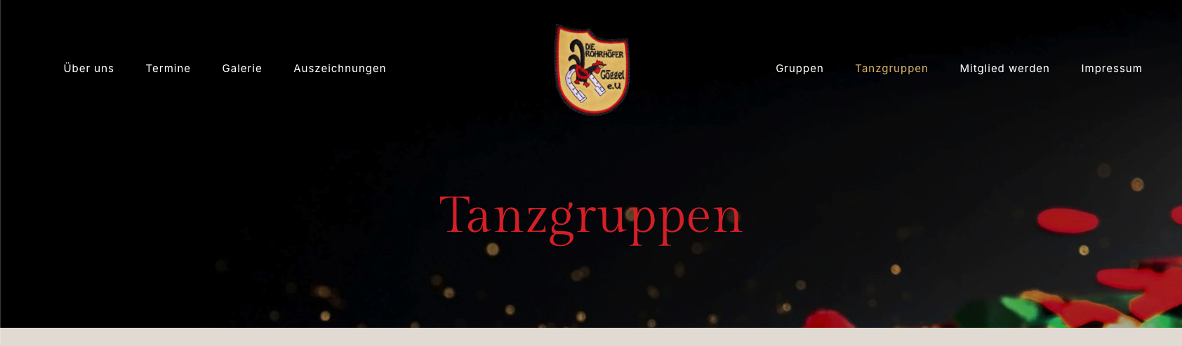
How it should look like:
Responsive Layout:

How it should NOT look like:

Comments
Hello,
Please go to Betheme -> Theme options -> Responsive -> Header, and increase the Menu breakpoint value:
Best regards
Thank you! But I have already set the maximum amount of 1240px. How can I increase it more? Thanks!
It is not possible within Theme options. To achieve that, you must recreate your header with the Header Builder and use Hide/Show under the responsive option.
https://support.muffingroup.com/video-tutorials/header-builder-2-0/
https://support.muffingroup.com/video-tutorials/show-hide-under-breakpooint/
Best regards