
How to adjust Section Query Loop content display

Here is the page I'm working on: [Links visible only for registered users]
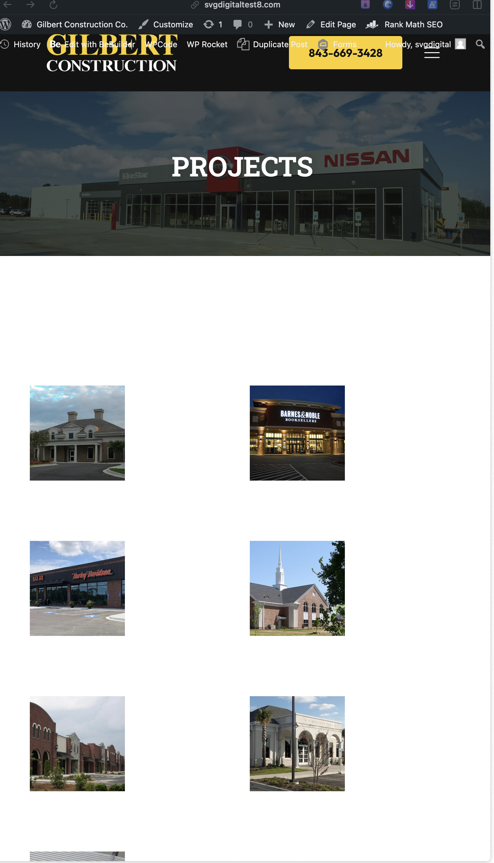
I have a Projects page to display the Portfolio category. I have setup a Section Loop and I want to display the portfolio items in 4 columns on desktop and laptop, 2 columns on tablet, and 1 on mobile. Right now I have the Container Item Width set to 25% on on desktop and laptop, 50% columns on tablet, and 100% on mobile. I also have the Item Min Height set to 280px for all views.
It looks good on desktop laptop, and mobile views but the tablet view shows the items much smaller than I'd like. How can I adjust the item sizing in the tablet view?
Comments
Please send us the WordPress dashboard access privately through the contact form, which is on the right side at [Links visible only for registered users] and we will check what might be the reason.
Notice!
Please attach a link to this forum discussion.
Sending incorrect or incomplete data will result in a longer response time.
Therefore, please ensure that the data you send are complete and correct.
Thanks