
Custom Mobile Menu

Hello -
Having trouble with formatting the mobile menu within a custom menu. Do you have a tutorial on this? I found one mobile menu video, but it's not helpful with the custom menu. If you don't have a video tutorial on this, I will just walk through this one question at a time.
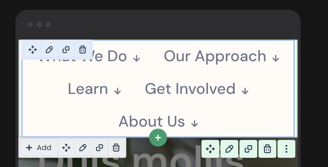
- My first problem I am trying to solve is that I am unable to get my items to break, they are running together as you can see here.
Question: How do I get each menu item to display one underneath each other?
Comments
Is this what I am looking for? I basically want a full screen menu on mobile only. How do I achieve?
Hi,
If you want to have full-width Sidebar menu only on mobile, then you must edit this template, open its settings, switch to mobile view, and set the Width to 100%:
https://support.muffingroup.com/video-tutorials/sidebar-menu-vertical-header-builder/
Best regards
So this is the approach for building mobile navigation for my custom navigation?
Sorry, but I quite do not understand.
The process of creating a custom Sidebar menu is explained in the video I attached in my previous message.
I will re-send it:
https://support.muffingroup.com/video-tutorials/sidebar-menu-vertical-header-builder/
Best regards
I have a custom navigation template. This tutorial seems like it's for a side bar menu?
Side bar menu is not the same as a full screen mobile navigation. Did you look at the image I attached? Whats' confusing?
Are you guys not into your job?
I am not using your very limited menu builder, I created my navigation as a template. Now I want to create the mobile version... see attached. By default it doesn't align the menu items vertical, like the image, they displaying on the same line and wrapping.
The last word I would use to describe BeBuilder is 'limited.'
The video tutorial is for the Sidebar Menu, which can be set to 100% of the screen's width by following both video tutorials mentioned in this topic.
Did you have a chance to watch these tutorials and follow the steps provided?
Maybe because of the language barrier, I do not fully understand your goal. In such a case, please attach some examples of what you need and explain it as much as possible.
Best regards
I am not saying BeBuilder is limited, your out of the box navigation/menu workflow is. I have a few special things about the navigation that the menu builder cannot do.
I have messaged support with login credentials, I am just trying to create a mobile navigation for the mobile responsive views. Not sure what language barrier you speak of. I sent over screen shots, asking simple, how do I style the Mobile navigation with a hamburger menu with the template navigation without using the built in navigation tool that gets turned off when using template navigation. I am not sure how to ask this any differently.
I have not received any private messages from you yet.
Did you attach a link to this forum discussion?
Best regards