
Issue with width elementor container

Hi,
I think after an update or something, I don't know when this started happening, but the elementor containers on all the pages from magazine in the store have become smaller in width. I've tried all sorts of options, but I can't make it wider on mobile. If I stretch, on Android the text sticks out too much, etc.
When the page loads, it looks good for 1 second, but then it gets smaller in width
It used to work properly, but recently I noticed this problem
Some help, please!
I am now experimenting with tests on this page, but without success.
[Links visible only for registered users]
Thank you
Comments
Hi,
Please go to Betheme -> Theme options -> Addons & Plugins, and switch the Container Content Width to the other option than you currently have:
Best regards
I changed it but it's still the same.
Where do you have this part from the screenshot?
I could not find and compare it to the link you sent.
Thanks
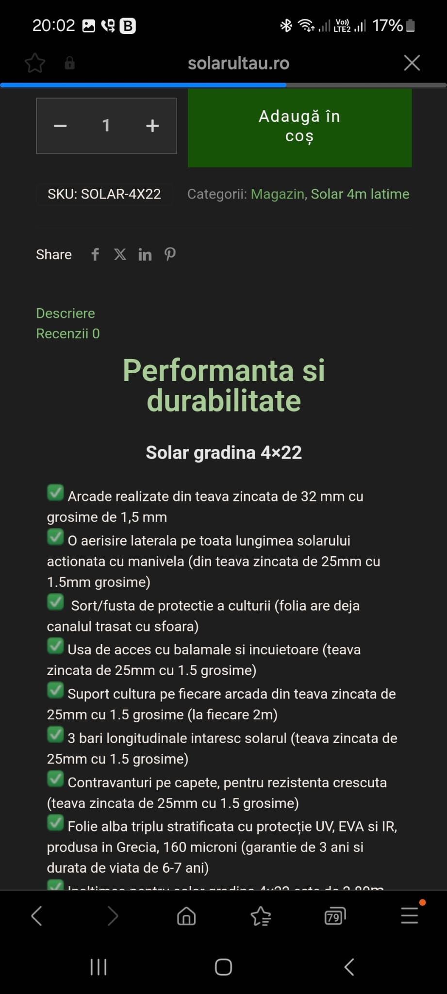
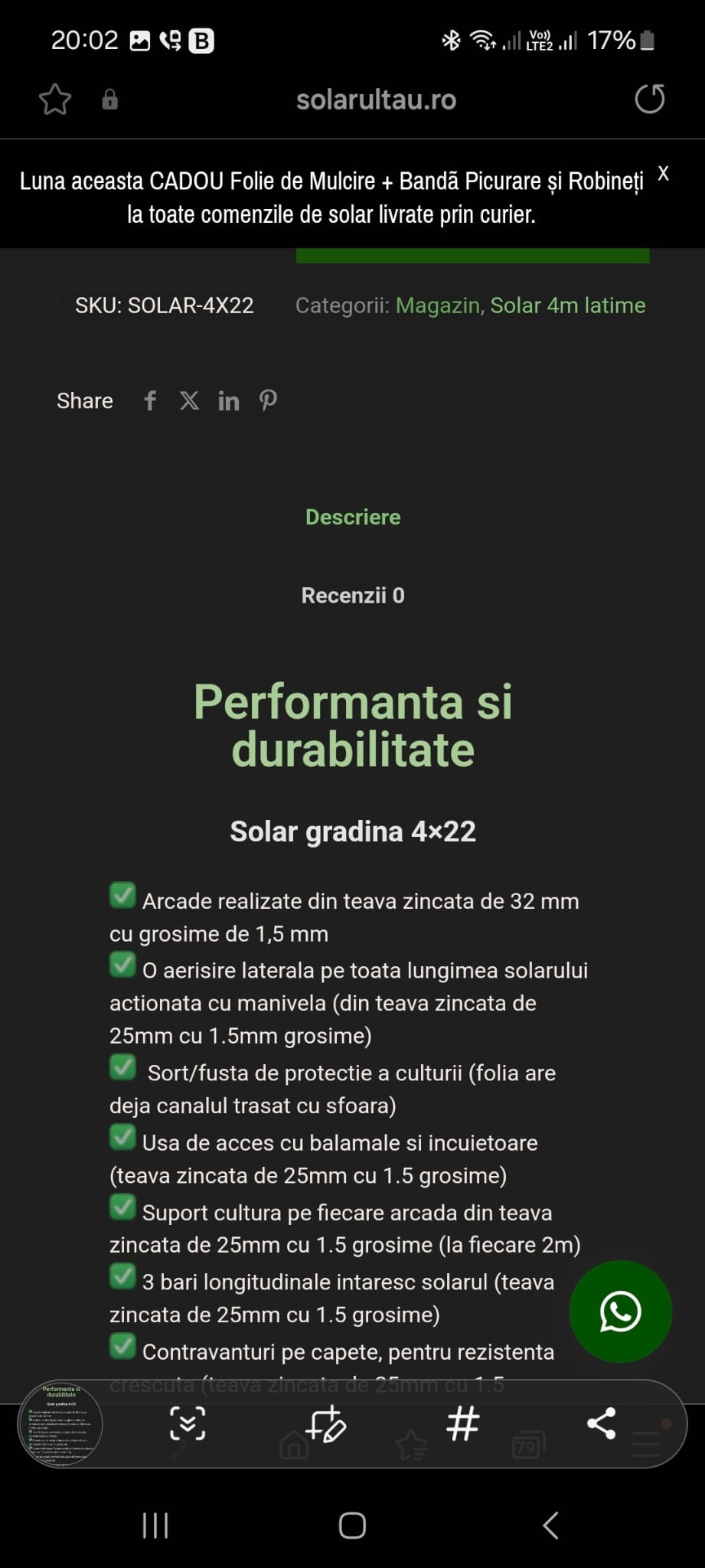
It's from the same page, but I've been working on it since yesterday. I'll leave you 2 pictures from the same page. Maybe it's because of that frame on the container or I don't know why the width is smaller.
[Links visible only for registered users]
It's possible that the pictures I'm sending don't make sense because the page still doesn't load properly. I just want to point out that the product pages made with Elementor are narrower and they weren't like that.
Thank you
Please also try the Flexbox Container settings in Betheme -> Theme options -> Responsive -> General:
Best regards
I set the Flexbox Container settings, and everything related to elementor looks good,
but what is related to the theme does not look corectly, for example in the top where the photos, variables, price are...
I have a page with a calculator and is made with bebuilder and it is affected if I use the settings from Flexbox Container
Thank you
Try the following CSS code:
.single-product #tab-description{
 padding: 10px 0;
}
Put it in Betheme -> Theme options -> Custom CSS & JS -> CSS.
Best regards
Much better now. Thank you