
Adjusting "Add to Cart" Button Position in BeBuilder

Hi,
I need help adjusting the "Add to Cart" button placement in my BeBuilder single product template.
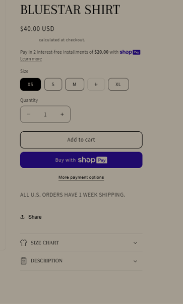
Currently, the button is displayed as you can see in the 1st screenshot, but I want it to appear below the quantity selector replicating the design displayed in the attached 2nd reference screenshot. Since the button is part of the Product Cart Button Element, I’m unable to move it manually in BeBuilder.
Additionally, the product title and price alignment doesn’t look quite right. I’d like them to be neatly structured and visually balanced, as shown in the 2nd reference image.
Could you guide me on how to fix these issues? Would this require custom CSS or adjustments within BeBuilder?
Thanks!

Comments
Hi,
Please always attach a link to your website so we can check it out. If the page is offline(localhost), then our help will be limited. You will have to contact us when the page is online. Also, please make sure that the page is not under maintenance before you provide us with the link.
Thanks
Of course, I have sent the required WordPress and FTP access details through this link: [Links visible only for registered users].
Please let me know if you need anything else.
Thanks!
Kind regards
1) You set up a custom width for the add to cart button, and set up inner wrap positioning to center:
Change the inner wrap positioning to left or default instead.
2) You set a custom height for the product title element:
When you change it to default it looks better in my opinion:
I do not recommend setting each element or wrap on your website to custom dimensions. It should be rather used when you are sure what you are doing, and default sizes like 1/2, 1/3, 3/5, etc., are good enough and generate fewer problems, especially for responsibility.
Best regards
Hi,
I've made the recommended adjustments to my Single Product Template in BeBuilder, following your instructions regarding the "Add to Cart" button placement and product title and price alignment.
I would appreciate any further suggestions, especially regarding the spacing between elements, to ensure everything looks structured and balanced.
Let me know if there's anything else I should refine.
Thanks for your help.
Appreciate it!
You can adjust the spacing between elements with margins in the Advanced tab of the element:
Best regards
Thank you so much.
Appreciate you!