
Mobile Product Tabs not responsive

Hi Guys,
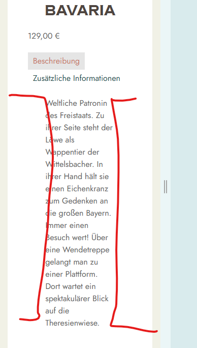
I´m improving my single product pages and instead of the regular product description, I now use the product tabs element. It is good on desktop, but on mobile the text is not adjusting, and I have no settings to control it. In the description tab, I´d like to decrease the spaces left and right, to have more space for the text:
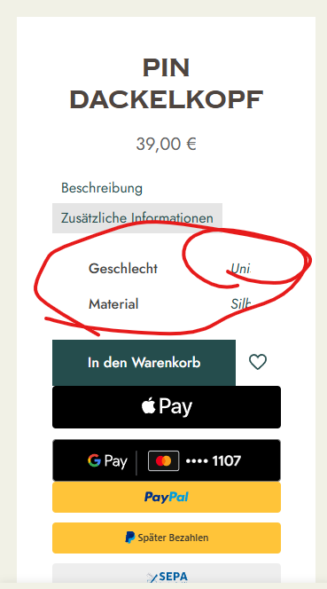
In the tab "Additional Information", it looks like this:
I´d like to centralize the tab titles, and then of course the full content should be visible. This is an example product page with the current settings: [Links visible only for registered users]
Also, could you help me to make these payment tabs better aligned. They look chaotic with random spacing instead of a clean look. They come from woocommerce.
Thank you!
Comments
Hi,
1) Please put the following CSS code into Betheme -> Theme options -> Custom CSS & JS -> CSS, and check if the problem persists:
.single-product .mfn-woocommerce-tabs-nav-top .section_wrapper{
 padding: 0;
}
2) The payments tabs come from the plugin, and it would be best if you contact their support regarding this.
Best regards
1) Go to Betheme -> Theme options -> Shop -> Single product, and enable cart button extra options:
2) Try this CSS code:
.single-product .mfn-product-add-to-cart .cart{
 margin-bottom: 15px!important;
}
3) I have passed it on to the dev team, and we will take a look at this problem.
Best regards
3) Did you change anything on your website?
When I tested it now, tapping on the search field does not close the sidebar.
Best regards
no, didn´t change anything. Just tried it and it still closes the sidebar. Do you need me to record my screen? please note, when I test this on my computer in responsive mode, it works. But on my phone, the keyboard screen opens when trying to input text, maybe that interferes with the sidebar? Please try on your phone aswell.
Thanks for the other code. Don´t you think it would look much nicer if the quantity field would also go fullscreen? Could you help me to achieve that? Otherwise, it still looks kinda weird:
I was trying that on iPhone 12 not on the desktop and it worked properly. I will try with another device as well, and I will let you know.
You can use the following CSS code:
.woocommerce .column_product_cart_button .cart .quantity{
 width: 100%!important;
}
Best regards