
Combining sticky menu and sticky wrapper

If i enable sticky menu, sticky wrapper does not work.
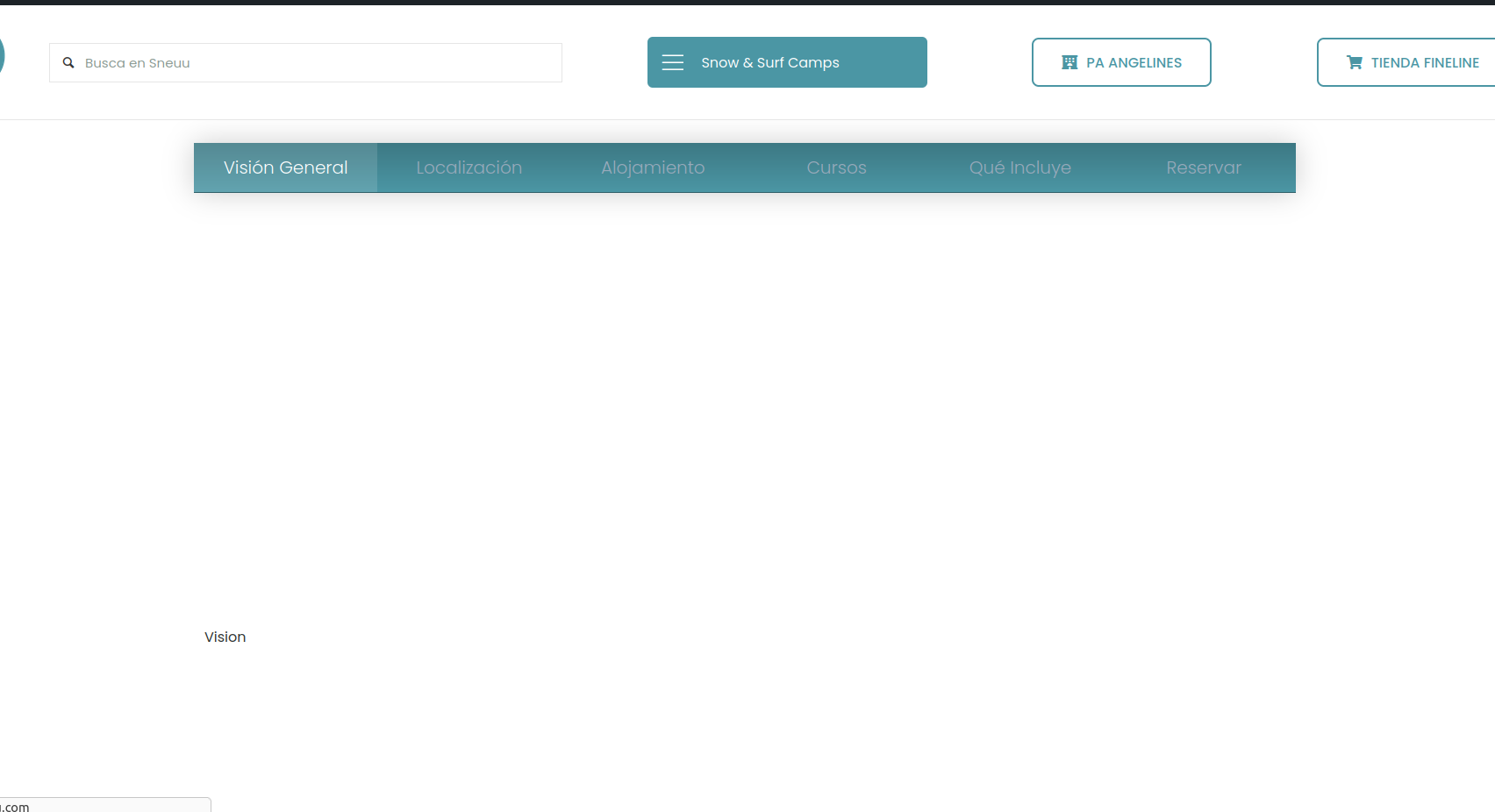
With sticky menu:

Without


Is this solvable?
If i enable sticky menu, sticky wrapper does not work.
With sticky menu:
Without
Is this solvable?
Comments
Hi,
Please try to add some offset to that sticky wrap e.g. 140px.
Best regards
is this a magic number or what? i had tried with 200 px and dint work! but 140 is nailed
not working on mobile thoug
try this in tablet or mobile:
sticky doesnt work, but in PC / laptop works fine
I assumed that it is the height of your header, more or less, and without this value, the wrap could be hidden behind it.
Also, if the value is too big, and there is not enough space for the sticky wrap to slide, it could be the reason why 200 did not work for you.
For mobile you must also have that value set. Also sticky wraps works only if there is another bigger wrap on the side, so they have space where they can move down and up.
Best regards
dont know how to make it work in mobile devices
is there a demo where i can see how its made mobile sticky wrap?
We do not have any demo with sticky wrap on mobile devices, as there is not enough space for that.
The smallest width you can encounter it on pre-built websites is tablet, for example, here:
https://themes.muffingroup.com/be/book2/
Best regards
ah, so then is not sticky wrap on mobile what i need, what i need is that when scrolled the wrap fixes itself on top.
i think ive solved, inserting a section in the header sticky, with conditional logic, only show on shop.
[Links visible only for registered users]
and [Links visible only for registered users]
Then in the single product template, ive put the ids into the sections.
If this is what you wanted to achieve I am glad that you handled it.
Best regards
thanks for your support.