
Hidden menu in smartphone cisualization

I donìt know why my main menu is not visible in smartphone visualization also it's activate in responsive mode also form mobile.
If I wanted to insert a larger logo and arrange the wishlist, cart, and account icons vertically, how could I do it? If I leave them vertical and enlarge the logo, they overlap.
One last question: if instead I wanted to place the logo in the header in place of the 'Questions and Answers' and 'Contact Us' text, would I need to create a dedicated header just for smartphone display?
Comments
Hi,
Please always attach a link to your website so we can check it out. If the page is offline(localhost), then our help will be limited. You will have to contact us when the page is online. Also, please make sure that the page is not under maintenance before you provide us with the link.
Thanks
Hello,
the page https://altriastri.com is on line ... check please
Thnx.
1) The desktop menu is not visible either:
If you do not remember adding "display:none" to your menu, I will need dashboard access to your website to check where it is set.
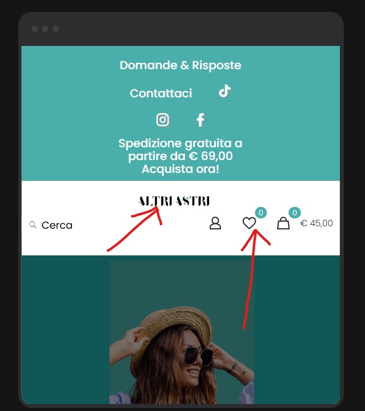
2) You must edit the wrap that contains these icons, switch Wrap elements to Wrap, and change the width to be more or less equal to the element width:
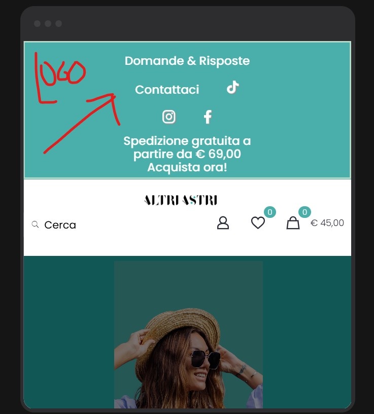
The logo should be in a separate wrap, and then enlarge it with the Width value:
3) You can add your logo there and, with responsive visibility options hide it on other devices:
Best regards
I have a lot of problem with header top, practically in desktop view it's OK for me but there are a lot of problem if I see the home page with different smartphone size, If I use betheme build I set the logo on center of page by notebook and it seem OK but If I check it from smartphone it's a disaster!
Desktop
Iphone 13 PRO
Samsung Galaxy S21 Ultra
I tried various settings for the smartphone version but I can't set a setting that works well with all smartphones.
I also didn't understand if a possible change to the header in the smartphone setting also changes the desktop mode.
What can I do I'm going crazy.
in the desktop version it's fine as it looks now, in the smartphone version instead I would like the logo to be in the center, that the search field could be seen well on the left and the icons also vertically on the right and also I would like the topheader above in the smartphone version to only show me the words free shipping from €69 and not also the social icons and the questions and contact us buttons.
Thank you.
In this situation:
You can edit icon elements and reduce margins on the sides.
The logo can be put into a separate section, and it should look better.
Regarding having a completely different header on mobile, the following video tutorial will be helpful:
https://support.muffingroup.com/video-tutorials/building-mobile-headers/
Then, you can only show particular things from the mobile view.
If something remains unclear, please let me know.
Best regards
Please can you give me answer also for point 1) regarding the problem to see menu in mobile visualization?
Thank you.
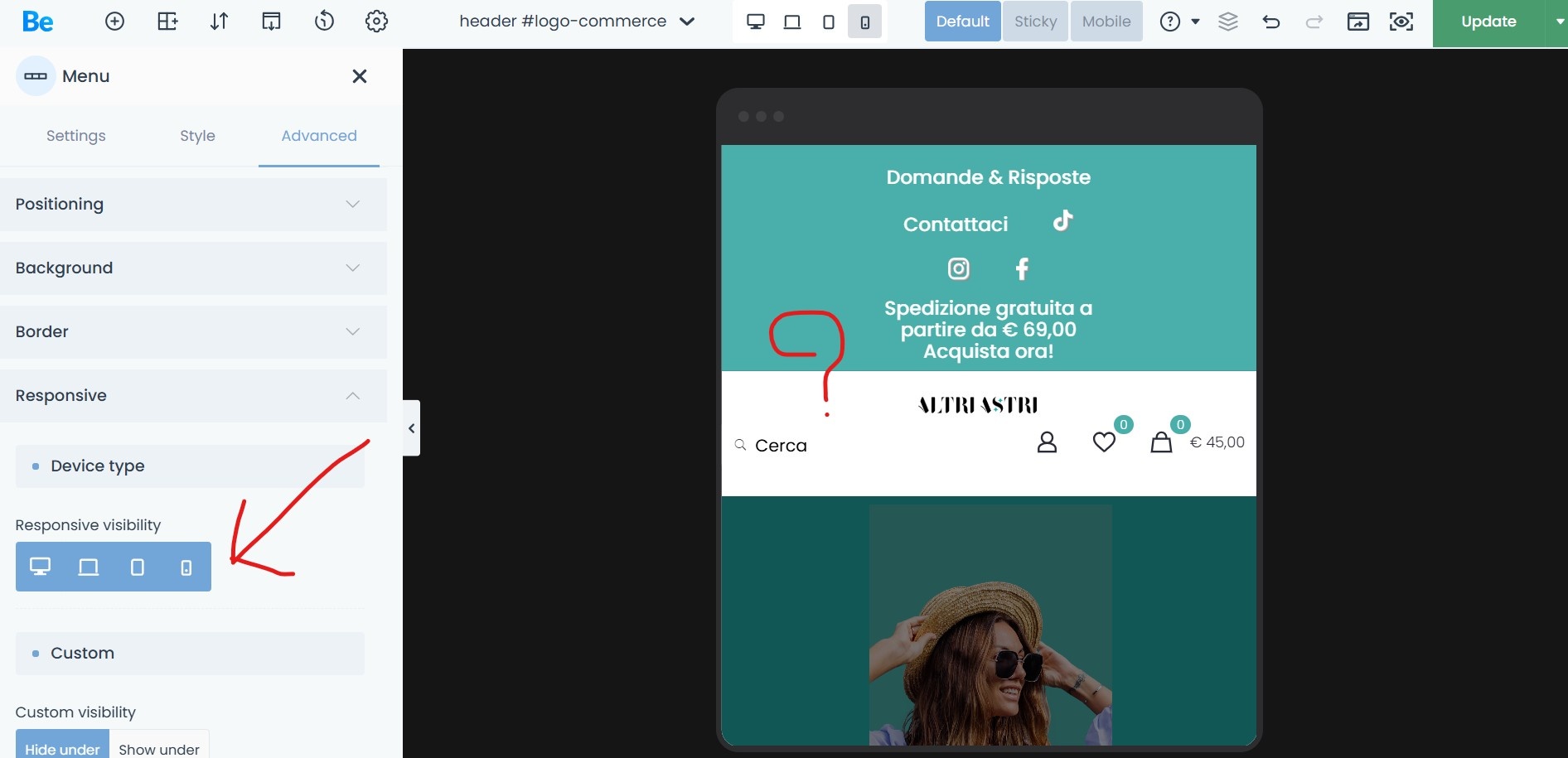
The entire section with menu is hidden for mobile view.
https://support.muffingroup.com/video-tutorials/responsive-editing-in-bebuilder/
It is the Responsive Visibility option.
Best regards