
Mobile Layout Adjustment for Image Gallery Block

Hello Support Team 👋
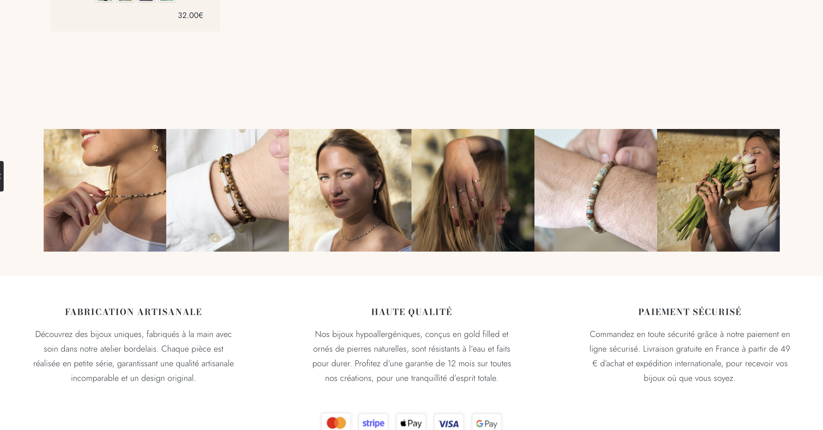
I’m using the “Image Gallery” block with 6 images. The horizontal layout on desktop works perfectly, but on mobile, the images are stacked vertically.
In some cases this mobile behavior makes sense, but for this specific section, I’d like to keep the images aligned horizontally on smaller screens as well — even if that means they appear smaller.
Is there a way to override the default mobile layout and force a horizontal alignment for this block?
Thanks a lot for your help!
Best regards,
Romain
Comments
Hi,
It can be done with a custom CSS code.
If you send a link to your website, I can help you prepare it.
Best regards
Hi, thank you for your answer,
I have image gallery on product page ex: [Links visible only for registered users]
Also, when I select a product variation on mobile, the main image doesn't change like on desktop mode. How can I change that ?
Thank you for your help :)
1) Try the following CSS code:
@media only screen and (max-width:767px){
 .single-product .gallery .gallery-item{
   width: 16%!important;
 }
}
Put it in Betheme -> Theme options -> Custom CSS & JS -> CSS.
2) Please, turn off all of the plugins, refresh your cache, and check if the problem persists.
Moreover, if you use a child theme, switch to the parent, and recheck it.
Thanks
Thank you for your answer.
I also use the image gallery on regular page like : [Links visible only for registered users] (it appears on other pages)
Regarding my second question, do you have any solution ? (when I select a product variation on mobile, the main image doesn't change like on desktop mode.)
1) If you want it on the entire website, remove the class
.single-productfrom the CSS code I sent.2) Please do as I mentioned in my previous message in the second point.
Thanks
Hello, thank you for your answer.
After spending hours, turning off all of the plugins, refresh the cache, the problem persists. I tried many different options, I noticed that the problem is the same on your demo theme : https://themes.muffingroup.com/betheme-store/product/besmartwatch2/
Is it possible that this problem comes from Betheme theme ? Is there any chance I can fix this quickly ?
Thanks
Please send us the WordPress dashboard and FTP access privately through the contact form, which is on the right side at [Links visible only for registered users] and we will check what might be the reason.
Notice!
Please attach a link to this forum discussion.
Sending incorrect or incomplete data will result in a longer response time.
Therefore, please ensure that the data you send are complete and correct.
Thanks
Hello,
I just send my Wordpress dashboard access.
Thank you
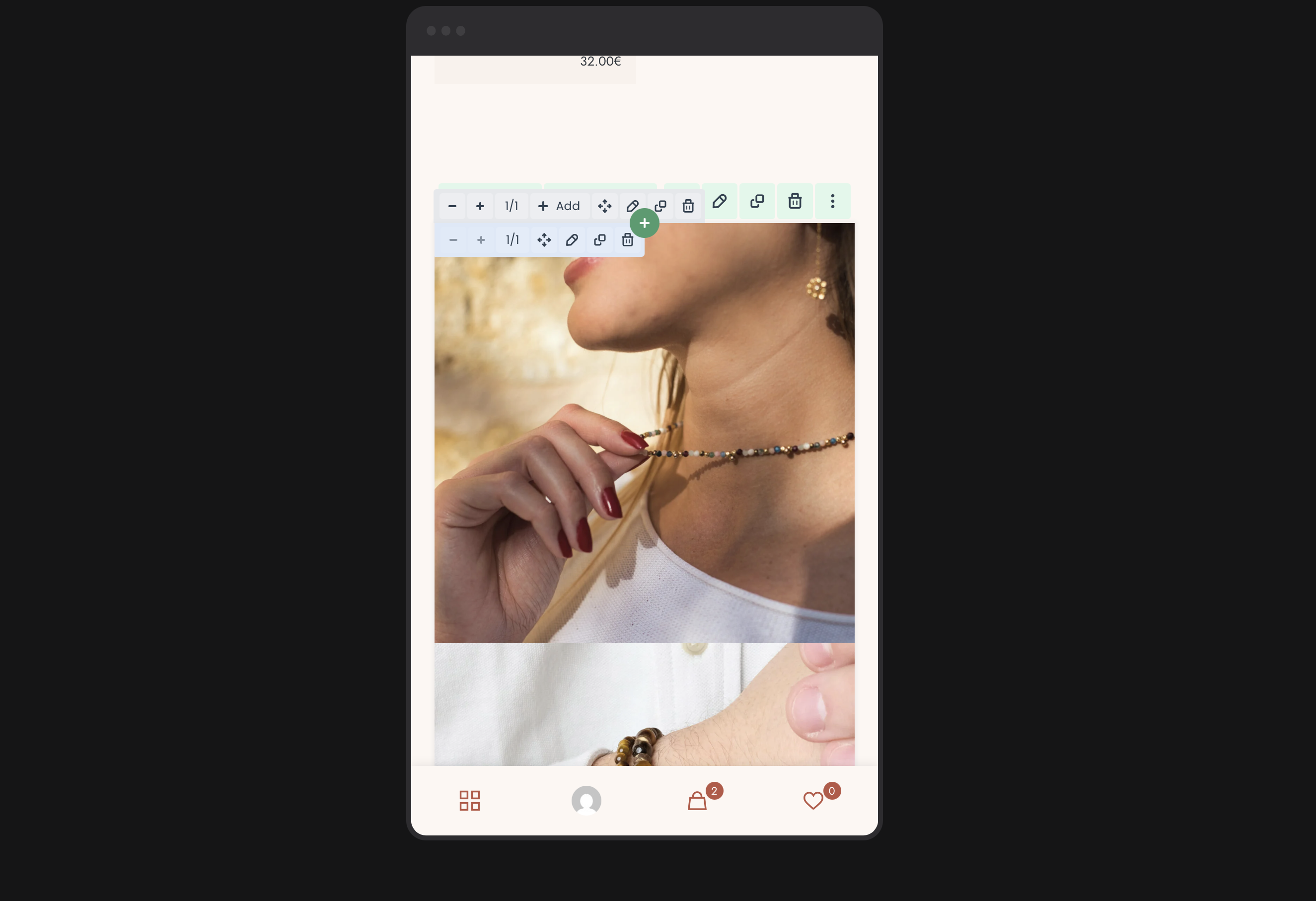
That is because you have doubled the Product image element. One is visible on desktop, laptop, and tablet, and the second is visible on mobile only.
However, as it is still present in the website source, only the first (desktop one) changes featured image. See the following screenshot:
I enabled the hidden part on mobile to present that it works properly for the Product Image at the top. This is a limitation caused by the WooCommerce functions that are responsible for variations and there is nothing we can do about it.
To summarize, variations can work properly only if there is only one Product Images element in the product template.
I reverted my changes to leave your website as I encountered it.
Best regards
Hello Phil !
Great ! Thank you so much for your help 🙏
Have a great day