
Homepage Sections – Horizontal Scrollable User Content

Hi,
I'm currently working on populating my homepage and would appreciate your help with a specific section.
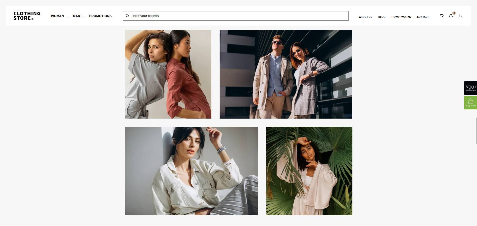
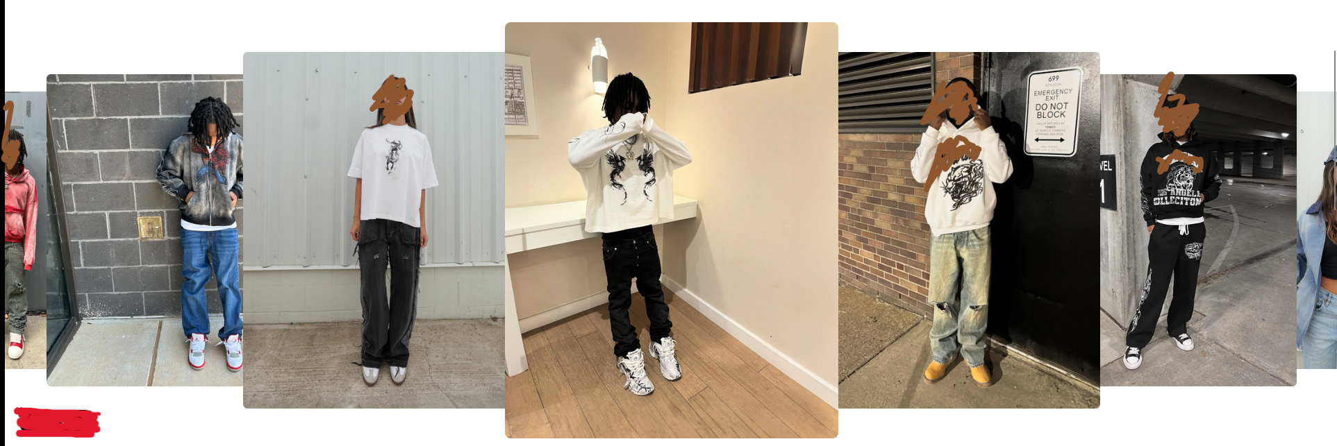
While browsing the pre-built BeTheme websites, I found a layout (screenshot 1), which I believe is designed for user-generated content. I’d like to recreate a similar layout but displayed horizontally side-by-side with scroll functionality, as shown in screenshot 2, but I'm not sure which element I have to use for this purpose.
Screen 1:
Screen 2:
Thank you so much!
Kind regards
Comments
Hi,
There is no element or construction in Betheme with a feature you show in the second screenshot.
If you look for more fancy sliders, you can check the following video tutorials showing what can be done instead:
https://support.muffingroup.com/video-tutorials/card-animation-for-loop-slider/
https://support.muffingroup.com/video-tutorials/fancy-hotspot-slider/
Best regards
I see what you're saying.
I'm checking the videos you've showed me
Appreciate you!
Kind regards
I have set a query loop section but I'm not sure which query and post type to choose from in order to achieve something similar.
The main goal is to set looped images with manual scroll that's all.
Thank you!
Kind regards
Please check the following playlist.
It explains how to use Query Loops more widely:
[Links visible only for registered users]
Best regards
Sure, appreciate it.
Hi,
1) When editing the QL section, I couldn't find the style tab (for center mode) highlighted in one of the playlist's video tutorials you've sent me. Is there a new way to achieve this with the new updated version of Betheme?
2)Also I've been wondering what's the correct way to add padding in the builder, is it through the element itself (advanced settings) or through its wrap settings?
Appreciate your guidance
Kind regards
1) You created a query loop in a wrap when you are trying to edit the section:
To have access to the style tab, edit the Query Loop wrap.
2) It depends on what you need to achieve. If you explain that in more detail, or even better, attach an example showing that, I can provide more details.
Best regards
1) Understood, I fixed it! Thank you.
Regarding the Hotspots is there any way to place each one in a different position for each image?
2)It's all good. For example these two screens represent spacing settings in two different locations: the section containing the shop element, and the shop element’s own settings. What I would like to know is: which one is the correct place to adjust the spacing? Or does each one serve a different purpose?
Appreciate you
Kind regards
1) No, there is no option to set a different position in a Query Loop per image.
2) Each serve for different purpsoe. As I mentioned in my previous message it all depends on what you need to achieve. Some layouts needs padding to be assigned to the element and some to the wrap.
Best regards
1) If I’d like to highlight a worn product in the picture using a Hotspot, should I just make sure it’s placed in the middle?
2) I see what you're saying, and I can relate. If possible, could you please provide an example of this case? The most important thing for me is to ensure responsiveness while adjusting spacing in Betheme and avoid overlapped elements.
Appreciate you!
3) I would like to set up a featured products section like the one shown in the following screen. Which elements do I need to use for this?
Thank you for your instructions.
Kind regards
1) I believe that will be the best solution for that.
2) I will try to explain that with the colors.
Here you can wrap with an orange background and a column text element with a green background:
Wrap has padding set to 80px, and the column text element padding is set to 40px.
After the column text element, I added an image element with no padding or margin so it is moved from the sides of the wrap 80px:
I hope that clarifies it.
3) It is a shop element.
Best regards
1) Alright no worries.
2) That means spacing inside a layout depends not only on an element’s own padding or margin, but also on the padding of the wrap. In your example, since the image element has no padding or margin, it is automatically pushed 80px from the sides due to the 80px padding applied to its wrap.Right?
For example, I set the top margin of this element to -15px rather than setting it in it's own wrap element. Is this correct?
Also, what I want to know is: does the "inherited styles" feature ensure everything stays responsive without needing to worry too much about manually set spacing values? Let me know if that's its intended purpose.
3)Okay, do I just need to set a fancy heading for it? Essentially, I just have to tweak this element for different purposes, like Featured Products, Product Grid, New Arrivals, Sold-Out Products (using badges), Top Selling, and so on?
Thank you so much.
Kind regards
2) Setting a negative margin is useful when you want to overlap content. We have a video about it:
https://support.muffingroup.com/video-tutorials/how-to-overlap-elements-in-the-bebuilder/
If you want to reduce the space between the price and text below it, it is better to reduce the bottom margin of the price.
I also suggest checking the following link:
[Links visible only for registered users]
Inherited styles have been described in this video:
https://support.muffingroup.com/video-tutorials/boost-your-bebuilder-workflow-inherited-styles-placeholders-explained/
3) You can add the heading element right before the shop element.
Some of the options you mentioned are available in this element.
Rest are either not available or controlled directly through Woo settings.
Best regards
2) When I set either a negative or a positive value within the bottom margin of the price nothing changes.
I've already watched the inherited styles tutorial and which I found very useful for sure.
Thank you for the link, appreciate it.
3)Yes indeed I've set the heading, I understand now. By the way, I’ve set a bottom margin of 1px to reduce the space between the product image and the title. Also, for example, I would like to align both the product title and price to the left. I’m not sure if this should be done through the Title and Price style options by adjusting spacing values specifically. Could you please clarify the correct way to achieve this alignment in this case?
4) I’d like to set a high-resolution full-width banner image similar to the one shown in the screenshot covering all the available space, with a “Shop all” shortcut positioned in the same location.
Here's a reference screenshot:
Thanks for you guidance.
Kind regards
3) Ive managed to align the titles on the left, the only thing left is the price.
Thank you
2) I can see that the price already have no bottom margin:
If you want to move the text below closer to the price, you should modify the line-height for the price/the text/or for both.
3) There is an issue related to the alignment and the Products List
We will fix that, but for now, please use the following CSS code:
.products_wrapper .mfn-equal-heights .desc{
 align-items: start!important;
}
4) You can put this image as a section background and add this text as a heading with a link
Best regards
Hi,
2) I've tried to edit the the line height of each one of the Title, price, I just want to push those two elements up close to the title. Check this out:
3) I understand, I've used the css rule but it's only affecting the homepage featured products, related ones on the product pages are still unchanged.
4) I have set a test background image onto the section as you've mentioned but nothing appears on the front end : I'm I on the right track?
Thank you
Kind regards
2) You have line-height equal to 100px to the title:
Reduce it.
3) Related products is a separate element in the single product template:
4) On what page did you add it?
From the screenshot I see that this section does not have any content inside of it. If you do not add anything there, the section will have 0 height on the front.
Put the heading element there as I mentioned in my previous message.
Best regards
2) Absolutely, that makes sense. Thanks for letting me know
3) Understood. I got it.
4)It's added to the homepage.
I understand, and I followed your instructions by setting the image as the background of the section. However, I'm not sure if it should be the section's background image or if I need to use an image element inside the section instead.
It looks cropped:
Your help is appreciated.
Kind regards
There is small space to display this image.
If you add some padding to this section, the display will be better:
If this is not what you needed, please explain that in more detail.
Thanks
I would like to display the picture in full width and height, and position the title element in the top-left corner of the image. I’ve tried adding padding, but I’m not sure how much bottom padding I need to apply to make it fully stretch.
Thank you!
Kind regards
In the Section settings under Dimensions -> Height, please set the Full screen option:
Also, in the Positioning settings, set the Section content position to top:
Best regards
Hi,
Thank you. I’ve seen some other stores where the hero image looks like it's added as a regular full-width image, not as a background.
Is there a way to replicate that exact same result using a full screen image element instead of a section background, while still allowing me to overlay the “Shop All” text/button the same way?
I'd like to achieve that for SEO and responsiveness reasons.
Please let me know what you recommend!
Kind regards
You can use the Banner Box element.
With that you must set the section that contains it to Full width:
Set banner margins to zero:
Set the image and empty fields you do not need:
And position the text where you need it:
Best regards
Done, appreciate you.
I'd like to ask about the resolution of the image used in the previous steps you mentioned. Could it be the reason why my image isn't spanning across the full width? If so, could you please tell me the maximum resolution I should generally use to upload accurate picture dimensions in this case?
Thanks
Kind regards
The image should be at least 1920px wide to meet most screen standards.
Note that some people might have ultra-wide screens that can reach 2560px in width.
Best regards
1) So in order to make it responsive, I have to stick with 2560px right?
I have tried uploading an image with 3506x2329px in dimensions but it's not spanning across like the one you showed in your previous instructions.
2) I've added my page link inside the "Link" field in the settings, but right now the link applies to the entire image. I want the “Shop All” button/text within the slider to act as the clickable link.
Thank you so much!
Kind regards
1) I checked your website, and the image you uploaded does not have the dimensions you mentioned:
Are you sure that you uploaded the correct image?
2) In that case, a different construction should be applied.
Use image element just like Banner box with no margins and in the Full width section, and use Heading element with absolute position that overlays the image.
Best regards
Hi,
1)I see what you're saying. The image is 3506 x 2329 px, but when I upload it, it's automatically set to 1200 x 797 px by default. The same thing happens with any other image file.
2) That's great. Appreciate it.
I’ve set the image to full size with the stretch option enabled. However, the heading isn’t displaying on the front end, even though everything looks correct in the builder. I’ve tried clearing the site cache, but it's still not appearing.
Thanks for your help!
Kind regards
1) Do you not have any plugin for images that could change their sizes during an upload?
2) Please try to set the z-index for the image and heading elements.
https://support.muffingroup.com/video-tutorials/how-to-overlap-elements-in-the-bebuilder/
Best regards