
Image alignment issues in the new products section

I have alignement problem, If I see the home page https://altriastri.com with smartphone I have the column of new arrival shited on left like in pic... and not centred.
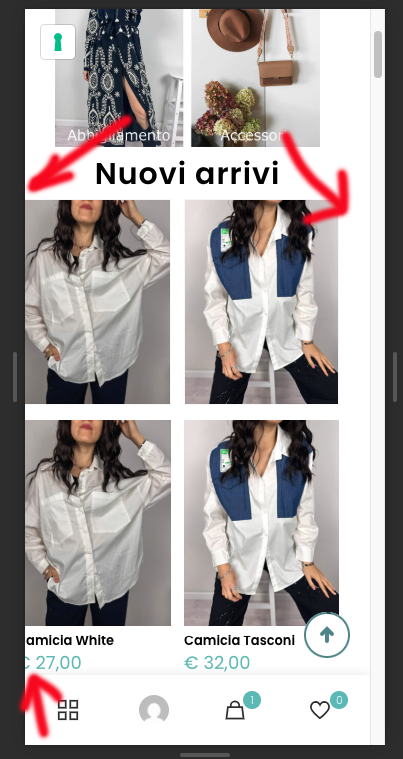
It seem correct in desktop visualization.

How can I make sure that the images are always centered when switching between desktop and smartphone views?
I can send you admin login if you need.
Thnk you.
Comments
I don't understand why all the containers of home page are shifted on left in smartphone visualization.
thank you.
Hi,
1) You have a negative margin assigned to this part:
Please edit it and change the margin to zero.
2) You also have the following CSS code that causes the layout shift:
Best regards
Hi, I’ve solved the alignment issue.
However, I’d like to ask you how I can change the menu animations/colors.
Right now, the active section is underlined, but I’d prefer it not to be underlined — instead, I’d like it to change color from #000000 to #72c0bd (see photo).
I’d also like to ask how I can change the font and have the text appear in lowercase letters.
Can I do this from the Theme Options?
Please edit your header template, click on the menu element, and under Style -> Animation tab set the color:
Best regards
Thnx.
And what about how I can change the font and have the text appear in lowercase letters.
Reveal the Menu tab in the Style and adjust the typography:
Best regards