
Margin / Padding right on "Related Posts"

Hi There,
I am working on this page [Links visible only for registered users] and have a problem with the "Related Posts" in the Blog Posts (like here [Links visible only for registered users]).
On mobile the margin / padding right is missing. The content has a margin, but not the related posts. See my screenshots from iPhone 15 Pro Max.
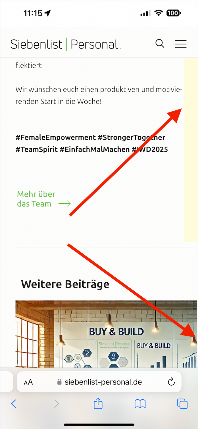

Could you please have a look at it and help me fix this?
Many thanks and
best regards,
Daniel
Comments
Hi,
I do not see that margin/padding at all at the moment:
Did you remove it?
Best regards
Hi Phil,
You have to check it on an real Smartphone – on a narrow monitor screen it looks fine (just like in your screenshot). But on a real phone or a emulating browser like Blisk you will see the error.
And to your question – no, the padding in the "Responsive" menu of the Theme Options is still active:
Best regards,
Daniel
Thanks for the clarification.
The last related post contains long words, and the font is big, causing the whole post area to expand, and causing this problem.
I believe it is due mainly to the word "Personalentscheidungen" as it is very long.
You can either decrease the H4 font size in Theme options -> Fonts -> Size & Style, or use the following CSS code to break the words:
.section-related-adjustment .post .desc h4{
 word-break: break-word!important;
}
Put it in Betheme -> Theme options -> Custom CSS & JS -> CSS.
Best regards
Perfect, Phil!
That did the job – mission accomplished 🚀
Thanx - Daniel