
Icons alignment on the right position in smartphone view in different devices.

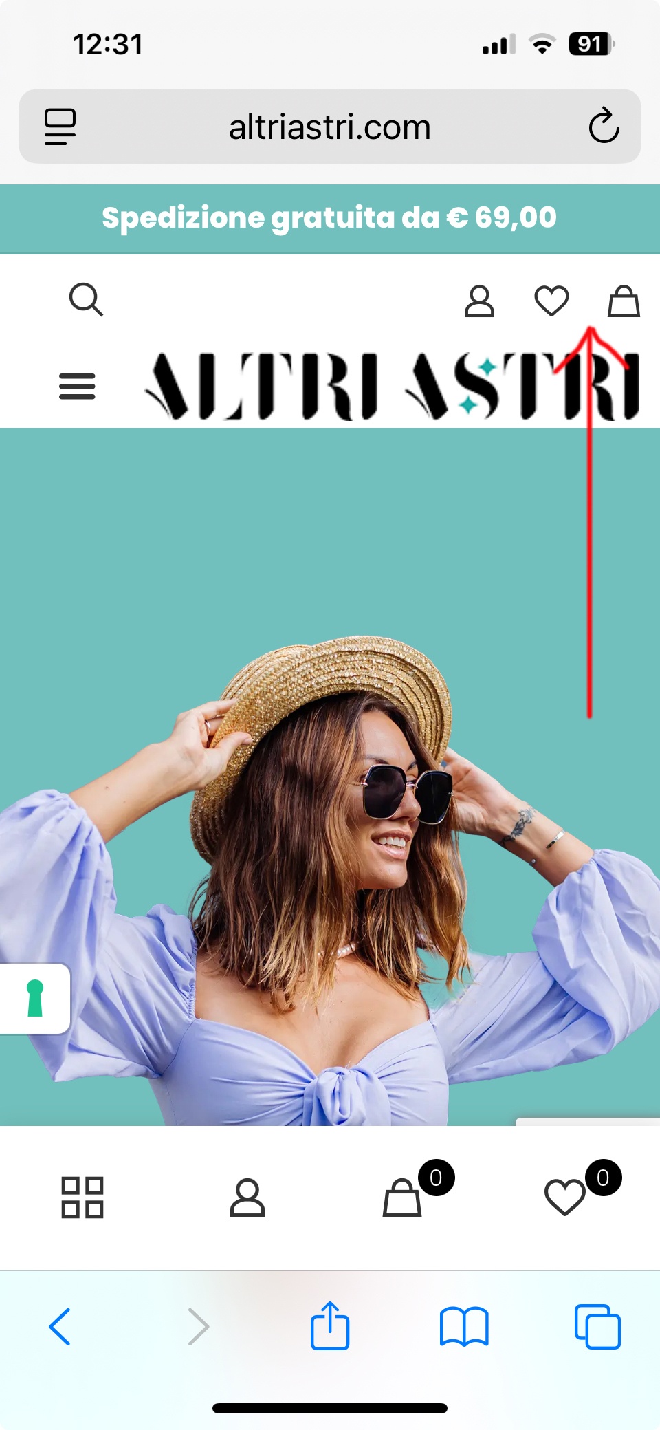
I’ve added some icons inside a container that is visible only in the responsive smartphone view. The icons are there, and when I view the site on a device like the iPhone 13 Pro (pic 1), they are correctly aligned to the right. However, if I view it on a device like the Samsung S21 Ultra (pic 2), they appear shifted toward the center.
How can I ensure the icons stay aligned to the right regardless of which phone is being used?

Thnx
Comments
Hey,
Please send us the WordPress dashboard access privately through the contact form, which is on the right side at [Links visible only for registered users] and we will check what might be the reason.
Notice!
Please attach a link to this forum discussion.
Sending incorrect or incomplete data will result in a longer response time.
Therefore, please ensure that the data you send are complete and correct.
Thanks
Hi,
data access to backed sent from indicated link.
Thnx.
There are many things wrong with your header.
I did not want to touch what you created, so I created a copy of it to show you modifications I made and differences:
-Firstly, this section has left margin set:
It is unnecessary there.
-Secondly, you have one wrap with 30% width and one with 120px width. As for mobile display, 120px takes a lot of space, pushing the rest of the content.
I believe that you do not need the wrap with 30%, so it can be hidden on mobile:
-Moreover, I changed the only wrap left width to 100%:
Margin left to zero:
And horizontal align to the right:
With these adjustments, the view is better.
However, I can still see some things that could be improved, e.g., the search bar should be placed in a separate wrap than the icons on the right.
I highly suggest watching these two video tutorials:
https://support.muffingroup.com/video-tutorials/building-mobile-headers/
https://support.muffingroup.com/video-tutorials/flexbox-positioning-with-bebuilder/
Best regards
Thank you.... one simple question .... how I can activate your template in entire site like my header?
Edit your main template, and remove display conditions from it.
Then open the second template, and add the condition to assign to the entire site:
Best regards
Sorry but I have not the option to modify display condition I can't click on + entire site for my template to change options and I can't click n/a in your template to change condition .... Please explain.
Thank you.
You must click on the update button in the header template.
Best regards
Thank you,
I set your template but there are some visualization problem with different device, first image on iphone there is not search bar on left side and in second image in Samsung the search bar is cutted on left side.
Thank you.
That could be resolved by having two wraps in this section on mobile, and use positioning options.
Did you have a chance to watch the video tutorials I sent earlier?
Best regards
Yes I see it ... but is not so clear for me ... sorry ... can you help me in different mode?
Thank you.
Enable Mobile header in the header settings:
Start creating:
Add search to the left wrap and adjust its width to fit well on mobile view:
Add icons to the wrap on the right:
Set positioning options to the wrap on the right to align elements to the right side:
It might also be convenient to set 50% width for both wraps:
Best regards