
Toggle layout on mobile

Hi, we're using the "toggle" on our website. It seems to look like it should on a desktop, laptop, and tablet.
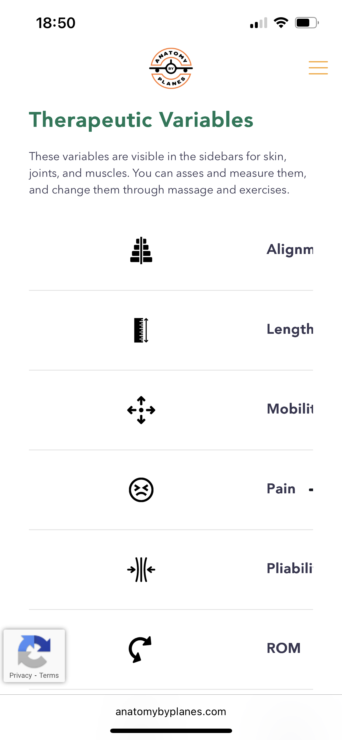
On a mobile, however, the layout gets jumbled up - see screenshot. The icons/images are supposed to line up left with the title just to the right of it, the plus sign ougth to be on the right.
So you know, the wrap that contains the toggle is set to center its content.
Is this a bug or something in our settings?
Thanks
Comments
PS, the layout is affected in Safari and DuckDuckGo.
Hi,
Please always attach a link to your website so we can check it out. If the page is offline(localhost), then our help will be limited. You will have to contact us when the page is online. Also, please make sure that the page is not under maintenance before you provide us with the link.
BTW did you adjust the display for the mobile view?
https://support.muffingroup.com/video-tutorials/responsive-editing-in-bebuilder/
Thanks
I think I solved the problem. After turning off/deleting the “smush” plugin, everything is fine.
thanks
I am glad that you found the culprit.
Please let me know if I can help with anything else.
Best regards