
Shop page and Product template

Hi,
I would like help with the following elements:
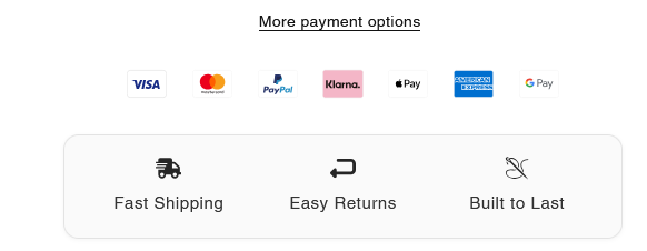
1) I want to set some spacing between the following icons, replicating the look displayed in the second screenshot
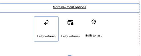
I have tried setting the wrap position of the icons to "Space between" but no space is applied.
2) The shop page is still not displaying sometimes when I try to access it until I proceed to make a change in the shop template. Could this be related to the external plugin from where those are imported ?
Thank you so much!
Kind regards
Comments
Hi,
1) You can add side margins to these elements.
2) If you suspect a particular plugin, you can give it a try to disable it, and check if the same thing happens when the plugin is disabled.
Best regards
1) Thank you!
2) Alright I will let you know
3) On tablet view things look distorted how can I correct those please?
4) When I try adding an icon through the builder none of the icons shows up until I upload one from my device, also you can see that the third icon look smaller than the others.
Kind regards
3) Adjust the display on tablet view in with the responsive settings:
https://support.muffingroup.com/video-tutorials/responsive-editing-in-bebuilder/
4) Can you explain that in more detail, please?
Thanks
3) Alright I will look into it right now, appreciate you!
4) When I try setting an icon from the following menu, nothing shows up when selected until I upload a custom one:
5) I would like to ask if there is a way to make the entire width of my website including:
to display in a full width layout similar to the look of the Thrasher website (please see the attached screenshots for reference). I would like it to span the full available screen width for a cleaner and more modern look.
Could you please guide me on how to achieve this using BeTheme’s settings, BeBuilder, or any recommended adjustments?
Thanks in advance
Best regards
4) If you have an image selected, it will overwrite the icon.
You must remove the image first:
5) Open options of sections, and in Advanced -> Dimensions, set the Full width option:
Best regards
4) Even when I remove the image and set an icon from the list nothing shows up!
6) When I click on the the product image to zoom in, and since the product is black I can barely see the product how can I make it visible ?
7) On mobile, how can I make my menu elements aligned to the top left like this?
8) I'm having difficulties placing those links aligned seamlessly within the footer, though I have corrected it on mobile.
9) Regarding the single product template, I want the "More payment options" text with the embedded link to send users to the checkout page of the same product they're currently viewing.
Since the template is used for all products, I need a way to make the link dynamic.
Could you please let me know how can I handle this, because currently when you click on the text link of a product it will take you to the checkout of another one!
Let me know if you need any more information or if something is unclear.
Thank you
Kind regards
4) Where do you have these icon boxes places so I could take a closer look at them?
6) You can change the background color in Betheme -> Theme options -> Shop -> Single product:
7) Edit your header template, open mobile view, edit Menu Burger element, and set the Vertical align.
8) In the section settings, you can use Space between option:
9) This would require writing a script to achieve such functionality, with which we do not provide help.
You should contact a programmer for this.
Best regards
4) I have deleted those, I have just tried adding them again to a vacant section and they're working properly. I will try make some adjustments and I will let you know if something went sideways.
6) Thank you, well done!
7) I have set the vertical align, but is there a way to make them stacked to the left side ? if not it's totally okay I just need to make the menu elements a bit bigger is it through Typography --> Size, under the style menu of the burger menu?
8) Done, that was helpful.
9) I see what you've explained, but is there anyway I can set custom product checkout links using the Advanced Cutom Fields plugin ? For example using the ACF to create a custom field (e.g., checkout link) and dynamically insert it as a link inside the template. Could this be a good workaround for this purpose?
I appreciate your guidance!
Thank you
Kind regards
7) You can move them to the left in the Style tab under the Menu subtab:
Also, if you want to change the font size, you can do it in the same place with the Typography settings.
9) I am not familiar with such a feature in ACF, but if you have an idea, you can try it out, as unfortunately I cannot think of any suitable solution for you to achieve that.
Best regards
7) I have already set the alignment of items to the left but the menu elements still look like this.
9) Alright I will see what I can do
Appreciate it
Kind regards
7) Please check it out now.
Best regards
It's still not set to the left side, here's a screenshot:
From what I can see, you refer to default sidebar menu but to customize sidebar menu as you like, you would need to create own Sidebar Menu using Sidebar Menu Builder. Otherwise, you need to use custom css to align menu items to left:
.mfn-header-menu > .mfn-menu-li > .mfn-menu-link { justify-content: flex-start !important; }Hi,
I understand what you said. The menu elements are now aligned to the left
Appreciate you!
You're welcome!
Hi there,
I’ve added a new product manually in WooCommerce, but the BeTheme Single Product Template isn’t applying to it. The product page is missing key elements like the price, add to cart button, and the overall layout.
Products added via a third-party plugin are automatically adjusted to the template, but since I won’t be relying on those plugins moving forward, I’d like to add products manually.
How can I ensure that manually added products seamlessly apply the BeTheme Single Product Template from now on?
Here's a screenshot highlighting the issue:
Thank you so much!
Kind regards
The product from your screenshot uses the single product template. However, you did not set any price to it and that is why price does not show up, and the add to cart button as well.
The rest of the layout is exactly the same as in your template.
Best regards
Hi,
I have set the price as you said and it is displaying the Add to cart element.
Thank you! But the related section isn't appearing either.
Kind regards
Are there more products in the same category?
If you have no other products with an exact category assigned, then no products will appear.
Best regards
They're now displaying after assigning a product to the same category
Thank you so much!
Kind regards
Also is there any css element I can apply to the burger menu on the mobile viewport to make the elements aligned to the left side just like how we did earlier?
Thanks
Sorry, but I do not understand. Your menu is already aligned to the left.
Can you explain that greater, please?
Thanks
Hi, my bad as I forgot to attach the following screenshot it's regarding the mobile device view.
The elements aren't 100% stacked to the left
Thank you for your help!
Kind regards
2) The shop page looks empty once again!
I don't know what's wrong!
Thanks
1) Please edit the menu burger element, and set left padding to zero for the Menu wrapper.
2) Did you perform any actions before it happened?
Best regards
Hi,
1) Alright I will try do as you suggested and let you know. Appreciate it
2) No I didn’t make or perform any actions before this. All I did was updating WooCommerce but this was occurring way before as I previously told you! I didn’t update any template or page yet.
Thank you so much
Kind regards
I opened your website, but the products show correctly for me:
Best regards
Hi there,
I hope everything is going well on your end. I fully understand that this issue might not be visible to you, but I’ve checked on both my laptop and mobile devices, and the shop elements are still not displaying. It looks completely empty.
Here’s a screenshot I took from my mobile viewport:
I hope you can guide me in resolving this issue and help identify the reason why it’s happening.
Kind regards
Please try to purge your phone and laptop cache, and check if the problem persists.
Moreover, disable your plugins one by one (except WooCommerce) and recheck that.
Best regards
Hi there,
Thank you so much! I found that the issue was coming from one of my plugins, the shop page is displaying once again after deactivating this one. Though does this mean I cannot use this plugin or I just have to let the support know about the problem and see if they can proceed to any fix regarding this?
Appreciate your help.
Kind regards