
Photos Sizes

I am experiencing an issue with images on my website when viewed on mobile devices. Here are the details:
- Problem Description:
- On desktop, all images display correctly, even when I use Chrome DevTools to simulate mobile devices.
- On real mobile devices, when I tap on an image to zoom or open it in a lightbox, the image appears pixelated and low-resolution.
- Observations:
- I have uploaded high-resolution images (e.g., 1920px+ for hero/slider, 1200–1600px for gallery/portfolio).
- The same images appear sharp on desktop and in the mobile simulator.
- On mobile, the browser seems to load a different, smaller version of the image.
- What I suspect:
- WordPress or BeTheme is automatically serving downsized / responsive images (via
srcset) for mobile devices to improve performance. - This downsizing causes the image to lose quality when zoomed in or displayed in a lightbox.
- I am not using any retina plugin or custom PHP code, so the issue seems to be related to the theme’s handling of responsive images.
- WordPress or BeTheme is automatically serving downsized / responsive images (via
- Impact:
- Users on mobile devices see pixelated images when interacting with lightbox/zoom features.
- The website does not display the intended high-resolution images on mobile.
- Goal / Request:
- I want all images to load in full resolution when zoomed or opened in lightbox on mobile devices, without compromising desktop display or site performance.
- Guidance on which theme settings, sections, or elements I need to adjust to ensure the full-size image is served on mobile would be very helpful.
I can provide screenshots or links if needed. Please advise how to fix this issue.
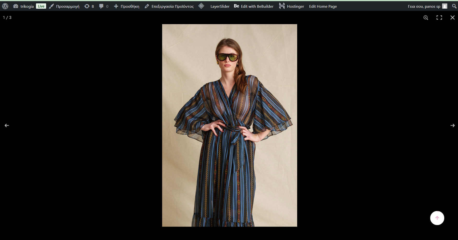
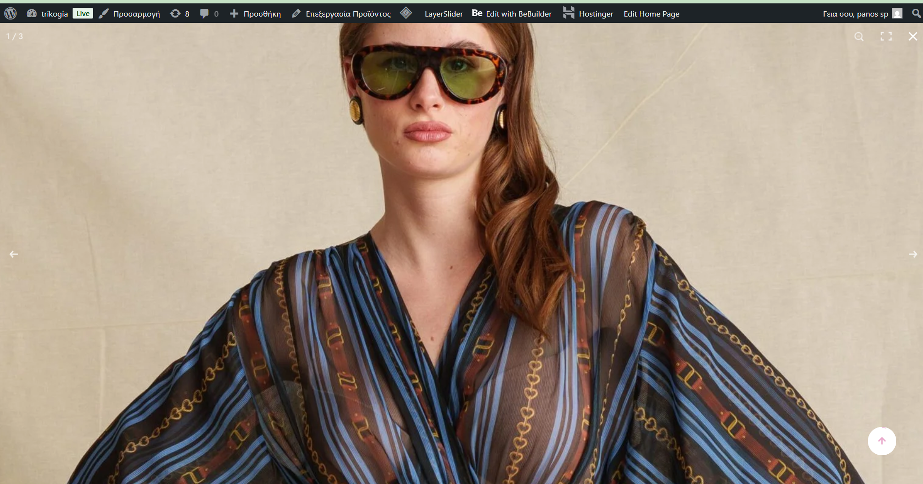
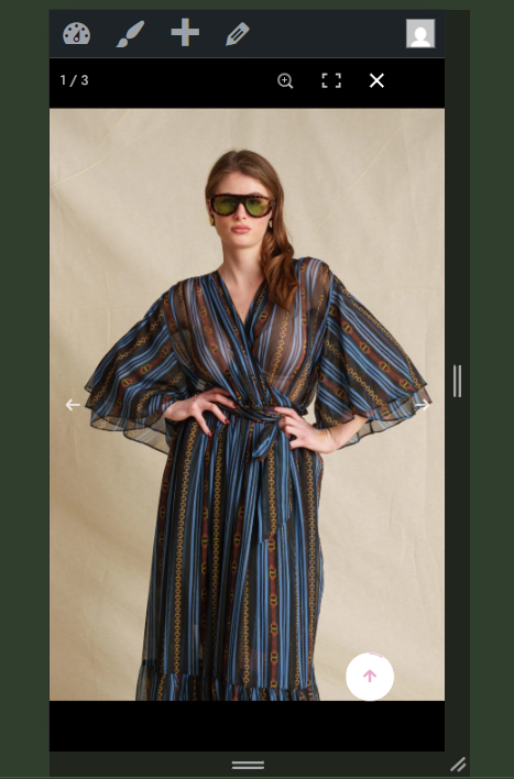
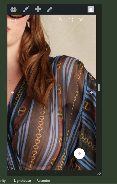
I send you some examples for a random product from the eshop.
Thank you for your support!


Comments
Hi,
Please do not create duplicate discussions.
https://forum.muffingroup.com/betheme/discussion/79367/photos#latest
Thanks