
Mobile Preview is Not Matching iPhone

Hi!
I noticed that when I look at my site [Links visible only for registered users] on iPhone, it doesn't match with what it looks like when I view the mobile in the builder. I'm sure dimensions are off and I'm not sure where to adjust it, but in other cases, it might not be a dimensions thing. Like the query loop. How do I fix it?
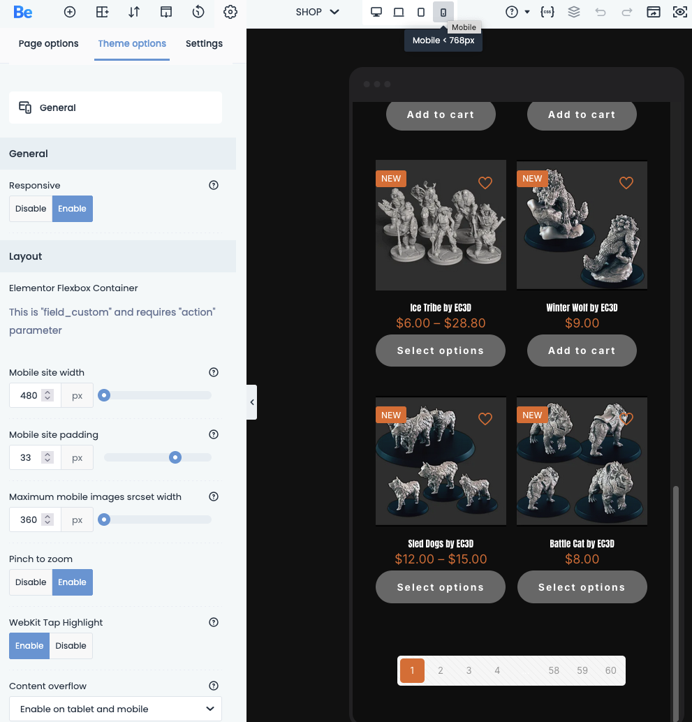
The page numbers at the bottom of products pages (builder mobile preview):
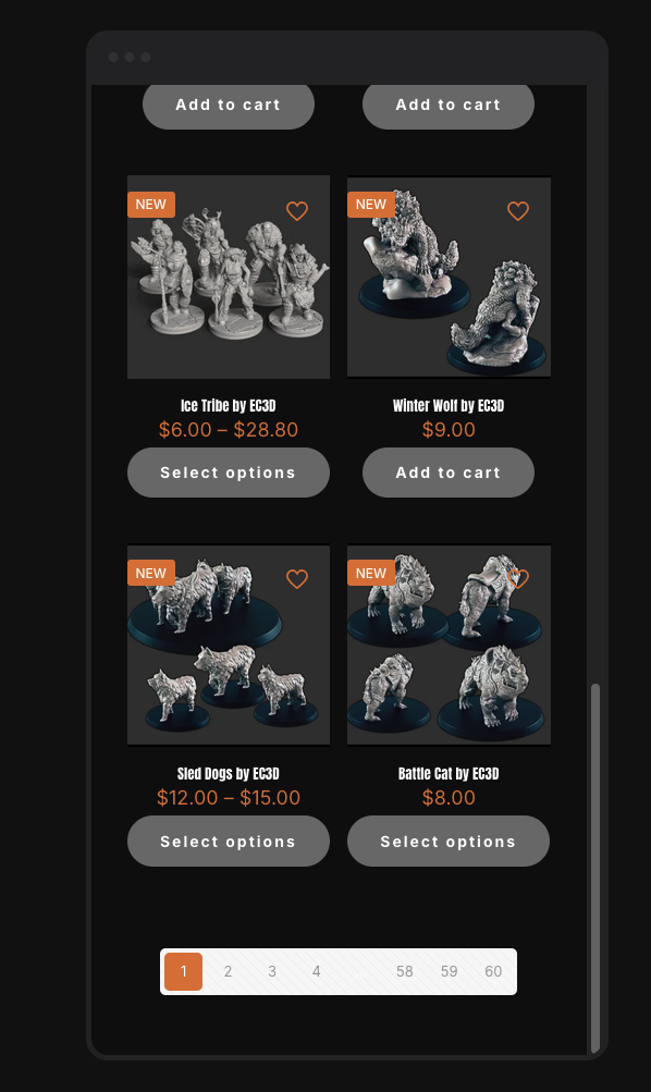
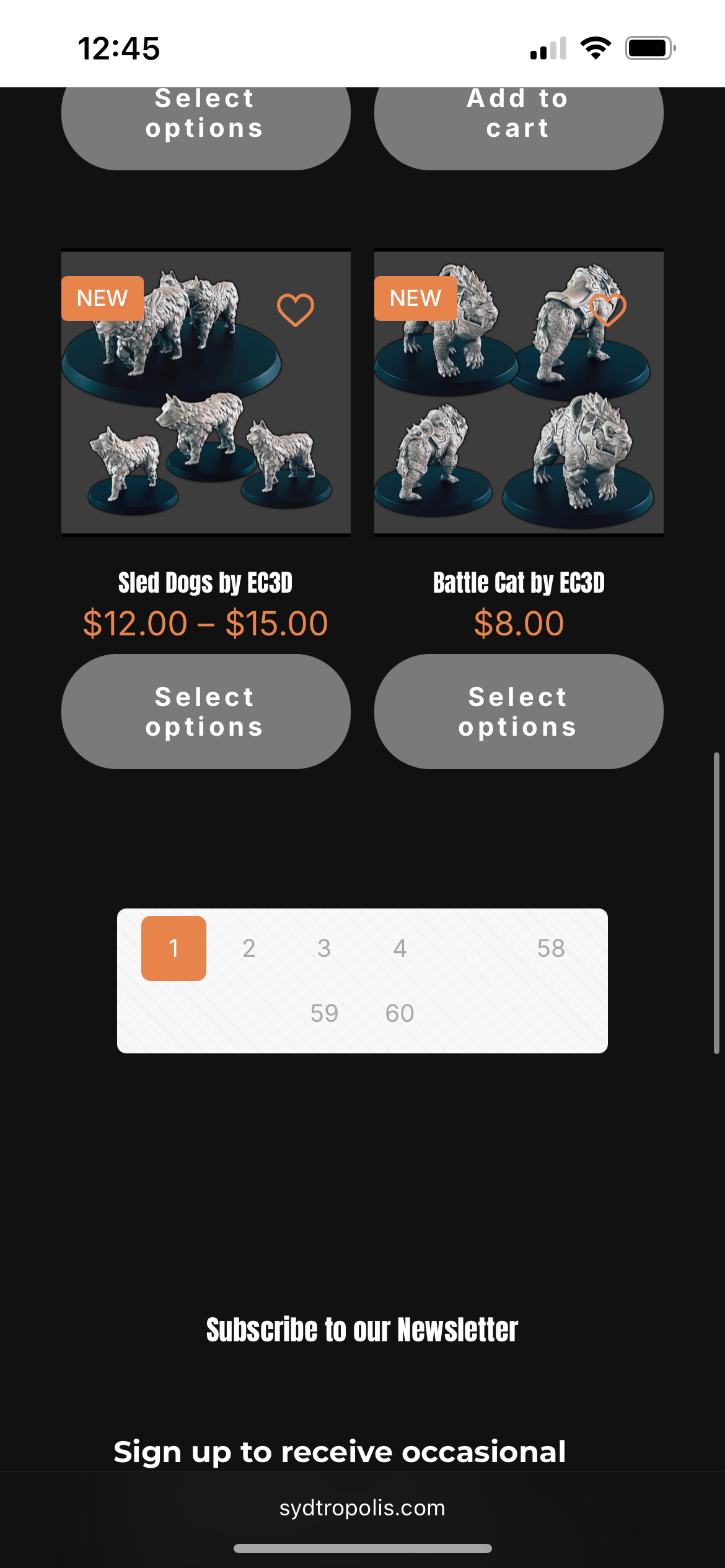
How it appears on iPhone:
The home page title and feature products should look like this (2 lines of text for the title and 2 featured items across):

But instead it looks like this:

The query loop on the home page should still have 6 items across:
But instead it's just doing one big one:

Again, how featured products should look with 2 products:

But instead, it's just one:

(Also, how do I get rid of the little blip at the bottom of these featured sliders? They didn't used to be there. I think they appeared with the latest update).
I found these settings in the builder, but the mobile width (above) doesn't match any of the settings on the left. So what should I be adjusting?
Your help is always appreciated! I'm learning so much!
Comments
Hi,
The widths of mobile phones differ, which is why the preview may appear differently on your iPhone (due to the preview and the device having different widths).
1) For the pagination, you can try the following CSS code:
@media only screen and (max-width: 455px){
 .archive .pager .pages .page-numbers{
  width: 28px;
  height: 28px;
  line-height: 28px;
 }
 .archive .pager .pages{
  margin-left: 0;
  margin-right: 0;
 }
}
Please put it in Betheme -> Theme options -> Custom CSS & JS -> CSS.
2) Edit your heading on mobile view and set slightly smaller font, so it will not break to more lines.
https://support.muffingroup.com/video-tutorials/responsive-editing-in-bebuilder/
3) Regular sliders that are not made with Query Loops always show one slide on mobile view.
If you would like to show more slides at once you should use Query Loop.
[Links visible only for registered users]
4) Did you set the number of columns in the Query Loop to show six of slides on mobile?
Best regards