
Menu responsive

Hello !
Three questions in one :D
[Links visible only for registered users]
Mdp: FireDev
1/ Got a problem with responsive menu, it seems to add some padding in responsive with menu template, i don't find a way to delete that:


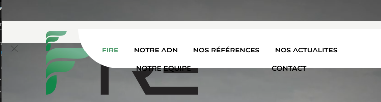
2/ Is there a way to delete the closable button in the left ?
3/ Is there a way to add a logo in the template in mobile menu ?
Thanks for your help.
Comments
Hi,
1) See the following video tutorial:
https://support.muffingroup.com/video-tutorials/responsive-editing-in-bebuilder/
2) Edit your header template, and ensure that your section does not have the Closable option set to Enabled:
3) Also, this video should be helpful:
https://support.muffingroup.com/video-tutorials/building-mobile-headers/
Best regards
Hi, Thanks, the problem for point 1 is that it create a body padding that is not visible in the bebuilder:
Thanks for your help
My bad i found the problem, there was an image in tablet mode in background ...
Sorry and thank you
So everything is fine now?
Is there anything else I can help you with?
Best regards