
Footer width not aligned with page/header (responsive)

Hi everyone,
I’m having an issue with the footer layout/boxing.
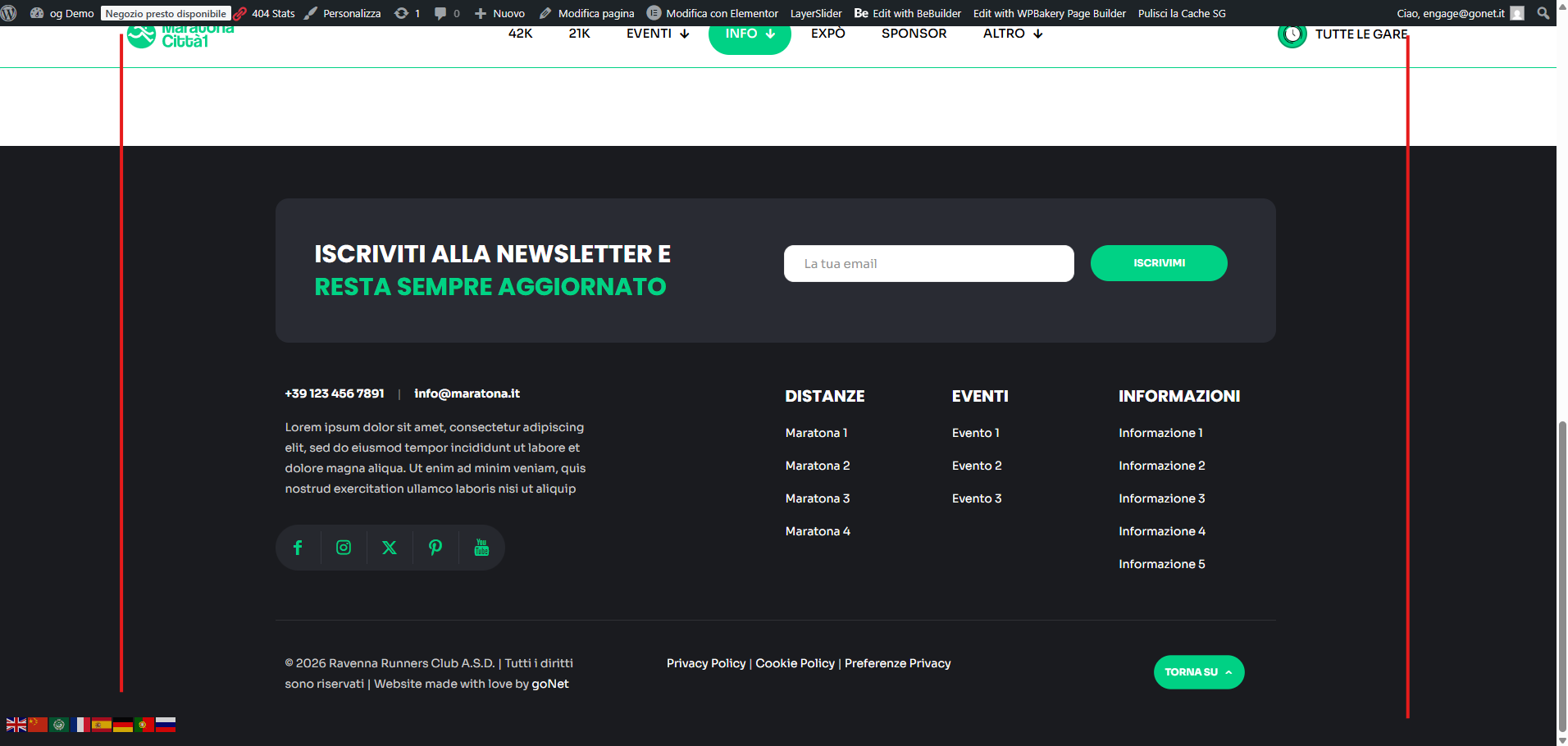
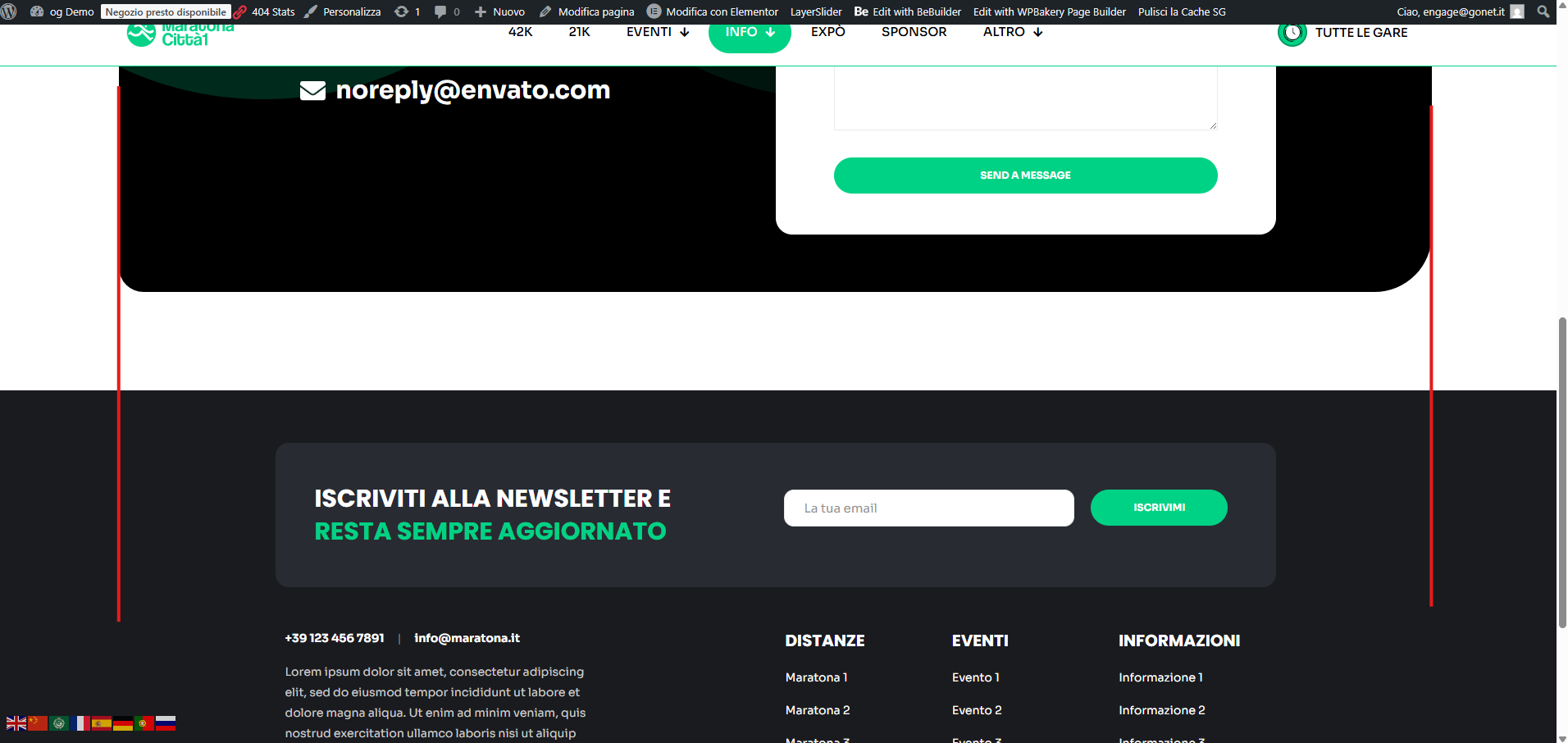
As shown in the screenshot, the footer content is not aligned with the same boxed width used by the page content and header. The footer seems wider/different, so the overall layout doesn’t line up.
I need the footer to match the same container width and stay fully responsive on desktop and mobile.
How can I align the footer boxing with the page/header width (responsive), because also in mobile is not the same?
Thanks in advance,
Filippo
Comments
Hi,
Please always attach a link to your website so we can check it out. If the page is offline(localhost), then our help will be limited. You will have to contact us when the page is online. Also, please make sure that the page is not under maintenance before you provide us with the link.
Thanks
It's published: [Links visible only for registered users]
Go to Betheme -> Theme options -> Global -> General, and increase the Site width:
Best regards
Okay but if i do this then the footer is no longer responsive and doesnt follow the rest of the page behaviour..
How can I let the footer have the same width and same behaviour of the content?
Can you explain that in more detail, please?
It would help if you also attached screenshots showing what you refer to.
Thanks