
space between Colum Text on Mobile

Hello,
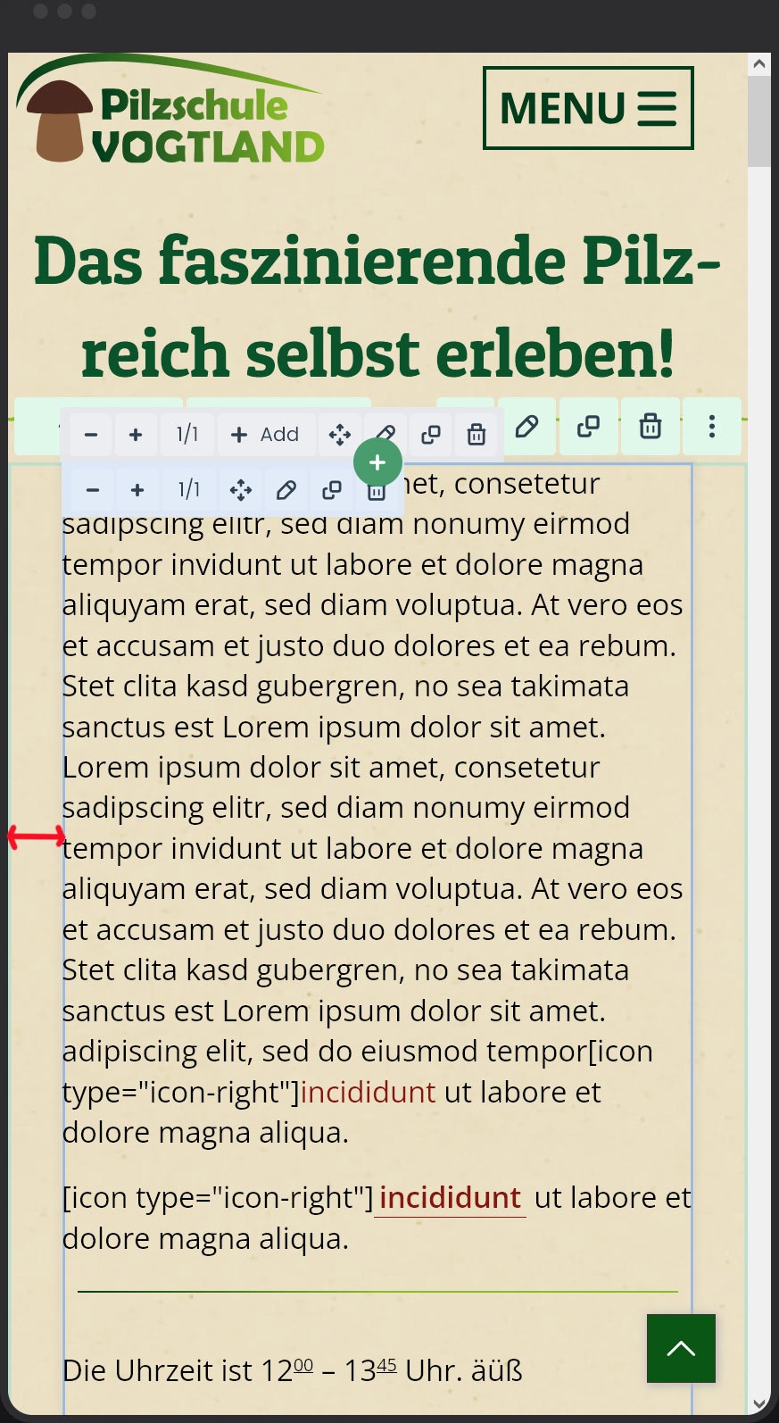
I'm slowly getting desperate because I can't figure out where the empty space between the column text and the edge of the screen comes from when viewing on a mobile device.
Please see the red arrow in the image.
Ok, if I set the section to "Full Width", then it works. However, this affects every screen size and not just mobile. I would then need two sections—one for mobile and one for everything else. That's a huge effort, which I'd like to avoid.
Do you have any idea how I can change or completely remove the empty space shown on "Mobile"?
Kind Regards,
Steffen
Comments
Hello,
30 min after my post I found the right place to set the space.
BeTheme Options - Responsive - Mobil Site padding
Kind Regards,
Steffen
Hi,
I am happy to see that you found it.
Please let me know if you need help with anything else.
Best regards