
Menu "slips" under Logo on Laptops and Tablets

Hi Muffin-Team,
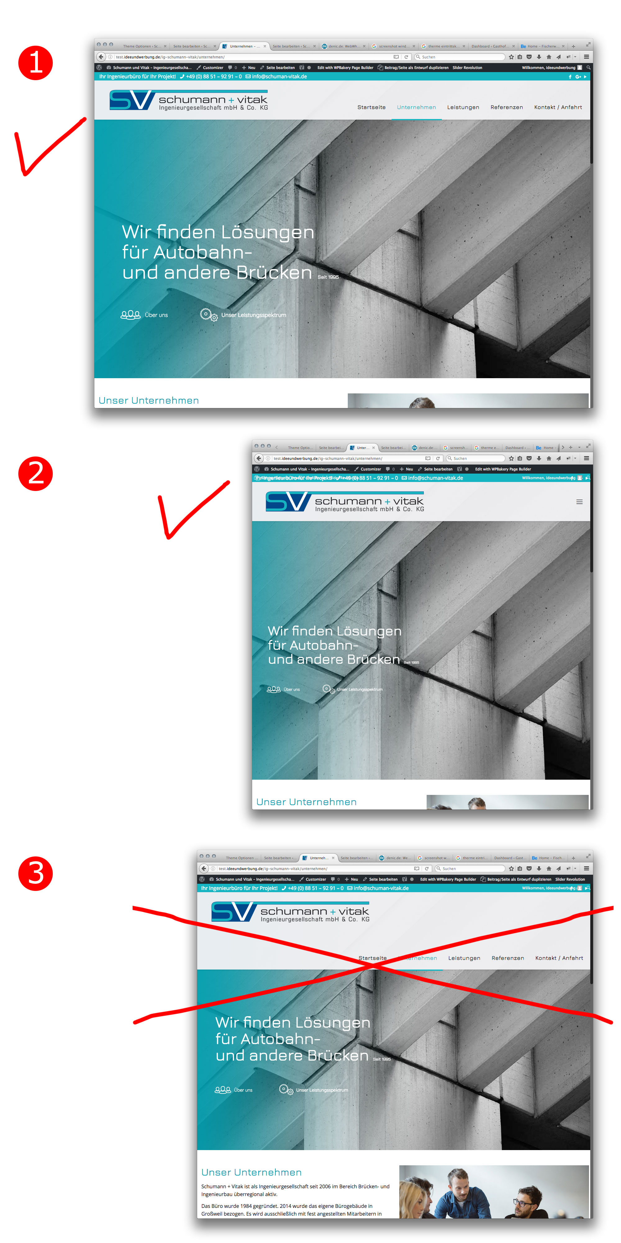
for a costumer i'm working on a website with a very wide logo. (See link below)
http://test.ideeundwerbung.de/ig-schumann-vitak/
In Tablet- and Laptop-Size, the menu slips under the Logo. But i'd like to switch to the mobile-menu-button, so that the menu never appears under the logo. How can i do so? (Sorry for my bad english. Maybe the picture helps, to explain, what i'm trying to say...)
Thanks in advance.
Kind regards
Frank
Comments
you have to set the initial width value to change the breakpoint. This will allow the burger menu to be enabled sooner.
Theme options>responsive>header.
thanks
No matter, if i set initial width to 768 or to 1024 – the menu slips under the logo in both cases... :-/
The logo is very long and this is why it goes under.
thanks
thanks