I decided to breakaway form my usual go-to themes as I'd heard a lot of good things about the BeTheme.
A really important feature of WordPress is it's ease-of-use.
A really important factor in deciding a theme is the ease-of-use for the client.
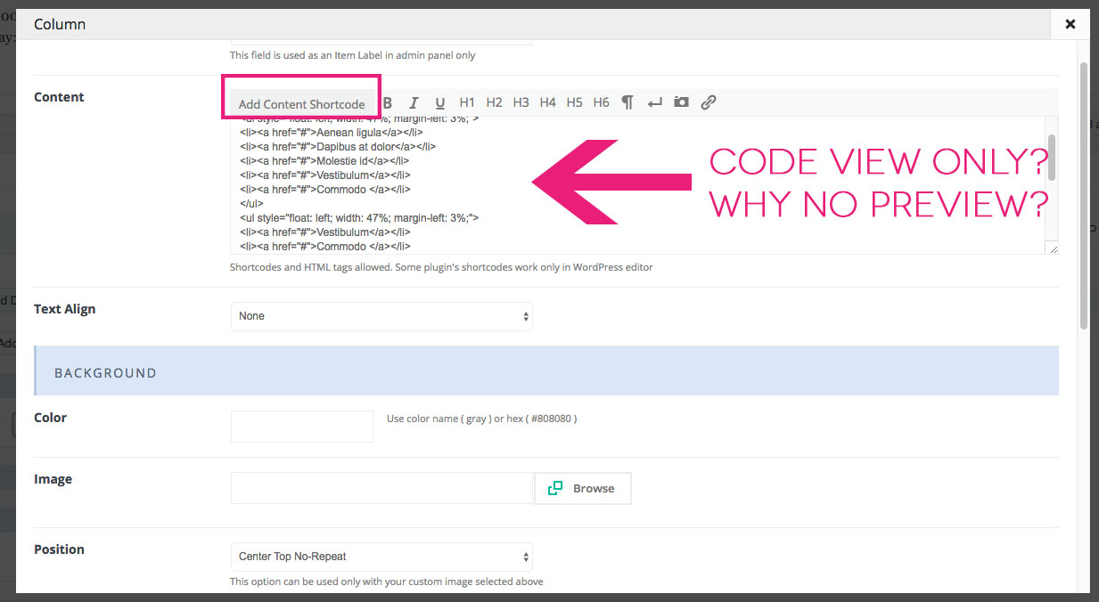
Sadly I am really disappointed in the Muffin Builder WYSIWYG editor.
When editing a column block users are presented with the muffin builders popup editing panel. This panel has a wysiwyg editor of sorts but it is not user friendly for clients as it forces clients into using code:
The result is a UI that many clients, who do not know how to code, will not be able to use this.
It leaves me wondering why the muffin builder does not use the WP wysiwyg editor? It would be easy to hook into the WP editor and you could give your users the choice to use the WP WYSIWYG editor and the Muffin Builder's one.
Not doing so means that users loose out on:
- the latest features of the WordPress experience such as inline linking and formatting shortcuts.
- Its easier and faster to add images
- Its easier and faster to add basic formatting
- Its easier and faster to add links
- It's easy to switch between visual and text modes if needed (which would allow for html editing)
So here's what I'd recommend.
Use the appropriate hooks to call the WP Content Editor which will allow users to use both "visual" and "text" modes.


Comments
this is how Column item looks like. And because most of our customers need this item and use it for their sites as it's more flexible than WYSIWYG editor it's number one. If you want to use WYSIWYG editor, just use Visual Editor item instead.
Thanks!
This is an important issue. There should be a WYSIWYG
Can I get a theme refund as this isnt fit for my purposes. My client needs easy editing access... TKS
Hello @bgildea,
Please send this information privately thru the contact form which is on the right side at http://themeforest.net/user/muffingroup#contact
Notice!
Please attach a link to this forum discussion.
Thanks