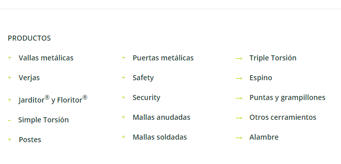
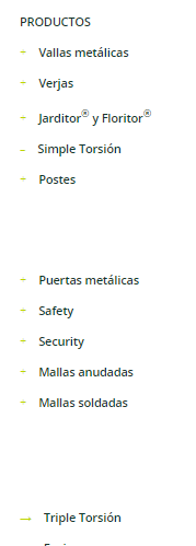
menu in footer
Hi!
I need to create a menu in the bottom of the page=footer. I created it from appearence>widgets>footer (1# - #5) I put footer text widgets with links to pages. I have problems with responsive visualitzation, the distance betwen paragrafs are very large, I need to remove this distance.
Screen
phone
By the way, I need to create a accordion with some of categories. Any idea?
Maybe there is a better way to make a dropdown menu in footer. I use a text widget because is easy.


Comments
Hello,
Please, try to use the Muffin Menu widget instead, and check if it suits you.
Thanks
I tested it, but I need a similar style like my first screenshot in last comment, I don't like the boxed text. There is an option to modify the muffin menu to remove boxes?
Please, try to use the following CSS code:
#Footer .widget_mfn_menu a{
   background: transparent!important;
}
Put it in Betheme -> Theme options -> Custom CSS & JS -> CSS.
Thanks
Excuse my poor english...
Now it looks with background transparent but, there is a grey line. The colour for letters should be #13352C, and colour for (+) and (-) icons should be #BED600. The style needs to be like right column example.
Please, try to use the following code instead:
   #Footer .widget_mfn_menu a{
      background: transparent!important;
      border: none!important;
      color: #13352C!important;
   }
It will probably not change the plus/minus color, and to change it, I will need to look at it on your website. Are you able to send me a link to it?
Best regards
It worked! I can't send the access codes to my website, sorry. Can we try to try something else for plus/minus color?
Another problem is if I put the menu in more than one column when I view the website from phone, the menu is not continuous.
Like this. There are no options to remove this default margin.
Thanks a lot!
1) I cannot assure that it will work, but you can try the following code for +/- icons.
#Footer .widget_mfn_menu a::before{
     color: #BED600!important;
  }
2) To remove the margin, please, try the following code:
      #Footer .widget_mfn_menu{
            margin: 0!important;
            padding: 0!important;
      }
Thanks
Codes didn't work.
maybe we could try to put something in Aparence>Menu>+Vallas metálicas.
Your need to copy the codes 1:1 and on the screenshot I see that they are different than the ones I have sent you.
For the plus icon you can also try to use inline CSS.
Thanks
For +/- icon in #BED600 I needed the second option (inline CSS) for solve it.
Correct codes in Betheme -> Theme options -> Custom CSS & JS -> CSS solved the margin problem with phone view.
But this change creat a new problems with pc view. The CSS code remove all margins in footer and I need a top margin for menu, like contact or logo.
Then please, try to use the media queries for that.
@media screen and (max-width:767px){
	#Footer .widget_mfn_menu{
            margin: 0!important;
            padding: 0!important;
      }
}
Thanks
It is perfect! What do I do to some "parent pages" don't have a link? Thats is, I want to some parent pages only for accordion use.
Create a Custom Link, and in URL input put the hashtag. Check the following screenshot for better understanding.
Thanks
If I put "#" in URL the page refresh when I press link. If I put nothing in URL link the text appears with light typography, I think the typography change because this isn't a link. Could we change the CSS to use the same type of typography for links and words in this case?
It is important because instinctive I press the parent page to close the accordion. If parent page have a link, it brings me to other page. The accordion only close if I press out of menu. Maybe we can change this.
In that case you should contact your web developer to achieve that because it will require more advanced CSS and/or theme files modification.
Best regards
Ok, thanks! That's all! I'll keep it as it was, with links.