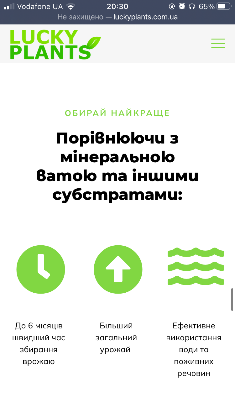
Montserrat looks different on mobile
Hi! My website luckyplants.com.ua uses Montserrat as a font for headers. The website is in Ukrainian and it looks good on desktop but font becomes weird when looking at website using mobile. Below are some screenshots from the website. How can I fix it? I tried to find corresponding parameters but I had no luck.


Comments
Hello,
I have checked your website on mobile, and this problem does not appear.
Did you handle it?
Are there any steps to reproduce to notice this issue?
What browser and device are you using?
Thanks
Hi! Thank you for checking it. The problem remains but I am using an iPhone. On Macbook fonts look good, so I am not sure if it is Apple issue or not. What could it be?
It seems that is an issue with iOS.
Please, check the following link, and try the solutions from there.
https://github.com/google/fonts/issues/2688
You can also try to upload this font as your custom font and check if the same problem appears.
https://forum.muffingroup.com/betheme/discussion/38753/how-to-upload-custom-fonts#latest
Thanks