
Logo gets really small in sticky header

Hi there,
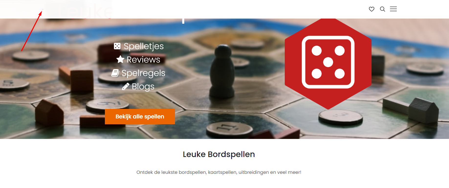
Sometimes when I make changes to the website, my logo gets insanely small in the sticky header (once I start scrolling) on both desktop and mobile. Please see attached screenshot (it's very difficult to see, but the image is still there).
Site: [Links visible only for registered users]
Is there any way to force it to remain the same size through custom CSS or something different?
Comments
Hi,
Please, go to Betheme -> Theme options -> Global -> Logo, check the option Auto width for Sticky Logo, and check if the problem persists.
Thanks
Sadly this does not solve it
In your website source, I noticed a couple of classes added to the logo image which do not comes from our theme.
Please, turn off all of the plugins, refresh your cache, and check if the problem persists.
Moreover, if you use a child theme, switch to parent, and recheck it.
Thanks
I managed to solve the problem by using the following CSS and turning on "Remove max-height & padding for Sticky Logo":
#Top_bar.is-sticky #logo img { max-height: 50px !important; }
Thanks!
Good to hear that.
If you have any other questions or problems, please, let me know.
Thanks
It seems like the issue isn't entirely resolved, as I now have a slightly different issue.
The logo is fine in the sticky header now, but the first time I load the page in my mobile browser, the logo gets insanely small again. Once I scroll and the sticky header appears it's fine, until I scroll all the way to the top, when the logo gets very small again.
This only happens on mobile, it's fine on desktop.
I have already disabled all plugins and refreshed the cache, but the issue persists.
Can this be solved through Custom CSS?
Please, try the following CSS code:
#Top_bar .logo .logo-mobile{
 min-width: 150px!important;
}
Thanks