
Tablet menu / header issue

Hi,
On our website imnera. com (I wrote it like that to prevent backlinking) , we use a side menu for the desktop. I would like to ask a few questions about header types of desktop, tablet, and mobile.
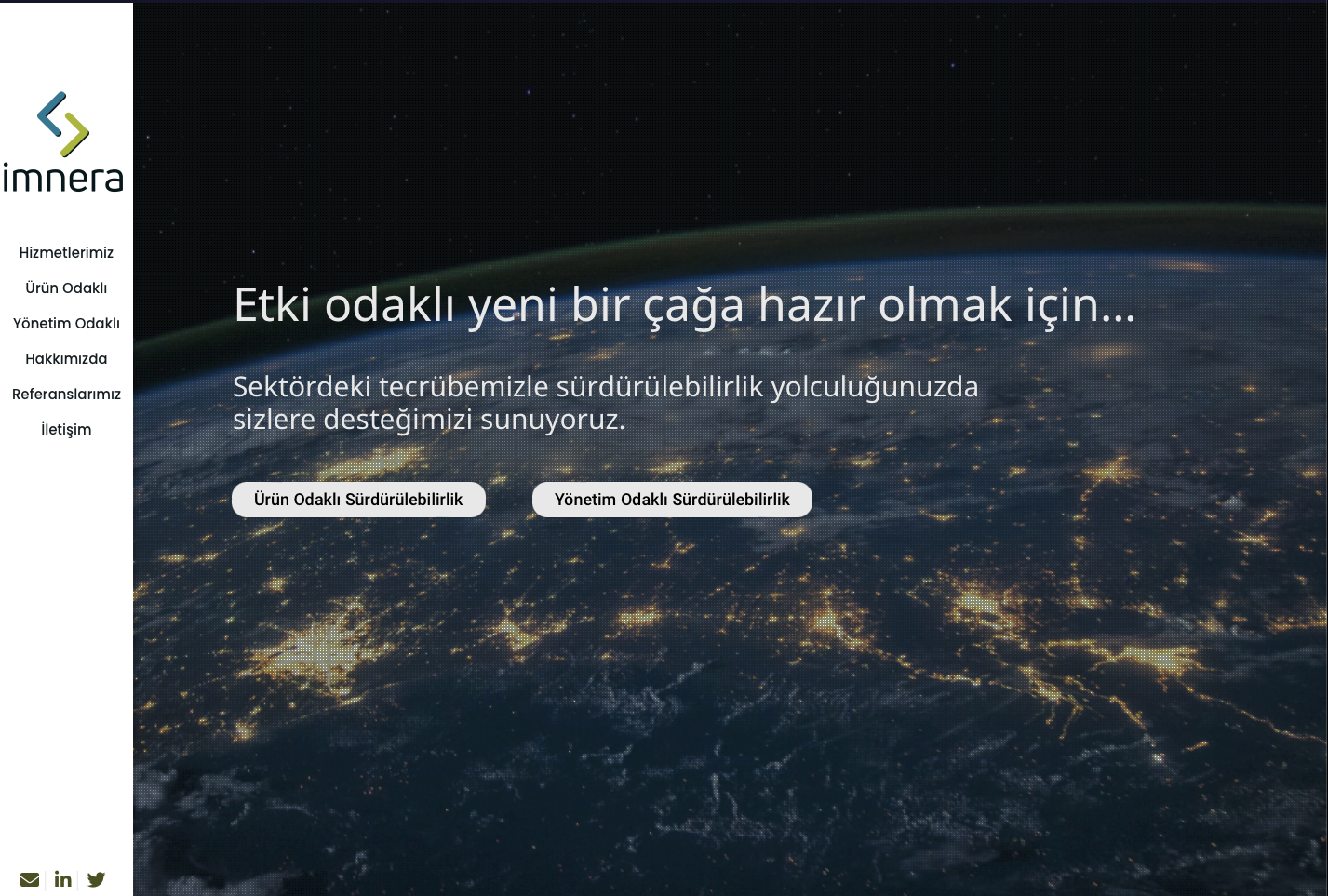
1- I want to show the menu in the middle of each screen size, I mean 14-21 inches doesn't matter, I want to set it to the middle. For example, in screenshot below it is in the topside, not the middle but it's ok in 14 inches but the screenshot is from 21 inches. Please see the screenshot below:
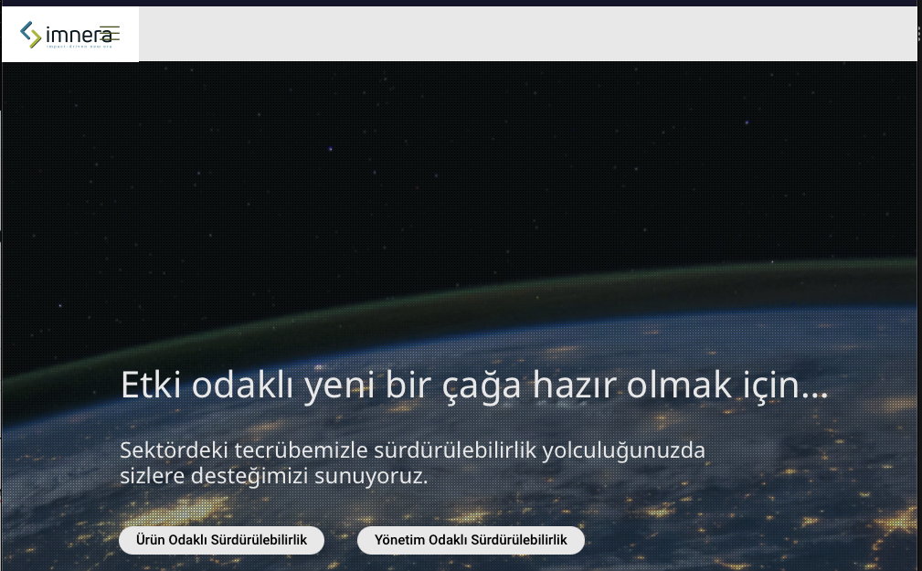
2- In tablet view, I couldn't manage to take the hamburger menu icon to the right side, it overlaps the logo. Please see the screenshot below:
3- Mobile has the same overlapping issue with the tablet hamburger menu but I manage to solve it via custom CSS but it's not stable, maybe you can check both mobile and tablet to see what I did for mobile.
4- Is it possible to make clients square not 150x75 ? Please check Referanslarımız page to see clients.
Thanks in advance
Comments
Hi,
1) There is no setting to put it in the middle.
2, 3) You have some custom CSS that moves the hamburger menu where the logo is. Without your custom CSS, it looks like this:
Please, go to Betheme -> Theme options -> Custom CSS & JS -> CSS, and there you should find code responsible for that.
4) The client's image size is hardcoded in the theme, and they cannot be larger than 150x75px. As a workaround, you can use the image element instead.
Best regards
Hi thanks for your answer, so I deleted all custom css codes for header widths. and they seem ok now as you suggested. But I would like to make submenu wider, how I can achieve that without effecting header? In submenu titles seem very narrow:
Thanks in advance
One mor question, is it possible to make the creative open menu narrower in desktop? I mean I want the main menu narrow and submenu wider.. Thanks
Please, try the following code:
@media only screen and (min-width: 1240px){
   #Header_creative{
      width: 200px!important;
   }
   body{
      padding-left: 200px!important;
   }
   #Top_bar .menu li ul.sub-menu li.menu-item{
      width: 250px!important;
   }
}
Thanks
Thanks the custom css code worked like a charm :) Have a nice day