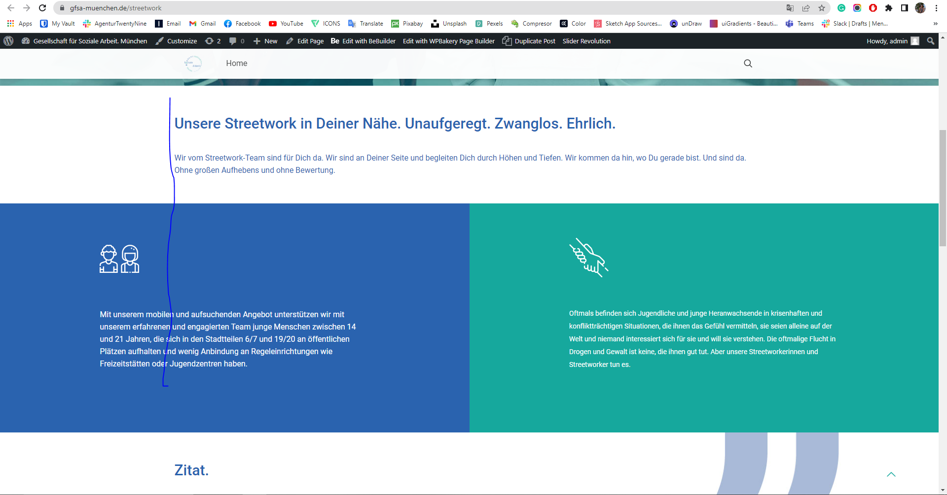
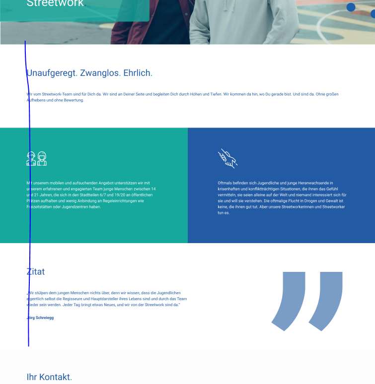
2 columns with background but wtill in grid
Hi,
I would like to ask how could I make as showed in pictures?
So the background color is full width, but the text is still in grid? I somehow fail, no matter what way I use.
Could you help me to set this up, please? This is going to be a very repetitive layout for a lot of pages. Thanks in advance.


Comments
Hello,
Can you provide the username and password for some test user? I need to check the layout you built, it will be much easier for me.
thanks
Of course, can I do it somehow privately and not in a forum, please?
Please send us WordPress dashboard access privately thru the contact form, which is on the right side at http://themeforest.net/user/muffingroup#contact and we will check what might be the reason.
Notice!
Please attach a link to this forum discussion.
Thanks
There is 11 pages that have this issue:
I created the layout you want on cloned page, please inspect it and recreate on other pages.
https://gfsa-muenchen.de/streetwork-mfntest
thanks
No, that is wrong... The background color should be full width. I could have done myself :)
the idea is as in a given image:
as you can see the color is extended :)
This issue is not solved yet
Okay, I understand now - now I prepared to be the most closest as possible.
I turned on the highlight option for section and attached CSS code to overwrite the color from theme options.
thanks
Have you checked a full desktop view?
this is now weirder than it was. It should be as in a given image, all in one line.
Maybe it would help to leave it and add some desktop and notebook padding? but then it maybe looks weird on different screens, right?
I did not notice that in Deprecated options there was an padding inserted from your wrap (I cloned the element)
It's okay now, I think.
Thanks
Where can I find that code you wrote? I am still not happy with the padding on the green square. Maybe I can change it myself.
And sorry, where can I find the element saved?
i do not see it in templates:
neither in:
To duplicate and redo 11 pages does not sound efficient at all...
ALSO!
Before the weekend this issue was not existing.... Now parallax goes crazy? Maybe it was affected by your code? The image is now duplicated.
Mobile looks good though!
Hi,
The CSS is placed in the page option of the Streetwork - MfnTest page.
Also on that page, you can find this section.
Also, I added another section with a different solution than Pablo suggested, where I used the gradient option.
If you want to have this section as a template, you can copy export it, and put it in the template while editing it with the BeBuilder.
However, I did not notice the problem with the parallax. Are there any steps to reproduce it?
Thanks
Ok, so even if i add padding on the green tile, then it is is wrong on different screens (tablet and mobile) and there is no option to remove padding only for mobile except dupliating the section and redoing it.
This seems to be such a simple request, but does not work at all :D I just decided to go with the option without full width then. However, I noticed there is default BeTheme color appearing from somewhere. Can we remove that?
and then we are done :) But just for the future, could I request this feature? :)
Thanks anyway for trying to help!
To remove that color, open the section options and uncheck the highlight option.
All your ideas for the future updates, you can put in the following topic:
https://forum.muffingroup.com/betheme/discussion/113/your-suggestions-for-future-updates#latest
Thanks
ok, you can close this ticket ;)
Thanks a lot for your support!