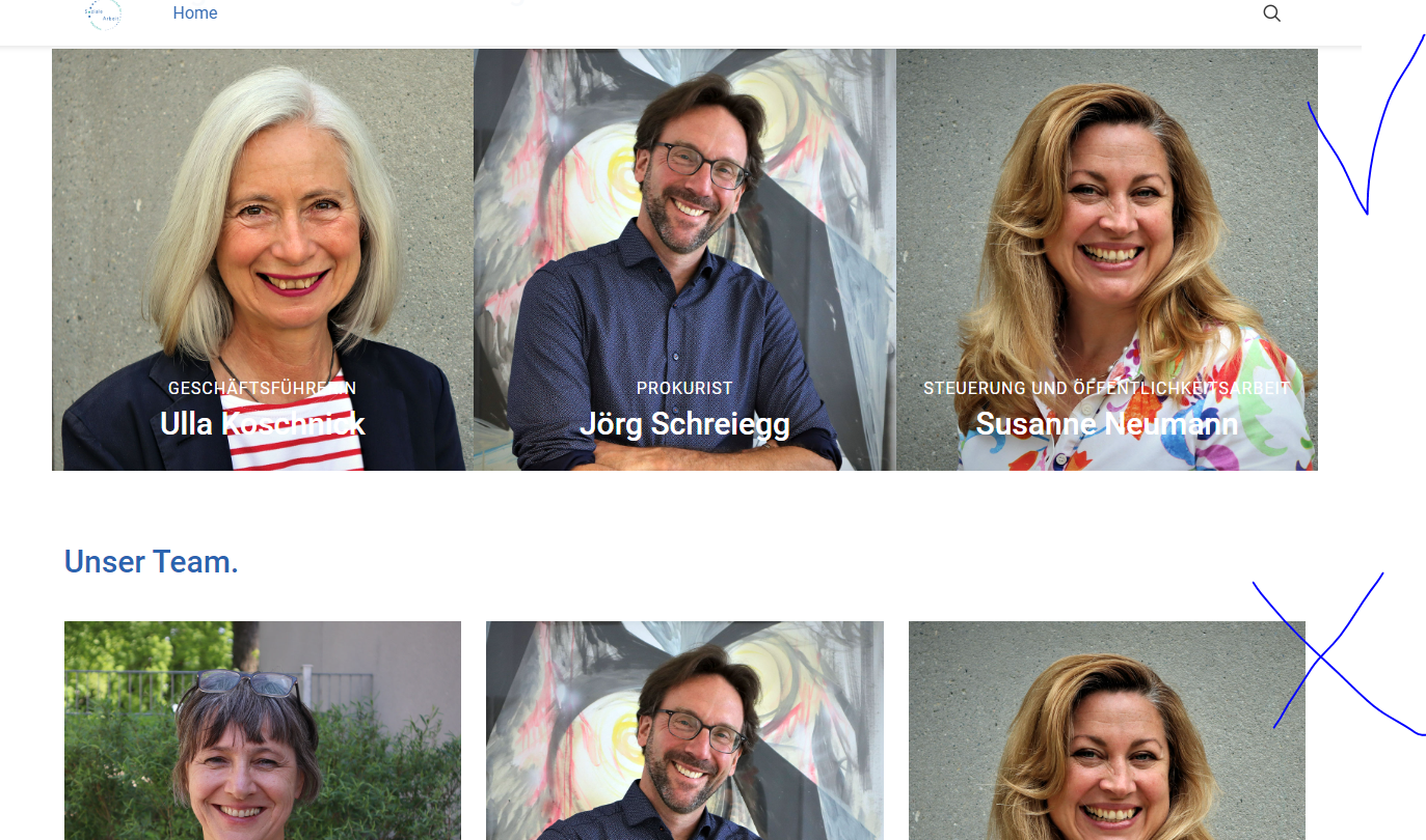
Portfolio paddting and hover opacity
Hi,
I am creating a page and I would like to have no padding with elements, but would like to have the hover effetct with the name of the person. No padding in between elements is the desired goal.
Also, would it be possible to make the background hover color with 40% opacity? I am not sure how can I achieve that.

Comments
Hi,
Your website is password protected.
Can you send me credentials here?
If you do not want to share them publicly, please send this information privately thru the contact form, which is on the right side at http://themeforest.net/user/muffingroup#contact.
Notice!
Please attach a link to this forum discussion.
Thanks
So i did it in the same time... check the emails please.
I did it at the same time and attached the ticket, so you should have seen it.
Maybe there is an option to ask for help when i immediately can share everything privately and not in the blog?
1) The Masonry Hover portfolio style calculates the post position with JS, and there is no option to reduce the space between them, unfortunately.
2) You can add the hover color opacity in the Style tab.
3) You can send a private message with the link to the forum discussion as soon as you create it.
Sadly I do not see any other option.
Best regards
Can you maybe suggest some alternative how to achieve a similar effect? It is a bit unfortunate that there is no way to show it withot gaps?
I tried using trailer boxes.. it is not ideal, but works until maybe you fix this issue with the next theme update?
However, is there a way to make the slogan text not all in capitals?
and maybe it is possible to make the title and the slogan appear only with hover?
Phil, I had another issue with Padding with Blog last week.. maybe you remember?
https://forum.muffingroup.com/betheme/discussion/comment/215327#Comment_215327
Maybe maybe if I re-create everything --> blog becomes Team and portfolio becomes jobs, maybe this would already solve my issue?
you have no idea how much you would help me if you had an idea how to make the design wihout the gaps and also appearing automatically....
We are an NGO and we are building our site regarding style of another ngo (our sister) and they have this team site and we want to make it very similar...
1) This blog style works this way. If you do not want to have any gaps between the posts, you have to choose between the Flat or Masonry Flat.
2) Open the Trailer Box options, go to the Style -> Slogan -> Typography, and change the Transform to Normal.
Best regards
I recreated everthing in Blog style :) It works better now :)
Just a quick question...
Could these arrows show just certain categories?
Since I re-created everything in BLOG style... I see jobs mixed with team... can I separate it?
What I mean is that When I go to explore one category I circle around only that category and do not jump ro unrelated posts?
Please, go to Betheme -> Theme options -> Global -> Navigation & Share, and uncheck the option Show all posts. Thanks to that the arrows will navigate in the same category.
Thanks
Thank youuuu!!!!!!!!!!!!!!!!!!