
SNS icons on the global menu area

Hello,
I am working on this site.
https://ironoha-cafephoto.com/
As you can see in the picture below.
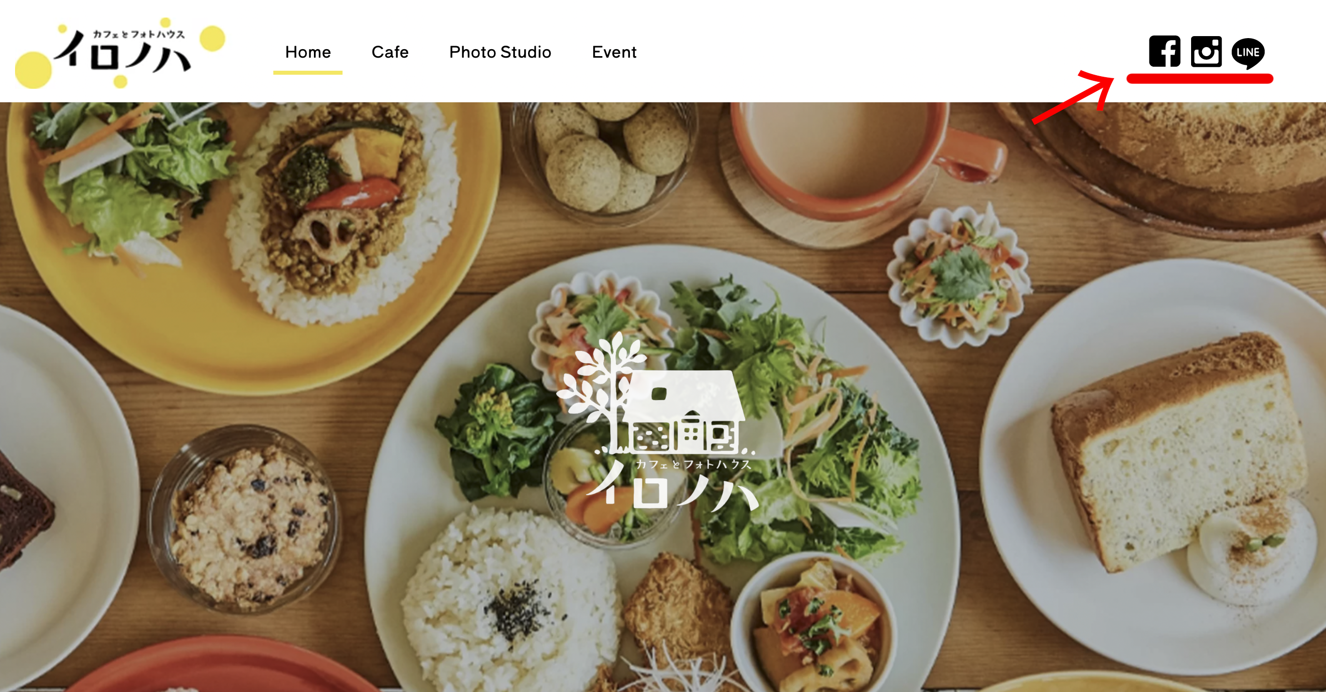
I want to put SNS icons on the right side of the global menu.
Is there any way to do this?
Thank you.
Comments
Hi,
You can use Header Builder 2.0.
In the following video tutorial you can check a general overview of this tool:
https://support.muffingroup.com/video-tutorials/header-builder-2-0/
If will have any questions, feel free to ask.
Thanks
Hello.
Do I need to install Header Builder 2.0 first? Because when I open the template according to the video, I don't see the option "header".
You do not have to install it. It is part of the Betheme, and you only need to have the most current version.
Best regards
Hello.
I have done some work after the update.
Question.
I haven't reflected it in my browser yet.
There is a difference between what I edit and "VIEW PAGE"
These are what I am editing.
These are "view page"
1. The position of the social icons is not correct.
2.The hamburger is not displayed in mobile view.
Can you also tell me how to reproduce the Line below Link (80%width) style in the template?
I have checked your website, but it is using a default header template. Can you activate the custom one, so I can take a closer look at it, please?
Thanks
I did activate header #1 only top page.
Thank you.
1) Please send us WordPress dashboard access privately thru the contact form, which is on the right side at http://themeforest.net/user/muffingroup#contact and we will check what might be the reason.
Notice!
Please attach a link to this forum discussion.
2) Hamburger menu is there, but it does not fit on a screen.
Please open the wrap options, and set the Wrap elements to Wrap.
3) To have a line below the menu item, you need to edit the menu element and set the Item Animation.
Thanks
I can see that you used an image element for the icons, which has a custom width set to 250px by default. So I have changed it to inline width.
However, I recommend using the Icon element for icons instead, but you can use images if you want.
Also, I have set the inline width for the mobile display for the "line" image.
Best regards
Hello,
I am currently using Header Builder 2.0 and I am working on HEADER from template.
I would like to bring it as close to this template design as possible.
(1) I would like to change the color of the selected menu item and the bottom line.
(2) The header background is transparent when displayed on mobile devices. Where canI change?
(3) I want to reduce the vertical height of the sticky header and the logo when scrolling.
just like "charity3"template.
④ Also, I used the following css to change the opacity of the stickyheader. Where should this be written?
#Top_bar.is-sticky{
background:#ffffff !important;
opacity:0.7 !important;
}
Thank you very much.
when I click this, page turn to monocrome。
1) You can change the menu item line in the "Style -> Animation" tab
The active menu item can be changed in the "Style -> Menu", remember to switch the to the "Active" option.
2) Please switch to the mobile version of menu in Header Builder and check the background color, if is set to section.
3) Change the header type to "Sticky" and edit the logo element, it's that simple.
4) All CSS codes should be inserted in the Theme Options -> Custom CSS & JS -> CSS
thanks
Hello,
I am working on HEADER from template.
https://ironoha-cafephoto.com/
1.I can set the of sticky header mode for desktop and tablet, but not for mobile. How can I set the sticky header for mobile?
2. Where can I change the line of menu ?
3. Where can I change submenu hover color?
I have set the height of the HEADER in the mobile settings, but when I look at the actual site, it overlaps the content and hides the content.
How can this be resolved?
1) Please check, on the sticky and on mobile responsive mode, if the "Scroll Visibility" is set to default.
2) You can change the menu item line in the "Style -> Animation" tab
3) In this case, you will have to use the CSS code, we do not have this option.
4) You set the height for wrap, not the section.
The section (green background) is the whole menu container.
thanks
Hi,
>1) Please check, on the sticky and on mobile responsive mode, if the "Scroll Visibility" is set to default.
→
I am trying, but still can't set sticky header for mobile.
Turning on the sticky option for mobile is what I shown you in previous post, this is the only way, you cannot make different sticky header for mobile.
If you want to create different sticky header for desktop/tablet, make sure that you enabled in the Header Options
Thanks
Hello,
This is the comment you give me:
2) You can change the menu item line in the "Style -> Animation" tab
I still cannot find the "Style -> Animation" tab when I work for mobile.
I can find "Style -> Animation" tab for desktop and tablet ,but not for mobile.
Then I set the yellow color "Style -> Animation" tab for desktop and tablet.
However the mobile it shows Blue.
Thanks.
The animation color is available for the regular menu item, and it is not available for the Menu burger element. I have passed to the dev team, that it should be added. At the moment, please, use the following CSS code:
.mfn-menu-animation-text-line-bottom > .mfn-menu-li > .mfn-menu-link .label-wrapper::before{
   background-color: #213705!important;
}
If it will not work, please, activate the animation on your website, and I will write a proper code for you.
Best regards
Hi, Thanks for the code. It worked.