
Margin/padding below LOGO and navigation menu on phone.

Hello,
I am getting a large white padding/margin below my logo when viewing the website with chrome on android - Samsung Galaxy S22.
I thought I had everything aligned on the site but now I'm once again stumped as to where I've made critical mistakes.
Here is the website
[Links visible only for registered users]
Here is the site on my phone -
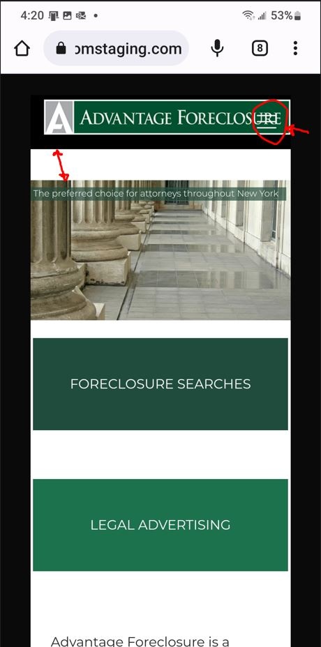
Also the three bar navigation menu - Is there a way to align right/left of logo? or is there a way to define a smaller logo for phone/tablet sizes to fit?
Comments
Hi,
1) The space comes from the builder. Open the WPBakery, and change this margin to zero.
2) You can upload a smaller logo in Betheme -> Theme options -> Responsive -> General.
Thanks
Hello,
I need to adjust all my paddings and margins, I never checked what the site was looking like on the phone, I just kept noodling with it on the desktop, the supervisor went ballistic when they looked at it on a phone... sadly, I'm feeling like I am in way over my head.
and again so sorry for not knowing about the Responsive options... I really need to RTFM
is there a way to align the three bar navigation?
any help would be greatly appreciated.
No worries, I am here to help you. ?
The hamburger menu can be set in Betheme -> Theme options -> Responsive -> Header.
Best regards
Hello,
The BeTheme options >responsive >header is very helpful, thanks!
I changed the margin to 0 and the white space is gone, but I am still getting a black space, perhaps my slider is built incorrectly or has settings that are making it larger in height?
I am trying to use the dev tools in chrome to work on the mobile/phone version of the site
I tried adding CSS code as identified
.vc_column-inner vc_custom_1663706119847{
padding:0 !important;
margin-bottom:0 !important;
}
but it didn't work - the space between the mobile/header and slider is black and looks like about a 20/30px space
am I allowed to modify this .vc_column-inner vc_custom_1663706119847?
You almost nailed it. The CSS should look like this
.vc_column-inner.vc_custom_1663706119847{
 padding-top:0 !important;
}
There should be no problem with using these classes. ?
Best regards
Thanks Phil!
Hello once again!
Oh my, I've suddenly turned off my Revolution sliders on many pages in Mobile Phone view, The slider I build for my home page works OK on the home page in phone view.... but I don't know what I changed that made several of my pages have hidden sliders
Is there a Theme Option that makes them hidden?
I can't find it in my CSS code but It's found with dev tools!
I must have changed something in Theme Options no?
This CSS comes from the WPBakery, so you probably hide the slider for mobile devices in the builder.
Please, check the following link about it:
[Links visible only for registered users]
Thanks
Where can you define the image associated with the site link
Is it called an HTML link? For instance, If I want to make the Logo the HTML link is there a Theme Option for this or is it a simple line of CSS code?
When I sent the link to a friend it used a picture from the site that we didn't want to use.
Hello once again,
Something happened to my wrapper - Perhaps I changed a Theme Option here?
I finally found that the hidden Revo Sliders were inside a WPBlock once I moved them they became visible in Mobile phone view.
I'm not sure why they are invisible when they are inside the block that has a custom menu in it, hopefully I'll be able to use the CSS code to adjust the margins on the suddenly found Revo Sliders.
Now, I'm just not sure where this odd border came from
1) This image can be set up for a whole website in Betheme -> Theme Options -> SEO, by setting the Open Graph image.
It can be also set for a particular page in the page options.
If you are using an external plugin to control the SEO, you will have to set it up in this plugin settings.
2) Please, go to Betheme -> Theme options -> Responsive -> General, and select option Force full width.
Thanks
Hello!
[Links visible only for registered users]
I'm still trying to understand using CSS code to force corrections in margins/padding
The Pages look correct on a desktop but not in Mobile view, I've tried editing the pages in WPBakery but have not been able to figure out where the adjustment can be made so I am trying to correct it with CSS.
/* Alternate Padding */
.vc_column-inner.vc_custom_1664315135460{
padding-top:0 !important;
}
.vc_column-inner.vc_custom_1662753132899{
padding-top:0 !important;
}
this code I put in didn't do anything... Do I need to identify the full line rather than just part of the line for CSS ???
thanks
Phill
Is there a BeTheme option to control the submenu in Mobile view?
I am OK with the 3 bar menu selector but how do I control the vc_column-inner vc_custom_1662671661399?
The Responsive and SEO controls you showed me are very helpful
I am accessing the Services menu from the 3 bar menu but why is the company menu automatically open on the home page in Mobile view?
[Links visible only for registered users]
These dev tools are awesome, is there a way to define different menus or adjust this position?
1) You can use the responsive options and create one section that will be visible for desktop, and a second that will be visible for mobile and style them differently.
However, if you want to use custom CSS, you should be familiar with the media queries.
Please, check the following article:
https://support.muffingroup.com/how-to/how-to-customize-css-based-on-screen-size/
2) The vc_column-inner vc_custom_1662671661399, comes from the builder, and you should find the spacing for it in the page editor.
3) This menu also is placed in the builder, and that is why it is visible. When you edit your page, you will be able to adjust it.
Best regards
PS.
I encourage you to check our Facebook group, where you can talk about Betheme and confront your experience with others:
[Links visible only for registered users]
Thanks Phil!
I'm alone here in the office, with only you guys that have any idea of what I'm asking about...
not a great situation to be in.
You are welcome, and always glad to help.
The more I suggest joining our FB group. ?
We just started with it, and we hope to build a huge and awesome community with you all there.
Best regards
Great!
I joined...but my question about that top margin in Mobile has bounced back to you ? I've also contacted the WPBakery support about it and the snippet of CSS they sent me wipes out my custom sub menu... I'll keep asking them to check, its so frustrating to build something that works on desktop but then needs a fair amount of tweeks for Mobile, so that's where BeBuilder's controls are really helpful. I'm also trying to work with CSS Hero and it seems to help identify pieces that I don't have enough experience with Chrome Inspect to modify... Some of the elements that I modify with Chrome Inspect work great but some have overrides that I don't know how to find.
Here's a new problem, I've made many CSS changes inside BeTheme Theme Options and suddenly the testimonial section on my desktop version is wrong while the Mobile version is perfect. I don't know what I changed to cause this.
Also Is there a way to make the rev slider wide, I'm not understanding the width of the site when using BeBuilder compared to the WPBakery version.
Editing with BeBuilder - there isn't a way to make it wide - is there a fill- or cover control?
Here's the page built with Bakery -
It's a small site so I have been trying to rebuild the pages with BeBuilder because it definitely easier to edit for Mobile mode, I just need make sure they match my original pages and then get approvals.
There is a default margin for almost every element.
You need to set the margin of the Advanced options to zero.
Also, I can see that you have a custom width set for your sections. Please, change it to Default.
Best regards