Add same padding as Header
Hi,
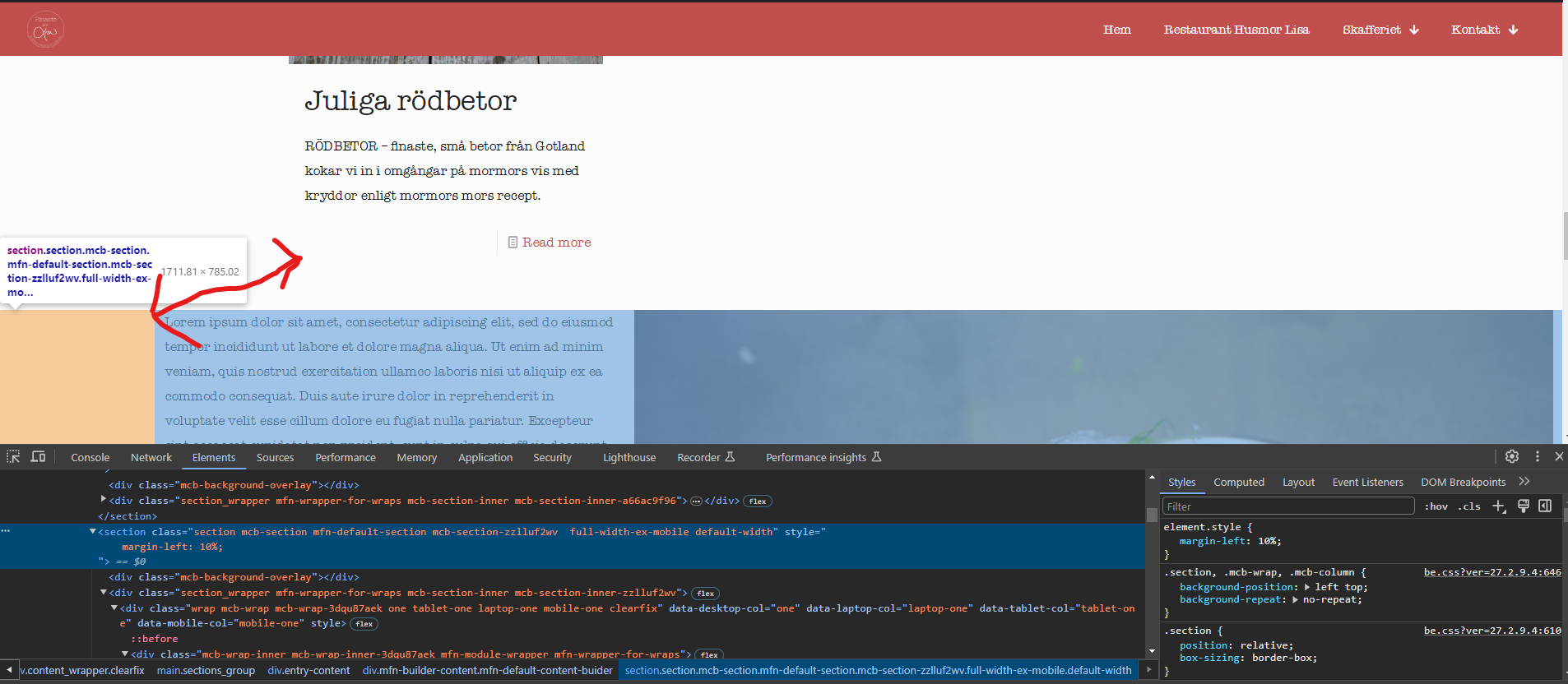
I have a section that is full width, which is great, but then I would like to add some margin to the left so that it would mirror the width of the rest of my content on the left-hand side.
I tried giving the fullwidth section a percentage based margin to the left but that doesnt work responsively. What margin value should I give the section so that it always lines up with the rest of my content on the left side, despite screen size
As you can see in the example below I have given the section a 10% margin-left, and I can increase that to match the content above, but that only works for that screen size.
I have seen that you use:
#Header .container {
- padding-left: var(--mfn-column-gap-left);
- padding-right: var(--mfn-column-gap-right);
}
Perhaps I can use that somehow?
Thanks in advance,
Ruben

Comments
Hi,
Please always attach a link to your website so we can check it out. If the page is offline(localhost), then our help will be limited. You will have to contact us when the page is online. Also, please make sure that the page is not under maintenance before you provide us with the link.
Thanks
Hi, link to page below,
https://finasteavlisa.se/skafferiet/
Its the section with the lorem ispum text,
Thank you
I can see that you added this inline to the section.
Instead, you should use the Advanced tab from the section options, and then you can set up different margins for our breakpoints:
Best regards