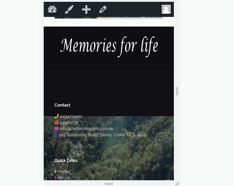
Foot over flowing on Call to action Mobile view
Hello, I have created a nice looking footer for my site
www.cedarvalepark.com.au
How do I center the text and fix the over flow issue on the mobile. Widget 1 Overflows onto the call to action area.
I would like to keep the footer left aligned on the PC. i know I could just use the code <center> </center> for the footer area. but I would only like this to apply on the mobile version.
PC view looks good
The mobile view the widegts over flow onto the call to action image.
Many thanks for your time


Comments
Hello,
Please, put the following CSS code in Betheme -> Theme options -> Custom CSS & JS -> CSS, and check if it is what you wanted to achieve.
@media only screen and (max-width: 768px) {
   #Footer{
      background-size: cover!important;
      text-align: center!important;
   }
}
Thanks
Amazing thank you :) It worked Perfectly